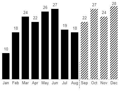
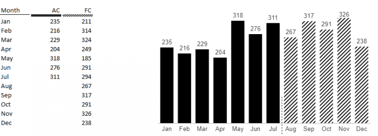
Business scenario charts are one of the Business Chart types.
They show two scenarios together in one series. The Forecast values show on the categories for which there's no Actual data.

Setup
Business scenario charts require a Compare by hierarchy. This'll hold the members containing the two scenarios to display. These members can be set directly from the dropdown, or driven from an Excel cell.

Actual values will be displayed as solid black columns. When there's no data for Actuals, Forecast values are displayed instead with a diagonal fill pattern.

This default behavior can be overridden by specifying the first forecast member in the formatting pane. This is useful if your data contains both actual and forecast data within one member. In this case, you would set that member as both the Actual and Forecast values in the task pane. Then, you would choose the Forecast from category in the formatting pane. This can be directly entered or driven from an Excel cell.

