Connecting to the Anaplan XL web server in a browser window shows a display.
The display shown is similar to the one shown on the Web HomePage.
Connecting
To create a new report in the Web edition, select Adhoc module. The user profile information is displayed on the top bar.
- Active Connections: shows a list of currently active data connections.
- Recent Connections: displays a history of recently used connections.
- New Connection: starts the process of creating a new database connection.
Connection Builder
| Section | Description |
| Connection Builder Title | Clearly identifies the section as a Connection Builder. |
| Connections Tab | This shows a list of previously established connections (Currently empty). A search function is present to filter the list of connections. |
| Server Address & Requires Logon | Fields for specifying the database server address (for example, localhost) and whether the connection requires a login. |
| Databases Section | A list of available databases to connect to. Use the search bar to filter the database selections. |
| Cubes Section | Once a database is selected, this section lists the available cubes (multidimensional datasets) within that database. Use the search bar to filter the cube selections. |
| Properties | Allows for advanced configuration options or customization of the connection. |
| Cancel | Cancels the new connection request. |
| Save | Saves the new connection. |
A list of the servers, databases, and cubes to which you have connected previously is displayed. To create a new connection, enter the name of the server in the lower half of the window and then select Connect. A full list of databases on that server is presented. By selecting a database, and on the right side, the cubes on that database to which you have access are displayed.
Creating a report
This example uses the Adventure Works cube in the Adventure Works Demo database.
After connecting and selecting a cube, the Report Designer appears to help you create reports similar to Anaplan XL Excel edition.
The Report Designer is separated into 5 main areas:
| Section | Description |
| Available Hierarchies | This lists the available dimensions and hierarchies within the active cube connection. Expand the dimension to view the hierarchies which it contains. Hierarchies can be dragged from this area into Headers, Rows, or Columns to be used within the report. |
| Headers | The Header area or filter area provides a set of hierarchies for user selections. The selections will be displayed at the top of the grid. User selections made within hierarchies in the Header area of the grid will determine the numbers displayed in the report body. |
| Rows | The Rows area is a holder for hierarchies to be positioned on rows in the reports |
| Columns | The Columns area is a holder for hierarchies to be positioned on columns in the reports |
| Member Selector | This displays the content of the selected hierarchy. The hierarchy tree can be expanded and members are selected by dragging to the right. Selections can also be based on Excel cells, Slicers, or specified as related sets of data, children/descendants, etc. This is covered in detail in the Member Selector Selection. |
Drag items from the Available Hierarchies list to the Headers, Columns, and Rows. Next, double-click each member. In the right side area of the window (the Member Selector area), drill down to select the member to display.For example, by double-clicking on Measures. The Member Selector Area expanded, allowing the selection of the measure, Reseller Sales Amount. Double-click or drag across the member to the right side to the Selections window.
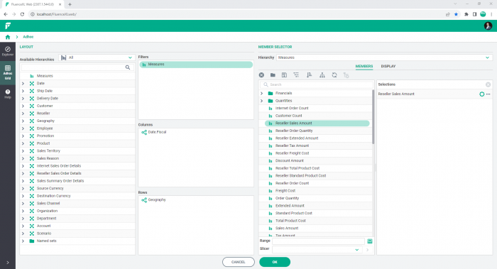
Use SHIFT and select or CTRL-and select as normal to multi-select members.
Having positioned and made selections within the hierarchies as required, press OK to insert the report.
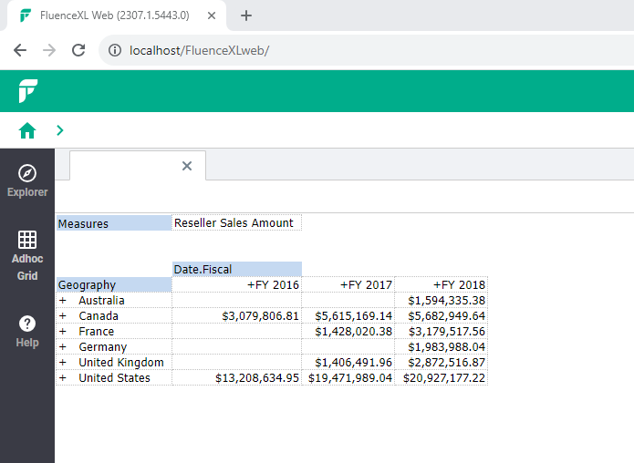
Double-click on entries in the grid to toggle between drill-down to expand and drill-up again. In the example above, double-clicking on Australia will expand to show the rows beneath (at state level). Double-clicking on Australia again will return to showing one row for Australia.
Change the layout of the report by selecting and dragging the hierarchy labels. For example, in the above report, you can drag Geography from rows to columns or drag it to the Headers area. You can do this with any of the hierarchies being displayed.
Right-click menu
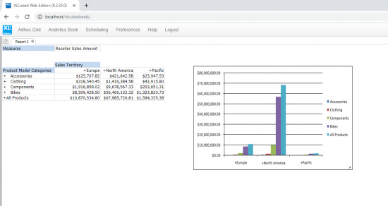
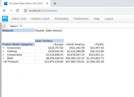
This report shows sales of product model categories across sales territories. Right-click on the grid, and you will see a menu with the options:
| Option | Description |
| Properties | The Grid Properties window allows changes to the grid report. Use the Behaviour tab to resize the columns after writeback by the user. The Appearance tab allows you to:
Enter Multidimensional Expressions in the Mdx tab and choose OK. |
| Design Grid | Opens the Report Designer window. |
| Format Data | Format the data. For example, format numbers, similar to Anaplan XL Reporting Excel edition, by choosing from the Category:
|
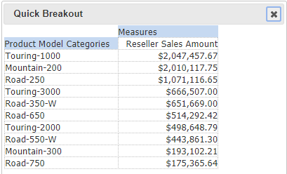
| Breakout | Allows you to take a subset of the grid report and display it in more detail. Choose the Hierarchy and Selection Type from the dropdowns. Select to display Top or bottom members from the dropdown. Select a number for the Breakout count. Choose Quick window or New Grid for the Breakout. For example, you can choose to display the 10 highest models in the Product Model categories as shown below. |
| Drillthrough | Select the number to limit rows for the Drillthrough option. Choose to Prefix text with quote (‘). |
| Apply | Expand Apply to Sort, Rank, Filter to the data. Choose Clear to remove the sorting, ranking, or filtering of the data. |
| New Chart | Create a chart from the grid report. |
| Actions | Actions defined in the Cube can launch applications, such as performing drillthroughs, etc. Analysis Services Action types supported are:
|
This result of the breakout shows the 10 highest models in the Product Model Categories:
The screenshot below shows the above report sorted in ascending order on the measure Reseller Sales Amount.
By selecting New Chart > All, you can quickly create a chart for the grid report – see example below.