

Explore the various panel properties and types that define the layout, size, and overall appearance of panels on the Homepage.
Panel Properties
Panel Properties determine the layout, size and general look and feel of the panel on the Homepage. Panel properties apply to all panel types and include:
- Panel Title
- Title Link
- Panel Position
- Show Header
- Header Tooltip
- Show Border
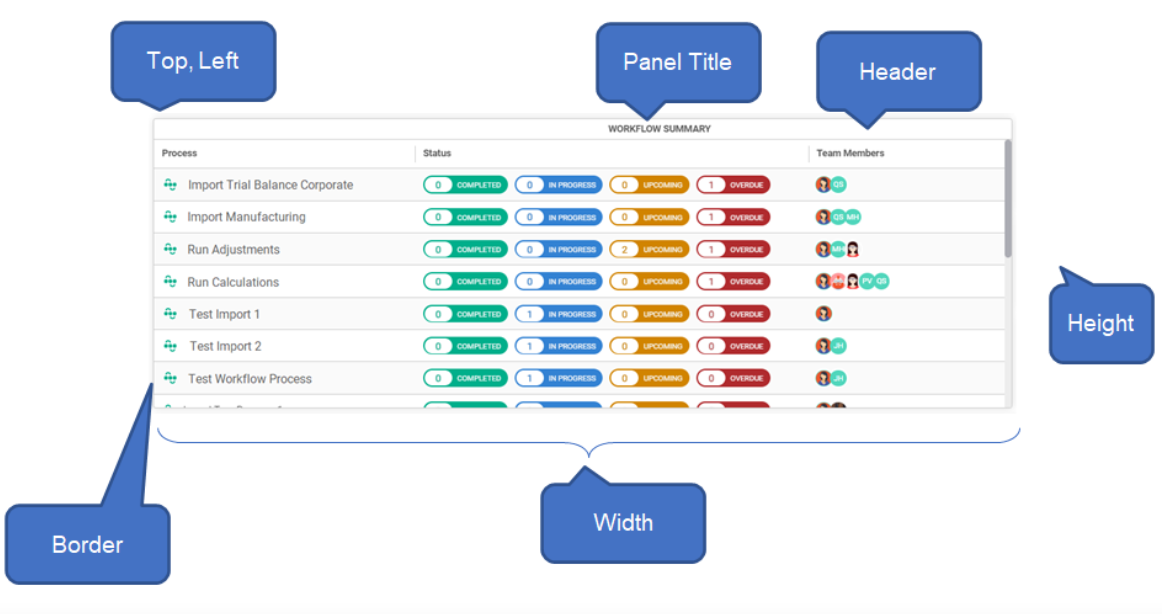
Panel Title
It's the text that appears in the Panel Header. This is a required property.
Title Link
Use this link to specify a URL to link to when the user clicks on the Panel Title. This is an optional property.
Panel Position
It specifies the position of the panel on the homepage and its relative to other panels on the Homepage. Within Homepage Designer, panels are laid out on the homepage in a grid fashion. There are 12 columns across and a maximum of 46 rows.
Use the Top, Left, Width, and Height to specify the position of the panel on the Homepage.
- Top and Left specify the grid coordinates to start drawing the panel from.
- Width specifies the number of columns .
- Height specifies the number of rows.
Show Header
The checkbox specifies whether to display the header bar with the panel title when the panel is rendered. You may opt to turn off the header with Image panel types where a header may detract from the image.
You can also turn off headers for Report panels. Anaplan XL Reporting and Power BI have their own titles in the report.
Header Tooltip
The tooltip is the text displayed when a user mouse over the Panel Header.
Show Border
The checkbox specifies whether to display the border around the panel when the panel is rendered. You may opt to turn off the header with Image panel types where a border may detract from the image.

