Variance Waterfall charts display the categories contributing to the variance between totals.
For example, in the chart below, the first half of 2018 had a value £103,246 greater than the first half of 2017, so this had a positive contribution to the change between FY 2017 and FY 2018.
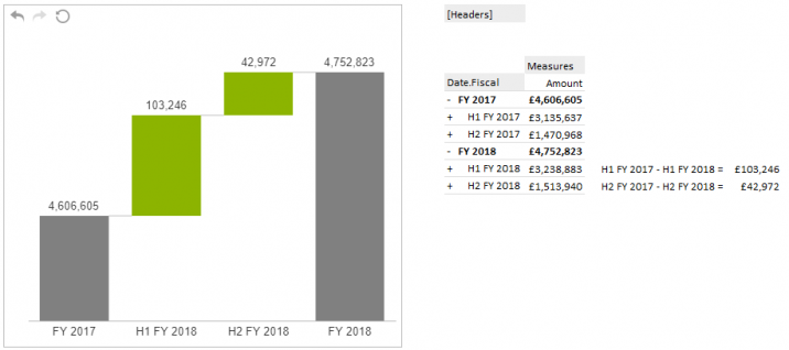
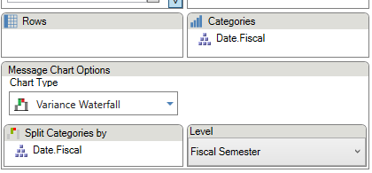
The values for the total bars are set in the Categories section of the task pane. The variance between each is then split up by whatever is on the Split Categories by. This can either be the same hierarchy or a new hierarchy can be placed in this area.
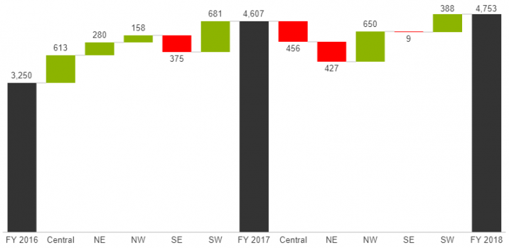
In the example below, FY 2016, FY 2017, and FY 2018 are the selected members in the Date hierarchy of Categories. In the Split Categories by section is the Organization hierarchy, with the five divisions as the selected members. This results in a waterfall chart showing how each division contributed to the variance over each year.