You can create a chart to display a rolling forecast that updates dynamically when you change the Current period.
Sales forecast example
Create a rolling forecast for sales forecast figures over a 6-week period, for a one-year time frame. You can adapt this for different time frames and more complex use cases.
This is a process with three stages:
- Create a module.
- Create a chart.
- Update the Current period.
Create a module
Create a Sales forecast module:
- In the Time pane, select Weeks: General as the Calendar Type.
Enter values for Start Date, Number of Weeks, and select a Current Period. - Select Apply.
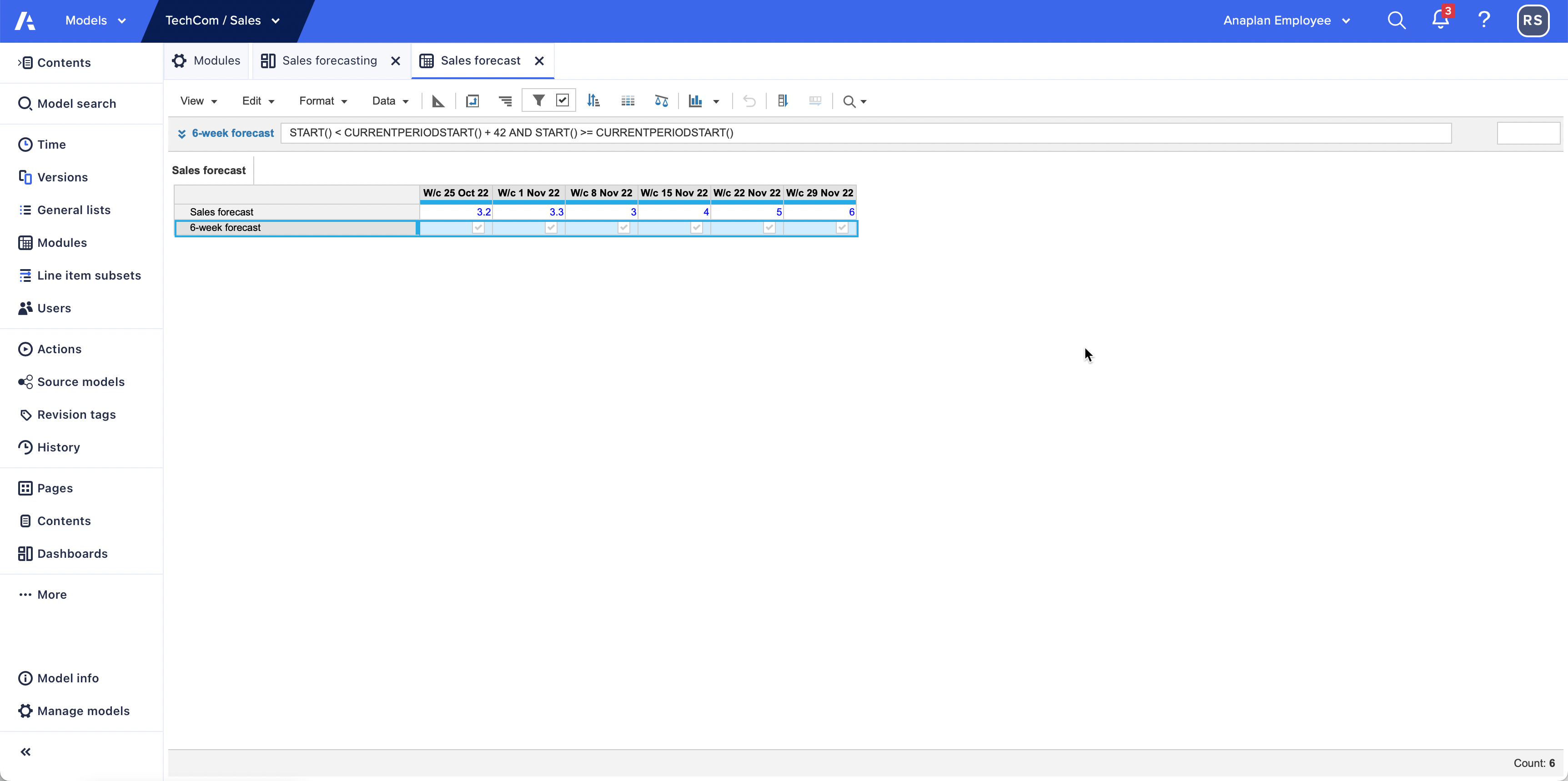
- In the Modules pane, create a Sales forecast module with two dimensions:
- Time on columns.
- Two line items on rows: Sales forecast and 6-week forecast.
- Format Sales forecast as Number and 6-week forecast as Boolean.
- Enter data into the line item, Sales forecast.
- Select 6-week forecast as true for all time periods.
- Apply a Time filter to display 6-week forecast cells equal to true.
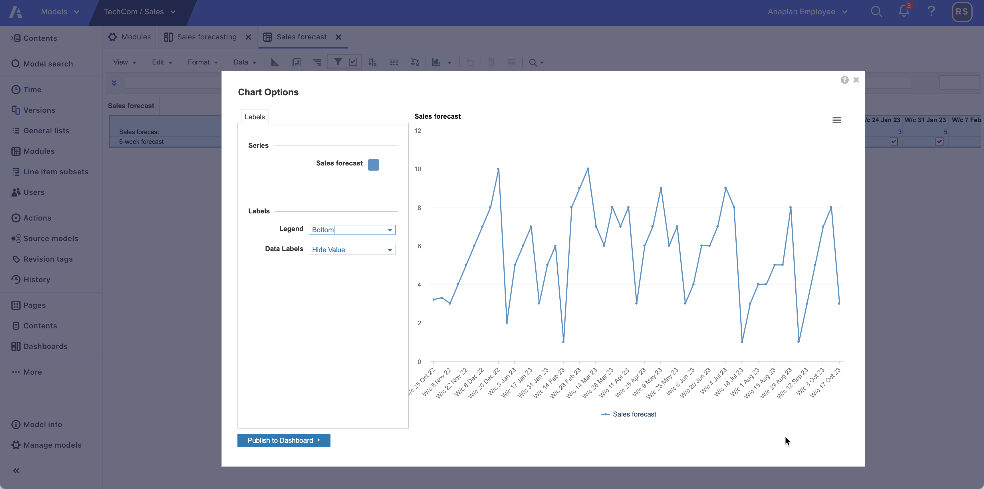
Note: Charts support a maximum of 200 items or data points. If you adapt this example, ensure your time does not exceed this.
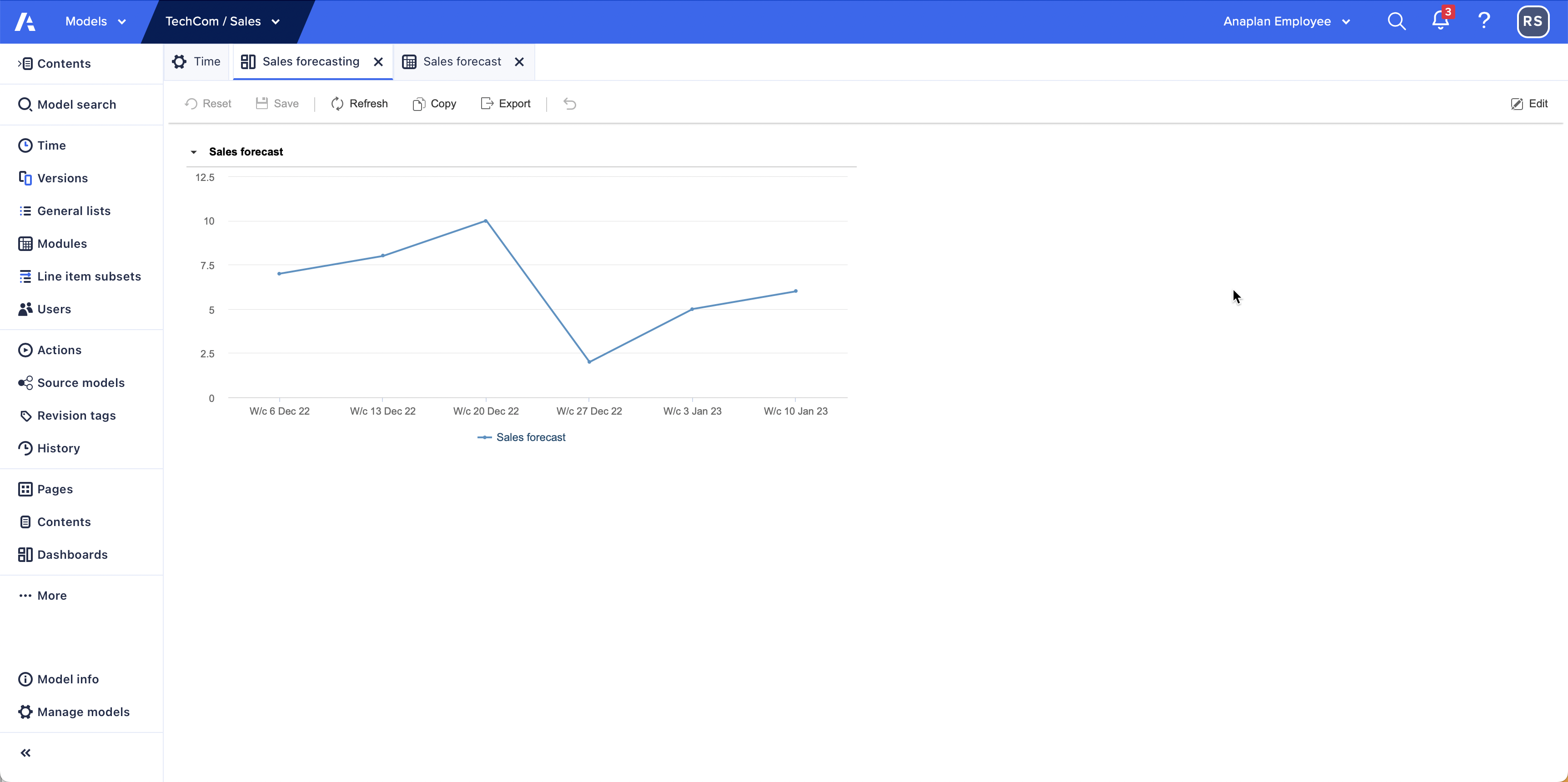
Create a chart
Create a line chart based on the Current period:
- Select the whole grid, then Create chart > Line Chart.
- Select Publish to Dashboard and select the dashboard to publish to.
If no dashboard currently exists, select New Dashboard to publish to a new dashboard. - Return to the module and enter a formula into 6-week forecast:
START() < CURRENTPERIODSTART() + 42 AND START() >= CURRENTPERIODSTART()This sets the data as true for the Current period and the next 42 days (6 weeks). With your filter, this means that only data for the current period and the next 6 weeks displays.
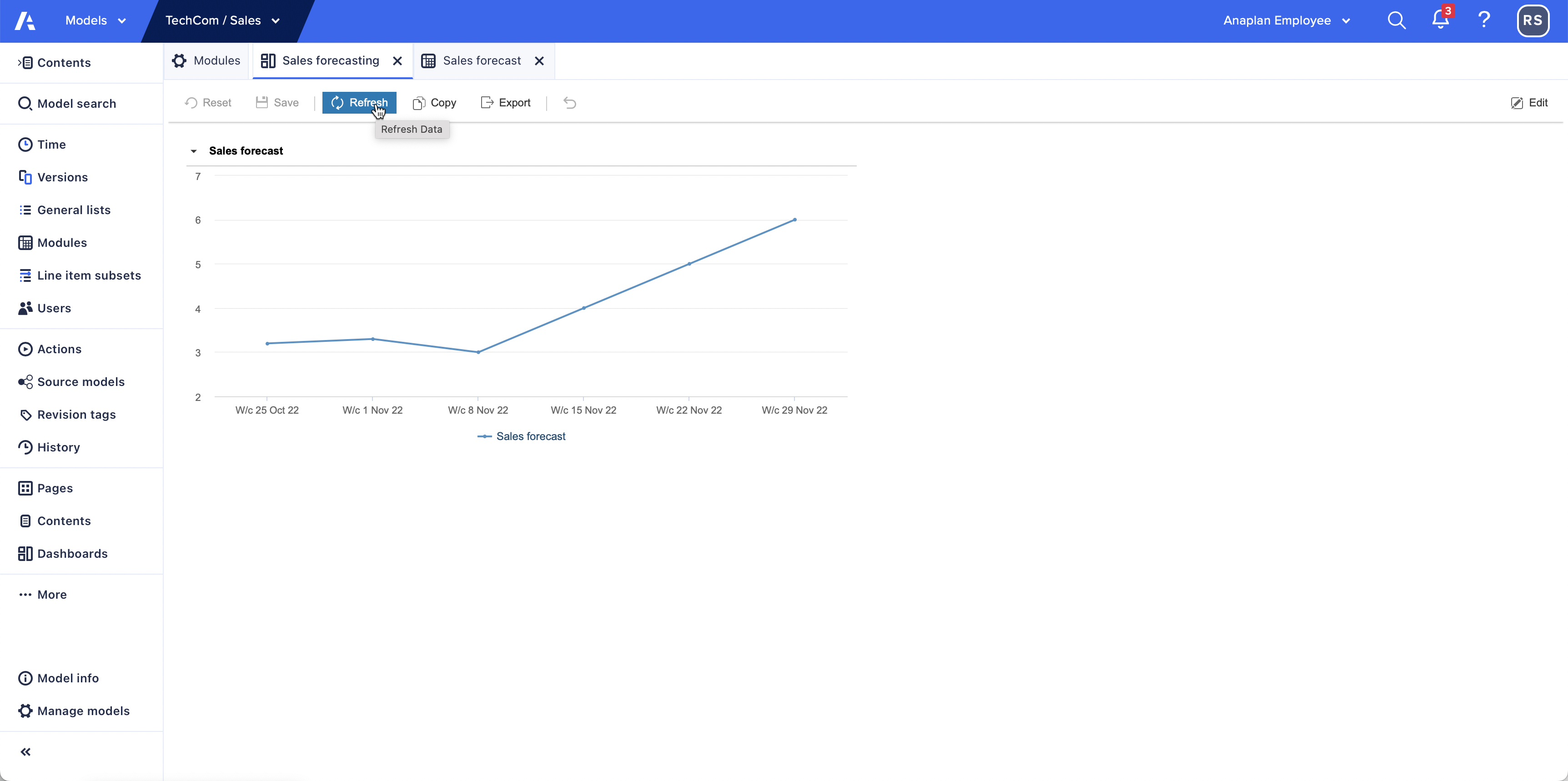
- Refresh your dashboard.
The chart now displays the data values from the start of the current period plus 42 days (6 weeks).
Note: You can also show a timeframe that starts before the Current period as well as after. For example, START() < CURRENTPERIODSTART() + 42 AND START() >= CURRENTPERIODSTART() – 21 displays a forecast for 21 days before the start of the Current period and 42 days after.
Update the Current period
Change the Current period in the Time pane and refresh the dashboard. You can do this in designer mode or on the published dashboard. The timeframe moves to begin at the new Current period.