Combination charts can be used to create a Pareto Analysis, a statistical technique based on the Pareto Principle. Also known as the 80/20 rule, the Pareto Principle suggests that 80 percent of the output from a given situation or system is determined by 20 percent of the input in a typical distribution.
A disproportionate improvement can be achieved by ranking causes of a problem and then concentrating on solutions that will have the greatest impact. Doing the 20 percent of work identified by the analysis will deliver 80 percent benefit to an issue.
Where to use a Pareto Analysis
The Pareto Principle can be applied in many situations:
- 80% of customer complaints arise from 20% of possible issues.
- 80% of delays in a schedule result from 20% of the possible causes of the delays.
- 20% of products and services account for 80% of profit.
- 20% of the sales force produces 80% of company revenue.
- 20% of a system’s defects cause 80% of its problems.
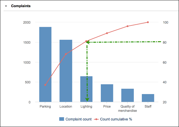
For example, imagine a retail outlet is experiencing a decline in sales but doesn’t know why. The retailer develops a questionnaire, asking customers to choose categories that deter them from coming to the store. The categories include parking, location, lighting, price, quality of merchandise, and staff.
Plotting the responses on a Pareto Analysis shows which categories to address first to encourage customers back into the store. The results show that parking and the location of the store is deterring customers from returning. The 80% line falls in the center of lighting, perhaps indicating something to look at after parking and location.
Format of a Pareto Analysis
A combination chart displays categories and count values in a column chart, ranked in descending order of the frequency with which they occur (from left to right). The left vertical axis is generally associated with the column chart (categories).
A line chart, overlaid on the column chart, shows the cumulative value as a percentage, moving from left to right across the Analysis to a total of 100%. The right vertical axis is associated with the line chart (the cumulative total).
A line is drawn from the 80% marker on the secondary Y-axis across to the line on the line chart. The line is dropped to the X-axis. Those items to the left of this point on the X-axis are the items that, if addressed, will deliver the greatest benefit:
Create a Pareto Analysis
We'll use the retail outlet example to illustrate the steps required to create a Pareto Analysis.
- Record the questionnaire categories; individual count and cumulative percentage count in a module.
- Sort the category line items in descending order with the line item with the highest count first.
- Create a combination chart with categories on the X-axis, count on the left-hand Y-axis, and percentage count on the right-hand Y-axis.
- Manually, draw a line at 80% on the right-hand Y-axis running parallel to the x-axis.
- Drop the line at the point of intersection with the line chart on the x-axis. This point on the X-axis separates the important categories on the left from the less important categories on the right.

