You can create dynamic charts from data in an Excel worksheet. To insert a new chart:
- Select the Anaplan XL > Insert > Small Multiples > Excel... ribbon item
- Select the data source, if it hasn't already been selected, such as an Excel range within the worksheet.
- Select the Read data in hidden cells checkbox.
Select the Read data in hidden cells option if you want all rows to be charted, whether they're visible or not
- Anaplan XL will then insert an empty chart for you, ready for your column selections.
- In this example, you can then drag MonthName to Categories, Category to Columns, and Color to Rows to give this chart:
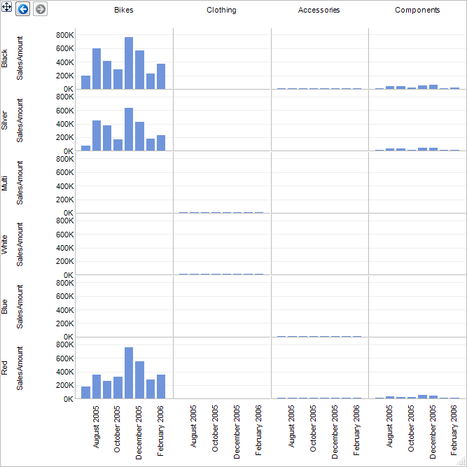
These small multiple charts are identical to the Analysis Services-based charts except for a few differences:
- There's no Header area: The charts are always based on the entire data set
- Any numeric column can be selected for the Y-Axis values. When appropriate, this also applies to X-Axis and Color values.
- To edit the range, you may select the Select data source toolbar button in the Task Pane:
- To quickly change whether hidden data should be included in the chart, you can use the Read data in Hidden Cells toolbar button in the Task Pane.

