In Anaplan XL, dynamic charts are useful for showing a lot of data. They can show hundreds of data points, separated into multiple individual charts, often called small multiple charts or Trellis charts. This allows you to find trends and outliers in the data more easily than by trying to study a large table of data.
Add a dynamic chart
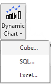
Insert a chart, select Dynamic chart on the Anaplan XL ribbon. This allows you to build cube, SQL, and Excel-sourced charts.
This inserts a chart and opens the Anaplan XL task pane. You can also open the task pane by selecting Show Task Pane in the chart's right-click menu.
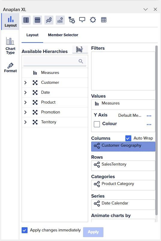
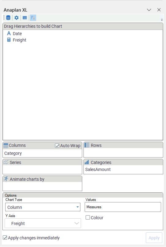
Select options for the Layout, Chart Type, and Format tabs if you chose to create a Dynamic chart using cube data.
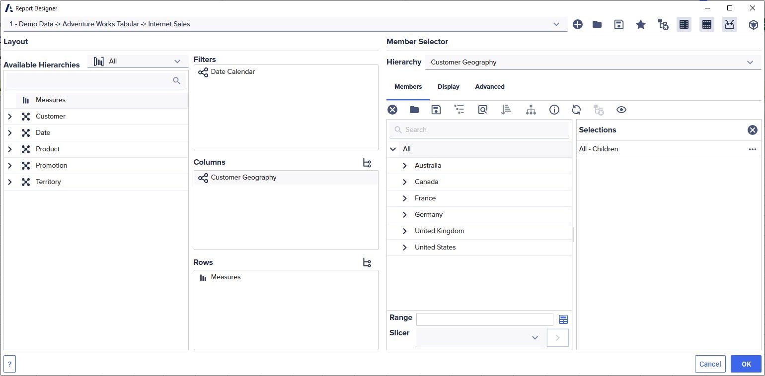
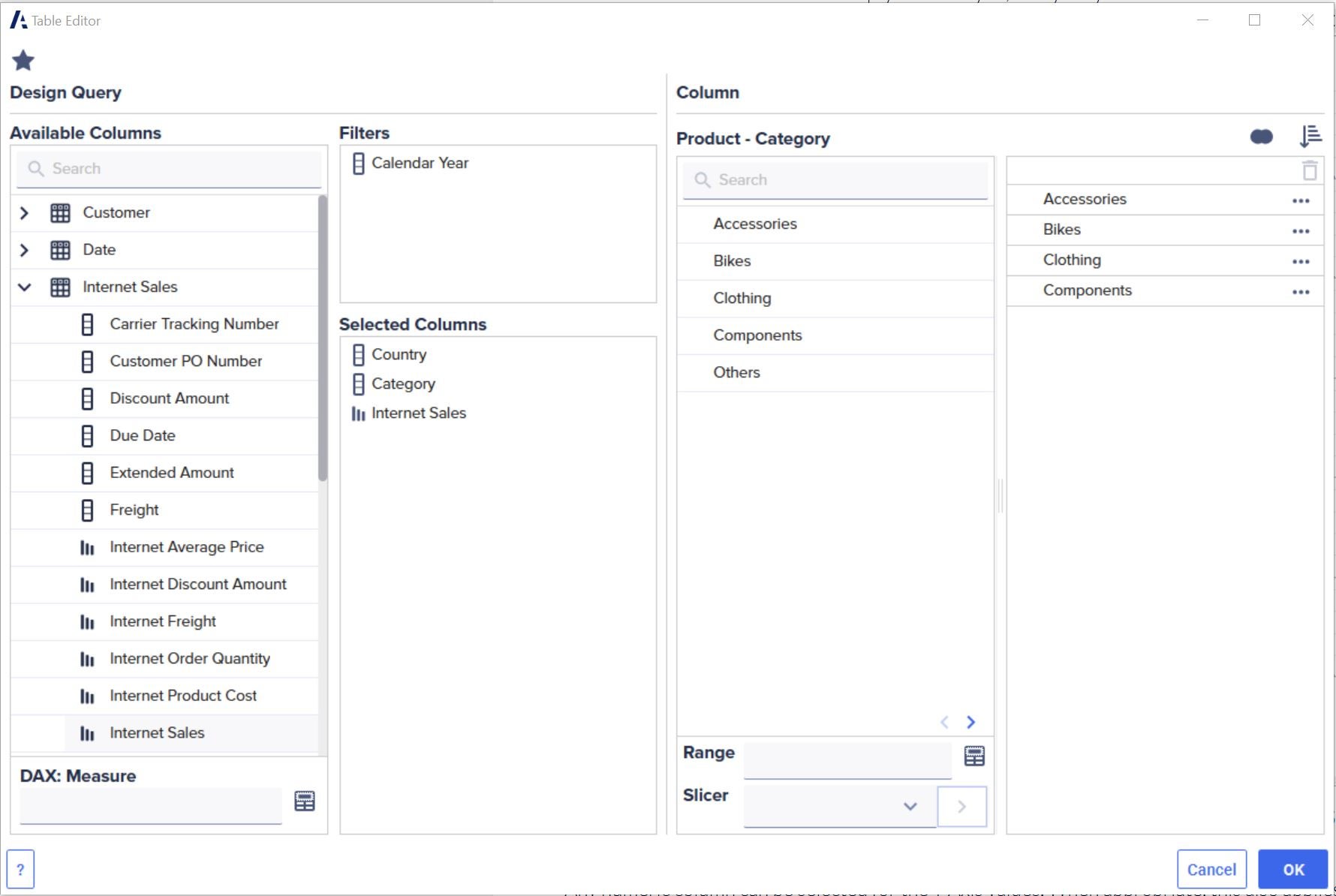
Depending on your selection of Tabular, Grid, or Grid (Simplified), use the Table Editor or Report Designer to select members for filters, columns, and measures for a Dynamic chart based on SQL data.
Use the Anaplan XL task pane to modify the chart after selecting the data on the worksheet for Excel-sourced charts.
To move, size, or close the task pane, drag it using the window bar or use the dropdown menu on the task pane header.
To delete the Dynamic chart, right-click the chart and select Delete.
You can move and resize the chart using the two icons at the upper left of the selected chart.
| Icon | Description |
 | Move the chart. |
 | Resize the chart. |
You can refresh the data within the chart by right-clicking and selecting Refresh.

