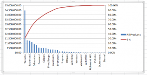
The Pareto Principle is often referred to as the 80-20 rule, that 80% of outcomes are attributable to 20% of causes. Pareto charts have both bar charts and a line graph. The bars represent individual values and the line represents the cumulative total.
To use Pareto Charts in Anaplan XL, within a grid, right-click the column header and select Grid Charts > Add Pareto Analysis.
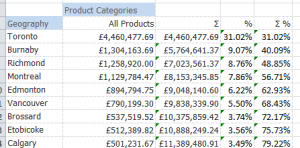
Take this grid showing Reseller Sales for Product Model Categories for Canadian cities:
Right-click on All Products to Anaplan XL > Grid Charts> Add Pareto Analysis. The Pareto Calculations window appears. Select from the options below:
Calculated Columns: These options determine the data calculated and displayed in the table before generating the chart.
| Option | Description |
| Rolling Total | For each category , this column calculates the cumulative sum of the members (values) up to that point. The first row shows the value for the first category; the second row shows the sum of the first and second categories; and so on. |
| Percentage of Total | This shows the percentage each member contributes to the grand total of all members. |
| Rolling Percentage of Total | This calculates the cumulative percentage of the total for each member. It shows the running total percentage of the items up to that row. This column is crucial for identifying the vital few in Pareto analysis. |
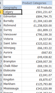
Sort by Value Column: This option dictates the order in which the categories are presented in the chart. Selecting it means the categories are arranged in descending order based on their Components values.
Create Chart: This option makes the Pareto chart. It combines the bar graph representing the individual values with the line graph representing the total percentage.
Chart Options: These determine which data to plot in the Pareto chart:
| Option | Description |
| Value | Represents the individual category values (the bar heights in the chart). |
| Rolling Total | Plots the cumulative sum of values as a bar chart instead of the value. |
| Percentage | Plots the percentage of total for each category (as bars). |
| Rolling Percentage | Plots the cumulative percentage (as a line graph). This is the key element defining the Pareto chart. |
All the options for the Calculated columns are selected as well as the Sort by Value column, Create Chart, Value, and Rolling Percentage. Select OK to return to the workbook. Notice that the chart is showing the top 9 cities that provide 80% of the sales.
You could also include the rolling total and percentage in your Pareto chart.
You also have extra columns on the grid showing the cumulative total of all sales, the sales percentage per category, and the cumulative percentage.