Configure the data series on chart cards to highlight the significance of your data.
A series is a set of data represented by a line on a line chart or a set of columns on a column chart.
To view or change the Series configuration options, select the Chart tab of the Card configuration panel and expand the Series section.
Configure the default series
To configure the default chart settings for all series:
- Expand Series and select Configure default series.
- On the Configure default panel, you can:
- Choose a Chart type.
- For line charts, you can select a color swatch or enter its hexadecimal value.
- Choose the Data label style.
- Choose a Data label
- Set the Axis plotting.
- Depending on the chart type, you can:
- Set the Series stacking.
- Choose a Line style, Line type, and Line width.
- Choose a Marker size, and Marker shape.
To reset your default settings, select Reset all.
You can override the default chart settings. This is helpful when you want to differentiate between diferent data series. For example, you could represent this year's forecast data as a dotted line and last year's actual data as a solid line. You could also turn on data labels for a particular data series.
To override the default chart settings, select the cog next to a data series to open the Configure series panel.
Assign a color palette
To assign a color palette to a chart:
- Select Chart tab of the Card configuration panel.
- Expand Series and in Palette, select the icon to expand the list of color schemes.
- From the dropdown, select a color palette. Both predefined and custom palettes are listed.
Change the colors
To change the color of each data series:
- Select the colored swatch next to a data series to change its color.
- From the dropdown, you can select a color swatch or enter its hexadecimal value.
The original color displays behind customized color swatches.
You can select Reset colors to reset all color swatches in that series to their original colors.
Add a right axis
You can add a second axis to the right side of a chart for a data series (except pie charts).
Select Right axis next to the data series you want to add a right axis to.
The right axis scales to the value of the data series you select. This can be useful when comparing two data series with different yet related values. For example, revenue and individual product price.
Note: If you turn on the right-hand axis for any data series and mix different combination chart types such as line, area, column or dotted, the results may look distorted and harder to read.
Change the chart type
You can choose the type of chart used for each data series when you create a combination chart.
In the Series box, select the Chart type icon next to a data series, then choose the type of chart to use for that series. The icon shows the type of chart selected.
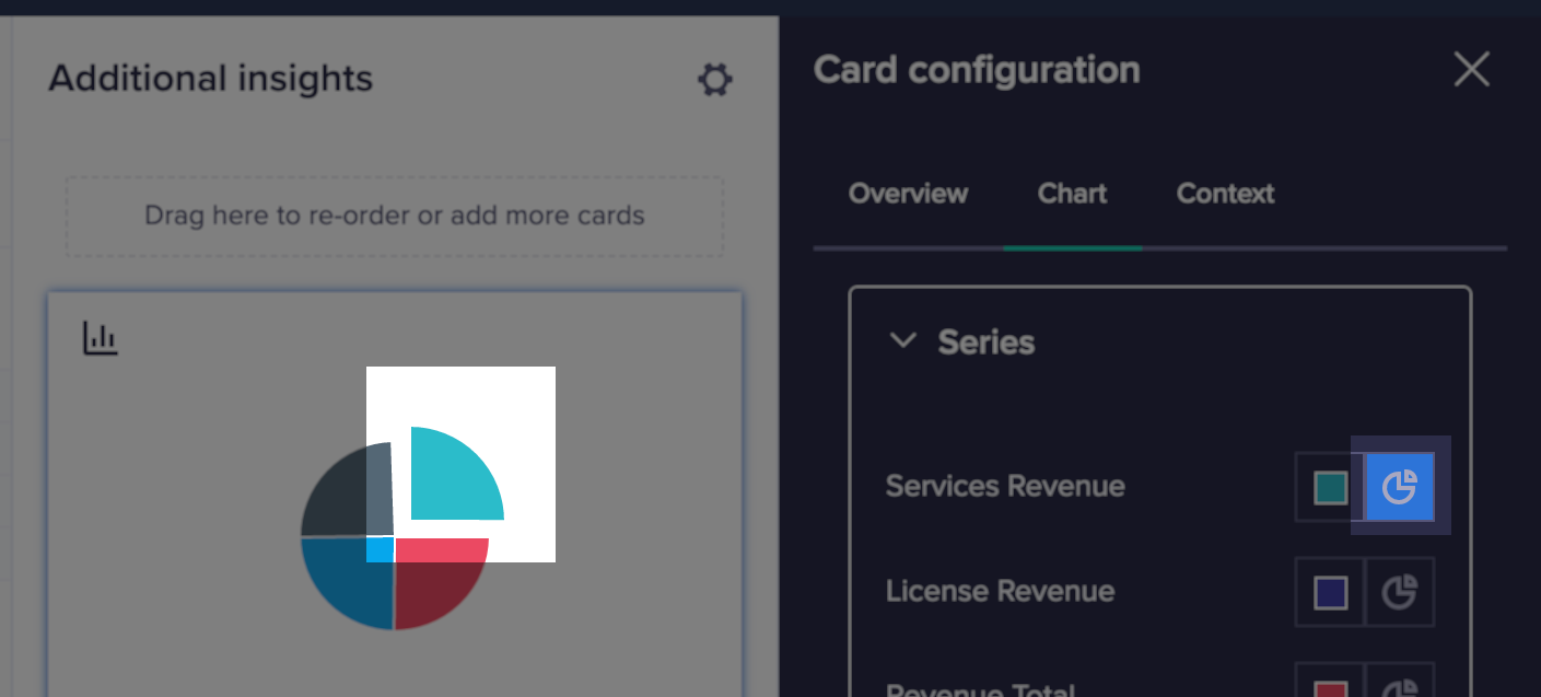
Detach segments from a pie or donut chart
When you configure a pie or donut chart, you can detach the segments for data series to emphasize them. You can detach multiple segments.
Under the Series heading, click the Sliced icon next to the names of the data series you want to detach the segments for.
Change the stacking method
If your chart card contains two or more data series displaying as a bar, column, or area chart, then the Series stacking heading displays at the bottom of the Series box. The options under this heading enable you to display your data series in the following configurations:
- Clustered — stacks the data items within a series in parallel bars or columns. The Clustered configuration is useful to identify the highest and lowest values within a series. In area charts, the Clustered configuration displays transparent areas of color that overlap.
- Stacked — stacks the data items for a data series within one bar, column, or area. The Stacked configuration is useful to examine the data items within the data series while simultaneously comparing the overall values of the data series.
- Percentage — stacks the data items for a data series within one bar, column, or area. A percentage chart fills the entire y-axis. The relative size of each data item determines the percentage it represents within the 0-100 scale on the y-axis. The Percentage configuration is useful for understanding the composition of your data series.
Set the marker size
If your chart card contains a line, point, area, or combination chart, you can set the marker size that displays on your chart. Under the Series heading, choose a size between 0 and 8 from the Marker size dropdown.
When you create a chart card, the default marker size is automatically applied.

