In Anaplan, a scatter plot displays values along two axes for two sets of data series. The distribution of the dots across the axes demonstrates the existence, or absence, of a correlation between the events. Bubble charts, which are an added dimension to scatter plots, replace the plotted dots with bubbles. These bubbles represent a third series of data, typically meaning the size or volume of a dimension related to the first two series.
In both cases, a single series of data is charted from the first two columns of line items (three in the case of a bubble chart) in your grid.
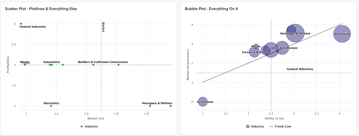
Switch on Trendlines to more easily analyze your data. Select either:
- Linear: Use for simple linear data sets to produce a best-fit straight line. This is used to demonstrate constant progression or decline.
- Polynomial: Use when values fluctuate to create an up-and-down curved line. This is used to analyze gains and losses in a large data set.
- Exponential: Use with larger datasets with continuously fluctuating values. These trendlines can't contain nonpositive (greater-than-zero) values in the Y axis, and will be unavailable if these values are present.
- Logarithmic: Use to facilitate the display of sudden increases or decreases in the trend, but tend to level out. Due to their nature, Logarithmic trendlines can't contain nonpositive (greater-than-zero) values in the Z-axis and will be unavailable if these values are present.
- Power: Use with data sets that compare measurements that increase at a specific rate, to display a curved line. For example, the acceleration of a race car at 1-second intervals. A positive value is required.
Scatter plots and bubble charts can also use conditional formatting. This allows you to set statuses to color the bubble or plot markers based on rules and values. In this case, formatting is defined by your source view's fourth column of data. To use conditional formatting in scatter plots and bubble charts, follow the process in Configure conditional formatting. After updating the chart, go to the Chart tab, and expand the Series section. Toggle right on Use conditional formatting from <list item name>. The formatting displays on your chart.
On the Context tab you can toggle hierarchy filters. The hierarchy filter selector displays on the published chart, for that card on your board or worksheet. Via this filter, users can navigate to different branches of the list hierarchy in the source model.
To learn how to add a scatter plot or bubble chart to a board or worksheet, see Configure a chart card.
Usage
The scatter plot and bubble chart are best used when comparing paired numerical data, not necessarily associated to a time dimension. The plot of markers across the visualization helps you categorize the data, based on your use case. If the markers are grouped tightly together, then there's a high correlation. If the markers on the chart are more random in distribution, then there's low to no correlation in the data. With scatter plot and bubble charts, you can:
- Determine the root cause of a given scenario, by comparing numerical data.
- Visualize the relationship between your two data series.
- Identify where or who are the outliers in the data set.
- Determine a trend in the correlation of data.
- Identify opportunities or risks within a competitive scenario.
Apart from generic chart configuration options, scatter plot and bubble charts have additional configuration options and requirements. These include:
- Define minimum and maximum values for the chart axes.
- Create a bubble chart via the Card Configuration tab.
- Enable the Size toggle in the Chart Data section to size each data point based on a Z-Axis value. By default, the data points are sized relatively to each other to compare between each point. For accurate scaling, where the values are of the same signage, select Allow absolute sizing under the Series > Z-Axis section.
Considerations
A scatter plot or bubble chart may not be the best option when:
- You analyze small amounts of data
- You use non-numerical data
Anaplan's mobile app doesn't support scatter plot or bubble charts.

