A Gantt chart displays project tasks across a timeline, providing a visual cue on the progress and status of each task.
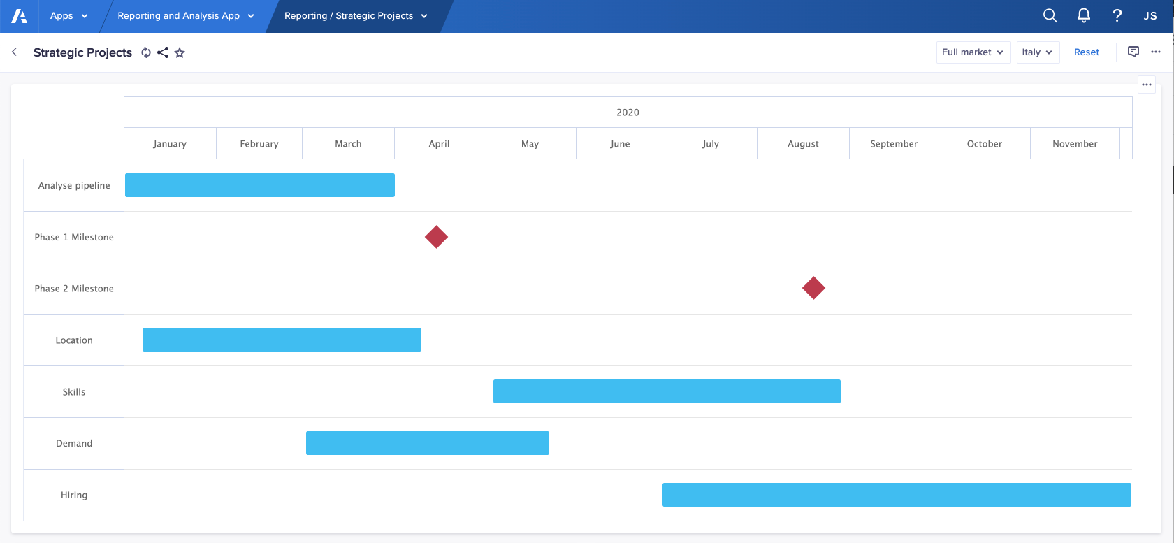
A Gantt chart helps you organize your workloads. Its bars display the statuses and dependencies of project tasks, revealing the progress of the project and any possible delays or blockers.
To build a Gantt chart, you must display date-formatted line items on columns when configuring your card. Additionally, the first two columns in your grid must represent the start and end dates for each of the project's tasks. If required, hide line items to ensure the start and end dates display side by side.
You can also configure a third column of data, of Date type, to flag key project moments for review or reassessment. On the Chart tab, use the Milestone Date toggle on the Data dropdown to turn on this feature.
Additionally, use the Series dropdown to change the Bar Color and the Milestone Color.
Your data must be date-formatted.
On the Context tab you can toggle Hierarchy filters. The hierarchy filter selector displays on the published chart, beside other context selectors for that card on your board or worksheet. Through this, a user can visualize projects and tasks belonging to a specific program, depending on the existing list hierarchy defined in the source model.
On the published page, your milestones display as diamonds. When users select a bar or milestone, any related cards update to display information about the selected task or milestone.
Conditional formatting in Gantt charts
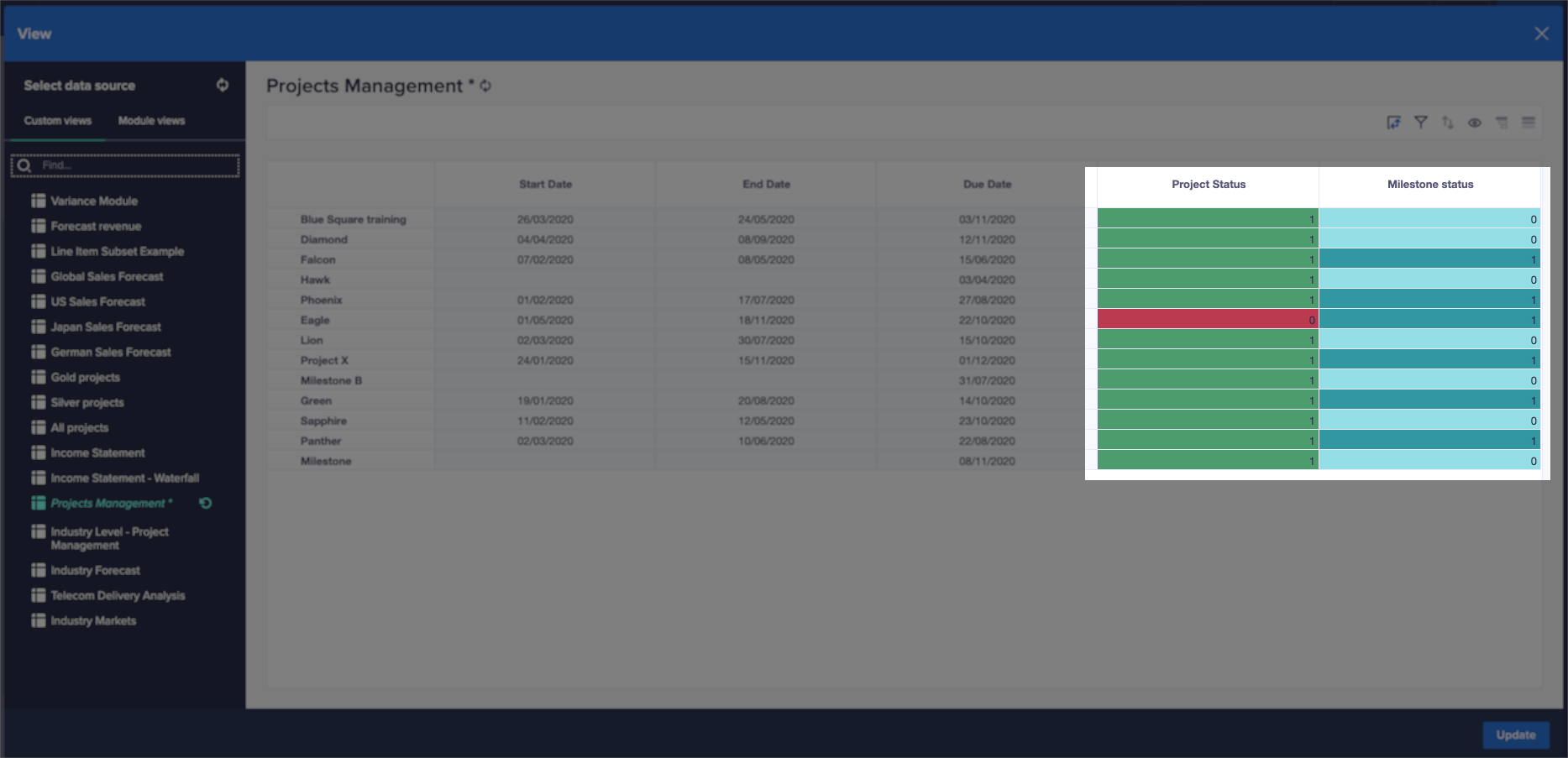
Gantt charts can use conditional formatting instead of setting bar or milestone colors directly. This allows you to add a color gradient based on values contained in your data.
The conditional formatting is obtained directly from the source's fourth and fifth column attributes.
Gantt chart interaction
Gantt charts provide an interaction feature that can be enabled or disabled from the card settings. With this, the data displayed by the chart can be adjusted by the user from within the visualization itself. Dragging either bars or milestones, the outcome directly affects the underlying source data. To be able to interact with Gantt charts, you must have the correct authorizations to edit the content in the underlying source. These include:
- Access to the model and module.
- Write access for any list on which the project is based.
- Write access where Dynamic Cell Access (DCA) is applied.
- Enabling the Allow editing toggle in the right-hand configuration panel, under the Series tab.
To adjust content in your Gantt chart, click and drag the start or endpoint of any particular bar, an entire bar, or a milestone.
Note: Any change to the Gantt bars or their milestones impacts the visualization of any chart on the page that shares the same source data.
To learn how to add a Gantt chart to a board or worksheet, see Configure a chart card
What can I use Gantt charts for?
Gantt charts have multiple uses. Primarily, they provide an easily understood roadmap of a project's stages throughout its lifespan. However, they can also help in other contexts, such as trade and promotions planning.
You can also use Gantt charts to improve future releases. For example, you can:
- Assess delays and blockers.
- Reassess priorities.
- Retrospectively analyze what went wrong.
Project tasks on a chart displayed by bars span the length of time in which each individual task should take place. This enables you to:
- Visualize a timeline of project-related tasks.
- Identify the status and progress of project tasks.
- Determine the relationship and dependencies between project tasks.
- Identify potential blockers or delays in the project's execution.
Considerations
A Gantt chart may not be the best option when you seek further details about the project tasks, project scope, or resources in use. To identify appropriate options, see Card types.
You can't change the column structure of a Gantt chart. Valid column structures are:
- Start date, End date.
- Start date, End date, Milestone Date.
- Start date, End date, Milestone Date, Bar conditional formatting.
- Start date, End date, Mlestone Date, Bar conditional formatting, Milestone conditional formatting.
Anaplan's mobile app doesn't support Gantt charts.

