Workspace administrators can use Chart Options to customize the configuration of dashboard charts. Different options display for different kinds of charts.
Classic dashboards are not supported for new customers. Build Apps or Pages in the User Experience instead.
Note: Chart Options is a dialog that enables you to configure charts within a model. Different options for charts are available in the User Experience, where page builders can add improved, modern visualizations to pages in your apps.
Simple charts, such as pie or line charts, have options to configure the Series color, Legend, and Data Labels. More complex charts, such as combination charts, provide additional options to configure the type of chart and axis locations. The timeline Chart Options dialog enables you to alter the date range.
All Chart Options are similar in presentation and many options are common to all chart types. These are the chart options for a Combination chart:
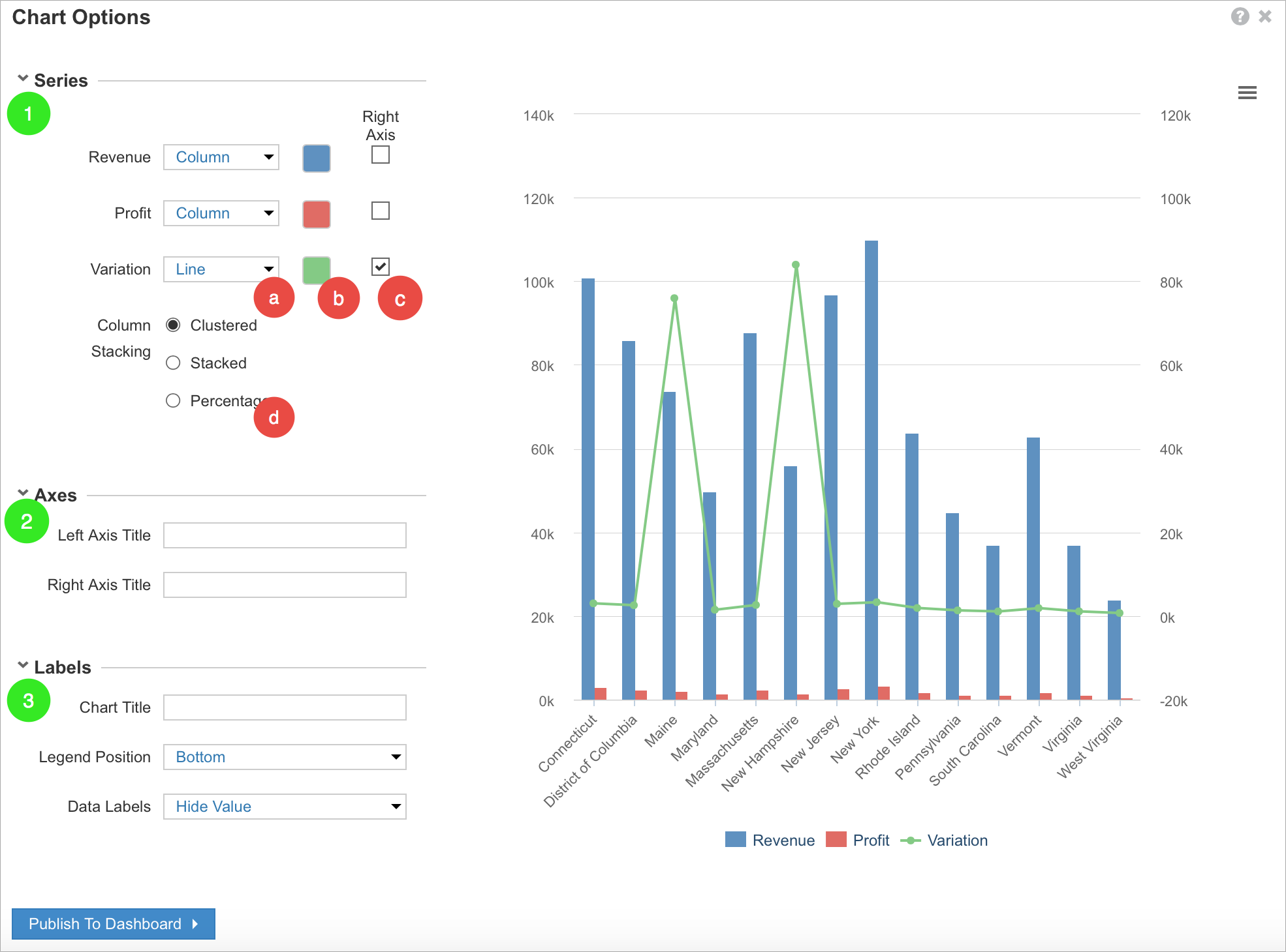
The Chart Options dialog is split into three sections, Series (1), Axes (2), and Labels (3).
- Series
- To change the chart type for a series, select an option from the dropdown list next to the series name.
- To change a series color, select the color picker next to the series name, and select an alternative color from the palette that displays.
- To change which series displays on the right axis, select the Right Axis checkbox for the series.
- To display a single axis on the left of the chart, deselect the Right Axis checkbox for all series.
The values on the left axis run from the lowest value, across all series, to the highest value. - To display a single axis on the right of the chart, select the Right Axis checkbox for each series.
- To display a single axis on the left of the chart, deselect the Right Axis checkbox for all series.
- Where there are multiple series types, choose whether the bars in a column or area chart are:
- Clustered: a separate column for each series type
This does not apply to area charts. - Stacked: a single column or area shows the value of each series type, differentiated by color, or
- Percentage: a single column or area shows the percentage value of series type, differentiated by color.
- Clustered: a separate column for each series type
- Axes
- Axes titles are blank by default.
Optionally, enter a Left Axis Title and/or a Right Axis Title.
- Axes titles are blank by default.
- Labels
- By default, the Chart Title is blank.
Optionally, enter up to 60 characters, including white space. - There are five options for the Legend position: Bottom, Top, Left, Right, Hidden.
- It’s also possible to choose whether to Hide Value or Show Value for each series.
- By default, the Chart Title is blank.
The Publish To Dashboard button publishes the chart to a new or existing dashboard.
If there are a lot of options to configure for a chart, a down arrow displays to the left of each section name. Select the arrow to hide the detail under each section name. You can select the arrow again to display the detail.

