When a chart is generated, the colors representing the series are taken from the palette chosen as the default in your model settings.
Your default model settings can be configured in Model Settings > Dashboards > View > Chart Palettes.
It’s not possible to change series colors on Timeline, Map, or Funnel charts.
Series color
The first series on the chart will use the first color in the palette; the second series, the second color and so on, to a limit of nine colors. If there are more than nine series, the colors will repeat: the first color in the palette will be used for series ten, the second color for series eleven, etc. When applying custom colors in this way, any number of different colors can be selected. Good practice would dictate that the number of series in a single chart be kept to a minimum, to ensure legibility of the data.
Any individual series color can be changed using the procedure below. A change to an individual series will not be overwritten if the default palette is changed. However, the other series in the chart will adopt the colors of the new palette.
Change a series color
The process for changing a series color is the same for all chart types. The options presented in Chart Options may vary slightly depending on whether you access them from a grid or a dashboard.
You cannot enter a Hex code when changing the color of a series.
- In Chart Options, select the colored box next to the series’ chart type. A black or white dot, depending on the color, displays in the center of the color that is currently selected.
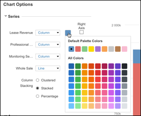
- To see the effect of changing the color for that series, hover over the colors on the palette to update the series and legend on the chart.
- Select the required color in the palette.
- Either select:
- Publish Copy To and select a dashboard to publish the amended chart to.
- Update to update the chart on the current dashboard.
- Reset to return the colors to the default palette.


