Administrators can choose a palette of colors to apply to charts in a model. This provides flexibility to apply color consistently across projects, business units, or series' so that it's clear to users that a color represents the same thing across multiple charts. For example, forecast and actual; or failing and successful projects.
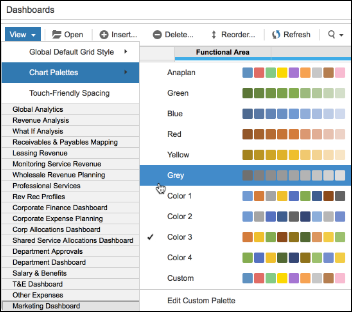
Custom chart palettes are configured for each individual model. A range of palettes, one of which is customizable, is available in the Model Settings > Dashboards > View > Chart Palettes menu option.
The chart palette can be changed at any time: color changes will be applied when the dashboards in that model are next loaded.
Chart palette changes will apply to all chart types except:
- Waterfall chart colors will not change because they are configured to show green as an increment and red as a decrement.
- Map charts will not be affected by a change of color palette.
- Funnel charts will adopt any new palette, but the new colors will be overwritten by any conditional formatting applied to the source data.
In deployed mode, palette selection is locked down and treated as structural information to be synced to target models as part of Application Lifecycle Management.
Series colors
Each palette contains nine colors. Where there are more than nine series in a chart, colors will be repeated. The first series in the chart will adopt the first color in the palette; the second series, the second color; and so on.
If a new series is added to a chart it will adopt the next color in the sequence in the palette. If there are more than nine series in the chart, series 10 will re-use color one; series 11, color two; and so on.
When a series is removed, colors for all series will be recalculated: they will not retain the colors they were originally assigned.
Customize chart palette
The Anaplan palette is the default for a model, and a copy of this is modified to create the Custom palette.
The Chart Palette option, in the Model Settings > Dashboards > View menu, provides access to a range of palettes. The Custom palette can be tailored to any range of colors represented by 6-digit Hex color codes. If the code entered is not valid, including three-digit Hex codes, the existing value will persist.
Select the Reset button to revert to the original palette.
Edit custom palette
- Select Model Settings > Dashboards > View > Chart Palettes > Edit Custom Palette. The first color in the palette is highlighted with a downward pointer to the Hex code for that color.
- To replace the highlighted color, either:
- Move your cursor over the palette. As you move the cursor, the color block being passed over will expand. Click a color to select it, and its Hex code will be inserted into the box.
- Enter a valid 6-digit Hex color code directly into the box.
- Select the next color in the palette and repeat step 2.
- Continue repeating step 2 for any remaining colors.
- When you are happy with the changes you’ve made, click Apply & Save.
- Select Reset to discard your changes and return to the default palette.

