To provide the best experience of viewing classic dashboards on a mobile device, they should be built specifically for that purpose.
Note: This applies to Classic dashboards only. The Anaplan User experience is available on the Anaplan mobile app.
Classic dashboards that display well on desktop computers don’t always scale well to mobile devices. To provide users with the best experience when viewing classic dashboards on mobile devices, build classic dashboards designed specifically for that purpose. It's a completely different way of building dashboards, so this page aims to help you develop skills in designing and building dashboards for display on mobile devices.
Classic dashboards are not supported for new customers. Build Apps or Pages in the User Experience instead.
Standard dashboards on mobile devices
Let's start with how standard dashboards display on different devices, and the issues around different device types and browsers.
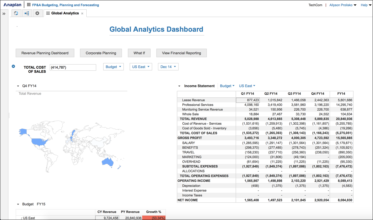
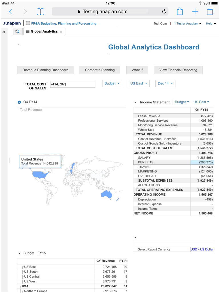
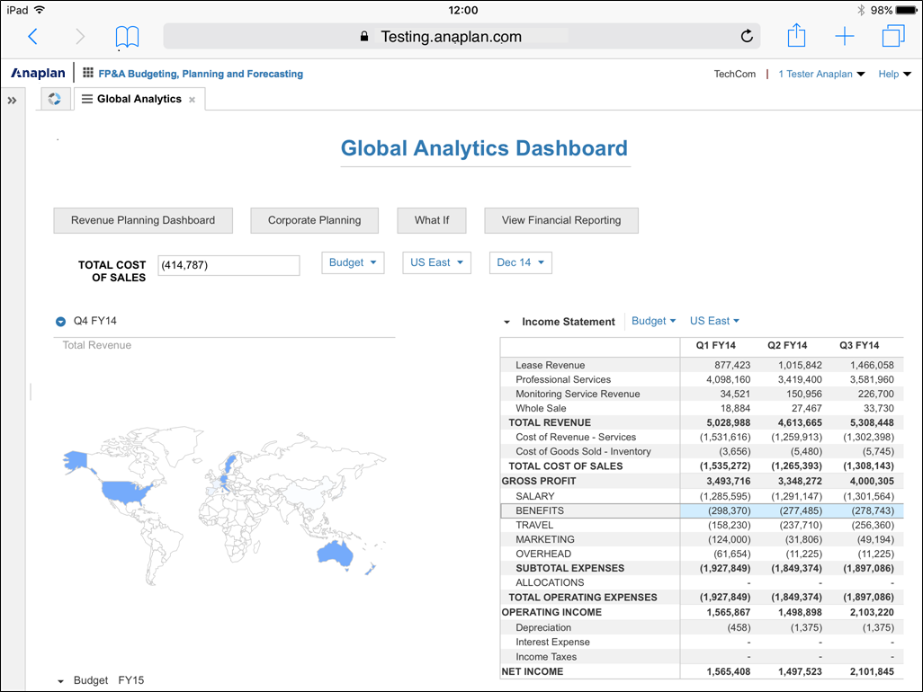
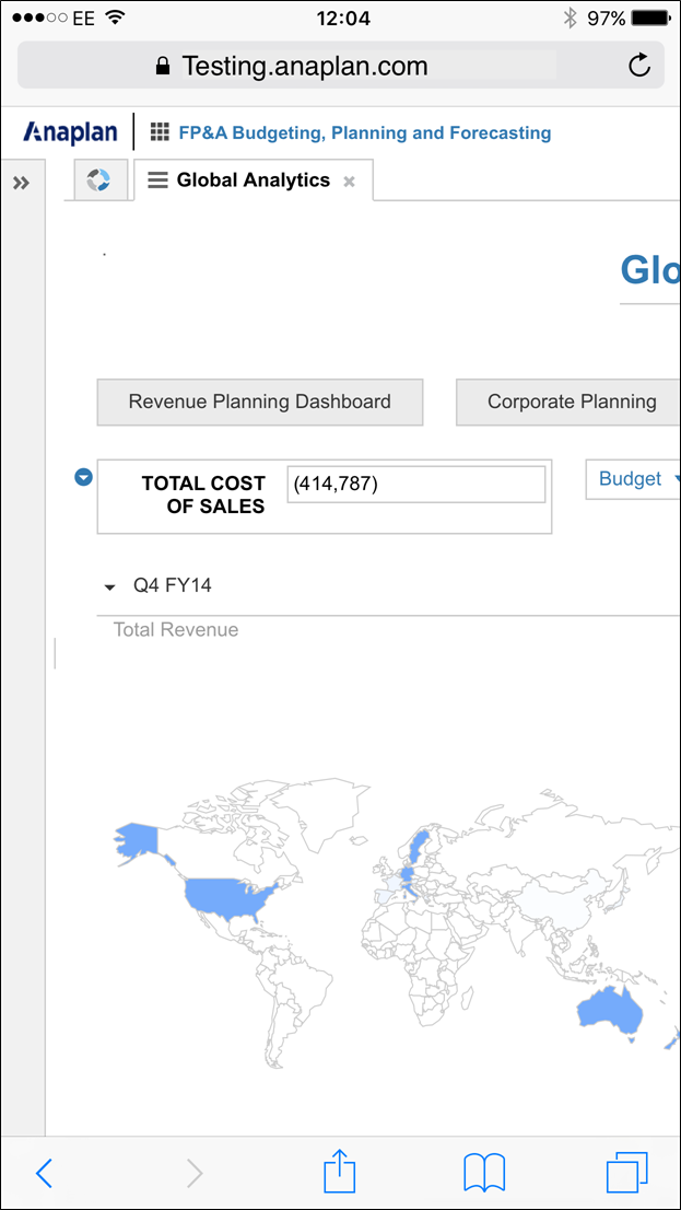
We’ve taken a standard dashboard and displayed it on different kinds of devices to show you what a user would experience. The dashboard is not amended in any way. We haven’t even applied the Touch-Friendly Spacing setting.
The display is different on each device, and can vary further on different brands or models of the same device type. For example, a dashboard may not display in the same way on an iPhone and an Android phone, or in different browsers like Safari and Chrome.
This is a good exercise to go through with your own dashboards, before embarking on any redesign work. It establishes what changes you need to make to arrive at the best design.
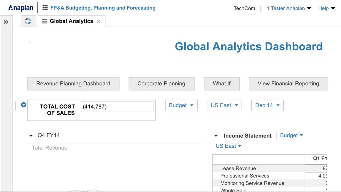
This dashboard is expanded to occupy the entire screen on a desktop computer:
This is the default view of the same dashboard in portrait mode on a tablet:
This is the default view of the same dashboard in landscape mode on a tablet:
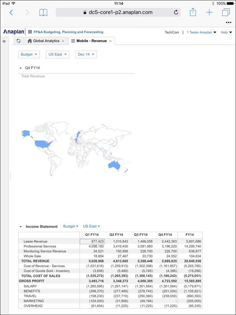
This is the dashboard on a mobile phone, in portrait mode:
This is the dashboard on a mobile phone, in landscape mode:
Functionality on mobile devices
The browser experience for Anaplan may not be identical across different devices. If you are an Anaplan user, try the Anaplan app on the Apple App Store or Google Play.
If you are using Anaplan on a mobile device, but not a dedicated app, some of the functionality that may prove problematic on mobile devices includes:
- Publishing to a new dashboard.
- Publishing a line item to a dashboard.
- Opening subsidiary views.
- Editing cells.
- Re-docking floating tabs.
For these reasons, we recommend avoiding complex dashboards, for purposes such as planning, for users on mobile devices, particularly phones.
Strategic or executive dashboards that provide overviews, or snapshots, of data are more appropriate dashboards for displaying on smaller mobile devices.
We advise against data entry on mobile devices, unless you have fully tested the device and dashboard combination and are confident that your design works.
Test your dashboards
The guidelines for building mobile dashboards were developed and tested using:
- Tablet devices — about 128 x 764 pixels.
- Small tablet devices — about 1024x768 pixels.
- Large mobile phones — about 414 x 736 pixels.
Dashboard emulation
There are many factors to consider when building dashboards for mobile devices. If you’re new to developing these dashboards, or updating your existing knowledge, research on the internet will reveal the most current trends.
Device emulation tools are available with many web browsers. They make the development process much quicker, as you instantly see the results of your changes.
- Safari: https://support.apple.com/en-gb/guide/safari/sfri40726/16.1/mac/13.0
- Microsoft Edge: https://learn.microsoft.com/en-us/microsoft-edge/devtools-guide-chromium/device-mode/
- Chrome: https://developer.chrome.com/docs/devtools/device-mode/
- Firefox: https://developer.mozilla.org/en-US/docs/Tools/Responsive_Design_Mode
Once your design is stable, make sure you test it on a physical device. Although emulation tools can show you what a dashboard will look like, test it on a mobile device to fully understand the user experience.
Performance
Watch for performance issues. The more complex the dashboard, the more time it'll require to load and refresh.
If your audiences use a range of browsers and devices, test your dashboards in each of them. You may find slight differences in performance between them.
Touch-friendly spacing
When you are designing your dashboards for mobile, consider the Touch-Friendly Spacing setting and how it impacts the model's dashboards. You can turn it on or off in Model Settings > Dashboards > Default.
Ask your users:
- What kinds of devices do they use.
- Whether they use a touch screen.
- Whether they use a stylus.
The answers to these questions will help you decide whether to turn Touch-Friendly Spacing on.
Disabling Touch-Friendly Spacing decreases the amount of white space between dashboard elements by 24 pixels. Your users can then see more of the elements on the dashboard. However, it does leave less space for users to navigate around the screen. Test the user experience both with and without Touch-Friendly Spacing.
| Without Touch-Friendly Spacing on a mobile phone. | With Touch-Friendly Spacing on a mobile phone. |
 |  |
| Without Touch-Friendly Spacing on a tablet. | With Touch-Friendly Spacing on a tablet. |
 |  |
Data and users of mobile dashboards
We've highlighted all the things to consider when developing mobile dashboards (for example, performance, testing, emulation). Now we can look more closely at how to design dashboards for mobile devices.
Keep the design as minimal and simple as possible, and avoid clutter. This enables users to see the dashboard elements clearly.
Designing mobile dashboards requires you to think in terms of a display mechanism rather than a traditional dashboard layout. Allow the device to display the elements accordingly. Your mobile dashboard may look untidy in Dashboard Designer, but when displayed on a mobile device it'll look quite different.
Think about the types of users who want to view dashboards on mobile devices, and identify the kinds of information they want to see. Accept that the format does provide some limitations, especially in the level of detail it’s physically possible to see. Design your mobile dashboards with this in mind.
Designing a user experience always requires you to consider the process flow for user activity. Additionally, designing for mobile requires you to consider the size of the screen you are working with, and the shape of the elements you want to display.
Before you begin:
- Decide which device you are going to design the dashboard for.
- Establish the screen resolution for that device, in pixels.
You can use this information to give a finer degree of control when sizing dashboard elements.
Format dashboard elements
There are a few simple things you can do to make your dashboards easier to read on smaller screens.
- You may have more success displaying complex information in landscape format on a small device screen rather than portrait.
- Some charts may need to be extended vertically to adjust the scale on the axis to display meaningful values.
- Test using percentage height and width values first. They’re more flexible over a range of different device types.
- Pixel size is static, but in some circumstances, it's the only format in which a dashboard element displays consistently. Remember, that you establish the pixel size of the screen before you start designing. This is where that knowledge comes in useful. You can use it when calculating the size of dashboard elements.
- If the image exceeds the screen size, elements sized using percentage values will have scroll bars. Elements that are sized using pixel values will not.
- It is not possible to resize published line items. Test these elements carefully. You may find that when you try to make a selection (for example, currency type) the dropdown arrow is beyond the edge of the screen.
Place dashboard elements
- Place elements to the left of the dashboard, so that users don’t have to scroll right to see additional elements.
- Be sure to leave space at the right of the screen for the user to touch the screen to scroll. It can be very frustrating if you’re constantly opening items you don’t want to.
- Develop simple dashboards with drilldown capability. This makes sure that your users can see the details you want them to see.
- If you have synchronization applied to dashboard elements, consider using a list rather than page selectors for making choices. They're a little easier to tap and faster to respond to, but the list needs to be fairly short or it'll fill the screen.
- Think about using small heading sizes in text boxes to reduce the amount of space they occupy on the screen. Heading 3 (H3) applies a rule under the text. This helps H3 to stand out while occupying the least amount of space on the screen.
- If you use buttons, order them in twos side-by-side. If there are more than two buttons, arrange them in a grid pattern, two-wide, to the left of the dashboard.
- Wrap column headers to prevent grids affecting the display of other elements.
Automatic resizing of dashboard elements
As a default, elements will always use whichever value will display the largest image on screen. For example, you might find, as you’re entering pixel values, that the element doesn’t seem to be resizing. That’s likely because the number of pixels you’re entering represents a value that is smaller than that displayed for percentage size. If you make the percentage a very small number, for example 2, the element will resize to the pixel value you enter.
Consequently, when you’re resizing elements, make sure that the measurement you are using (pixels or percentage) is much greater than the measurement you’re not using.
For grids, the value -1, in the minimum pixel field for Height and Width makes sure the grid resizes automatically. For charts, the -1 value should be in the Maximum fields for Height and Width. Never amend these values to zero. Doing this may cause dashboard elements to float over each other and you won’t be able to reorganize the dashboard.
Grids
Grids are the easiest elements to display on a device screen, as they automatically expand to show all rows or columns wherever there's enough room to do so. Where it’s not possible, scroll bars display to help navigation around the grid. You may need to prepare large grids for display on mobile screens. Use filtering and the hide and show functions to display only those values the audience is interested in.
Note: You are unable to pivot dimensions on Safari running on an iPad. However, you can pivot dimensions when using Safari on an iPhone.
Charts
There are a number of issues to consider when styling charts for mobile devices. Different chart types behave in different ways on smaller screens. These guidelines point out some of the issues you need to consider:
- Publish the element to the dashboard twice. Configure one with percentage values, and one with pixel values to see which one displays best. Delete the less successful element.
- It may be that making the element narrower will alter the increments displayed for the y-axis, and make the chart easier to read. Resizing an element often affects the scale on its axes. A line chart that is 100% high, may display the scale in increments of 25k. However if the height is reduced to 50%, the increments will display in 100k increments. This could make it very difficult to compare values.
- If you make the height of an element 100%, it doesn’t mean the width must be 100% as well. Play around with the proportions to create a chart that displays the way you want it to. You may find that a height of 150% and a width of 60% makes sure that all labels can be read, and that the scale is at the required level of detail. However, you must make sure that changing the proportions doesn’t distort the element to the extent that the data could be interpreted as misleading. It may be that a different chart type would be more successful for displaying this data set.
- Some chart types, for example pie and map, display better in a square format rather than oblong. If you make a pie chart 100% wide, you may see an excess of white space on either side of it. You'll need to experiment with size to make sure that labels aren’t truncated.
- Pie charts can look excessively large on mobile screens, particularly if one segment of the pie is considerably larger than the others. Making the pie chart smaller, while making sure that the labels are legible, will improve the appearance.
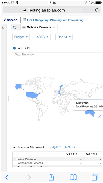
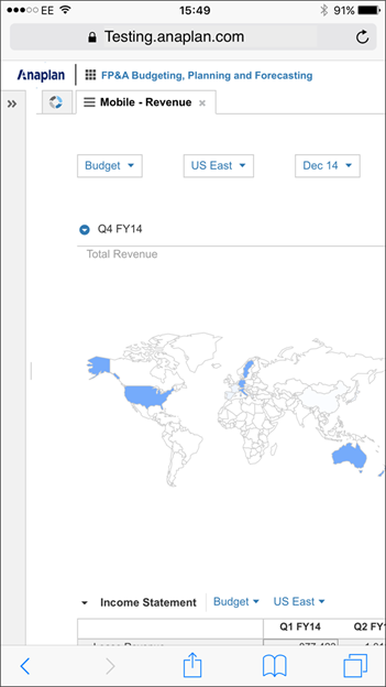
- Despite the level of detail included, map charts can still be informative when displayed on a smaller screen. Users may need to expand parts of the map to be able to select an area and display pop-up information.
Devices
The following mobile devices and app combinations are supported for use with the Anaplan functionality listed above:
- iPad Air and later running iOS 10 and later.
- iPad Mini running iOS 10 and later.
- Tablets running Android versions 4.4 and later.
- Tablets running Microsoft Windows 10.
Examples
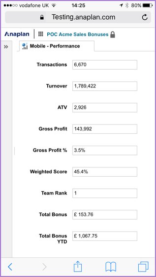
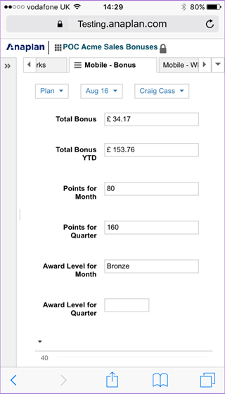
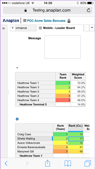
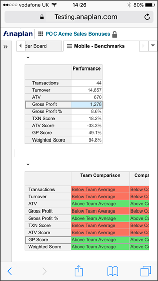
These dashboards show how simple task-oriented design produces easily understood dashboards on very small screens.
| This dashboard displays sales bonus performance figures. | This dashboard displays sales bonus performance figures. |
 |  |
| This dashboard displays performance ranking, including a message field to deliver information to users. | This dashboard displays benchmark information, and makes use of conditional formatting. |
 |  |
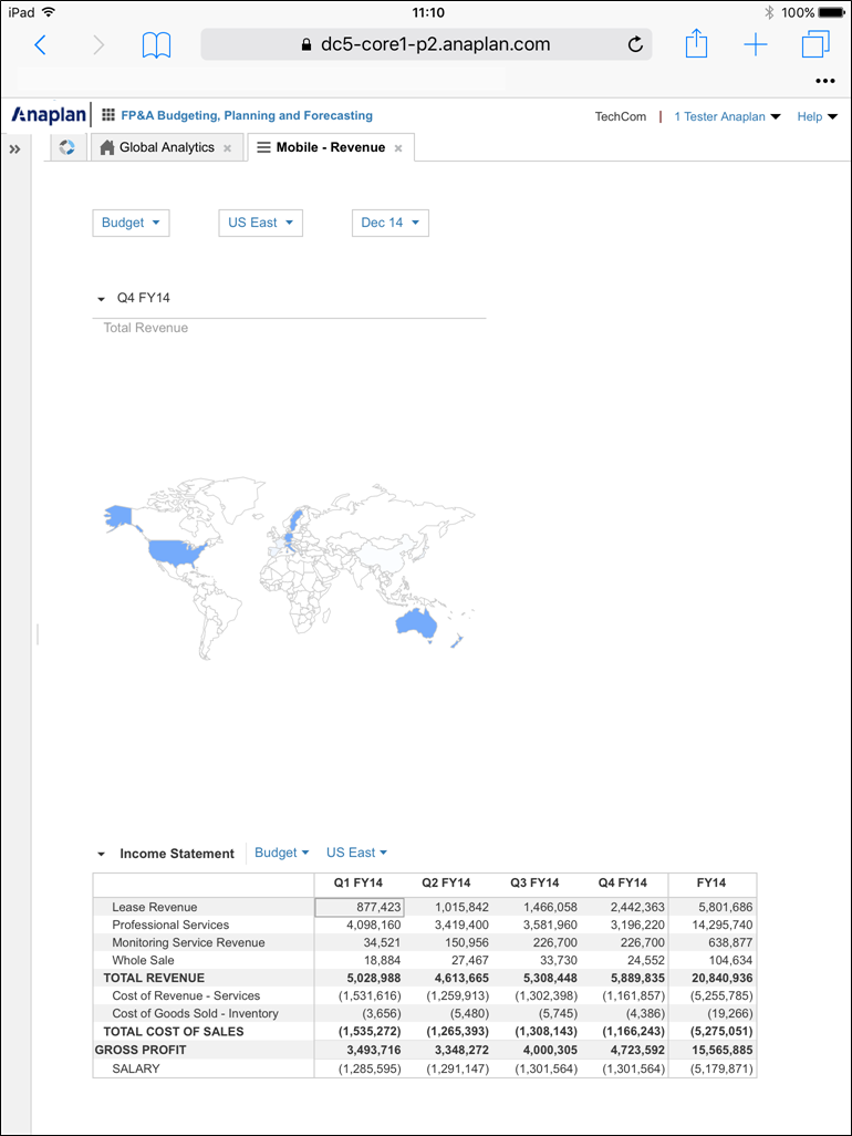
| This dashboard shows how informative maps can be, even on a small screen, and how supporting data can be displayed. | |
|

