
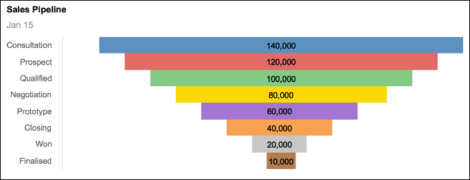
Funnel Charts, or pipeline charts, are often used as a sales pipeline visualization to depict the proportions of a sales pipeline by stage. For example, first contact, requirements identification, negotiating, won.
Typically, a funnel chart shows the size of some quantitative measure of the sales pipeline. For example, potential sales revenue, number of prospects, gross margin per stage.
Data format and values
Only items formatted as Number can be used to generate Funnel Charts. Zero values are plotted as zero and the label will display zero (0).
Funnel Charts don't support negative numbers. They're plotted on the chart as zero, so no bars are displayed for negative values. However, despite there being no colored bar, the label for a negative value is displayed on the chart.
The chart takes categories from lists and values from line items. Aggregate values or subtotals can be excluded from the chart, using the Hide option or level-based selections, before selecting the data to chart.
Note: Funnel charts do not support pagination.
Sales pipelines generally don't have a large number of categories and, when exported to .PDF format, are clearly legible. Be aware that if you use a Funnel Chart for other types of data, and you want to export the chart to .PDF format, the larger the number of categories in your chart, the smaller it becomes on the page and the harder it is to read.
Appearance
A mirrored, centered, horizontal bar chart displays the quantitative information. The order of the bars is determined by the order of the chart selection.
The width of the bar represents the data values in the chart selection. There are no margins between the bars.
Different colors to a maximum of nine, that repeat if there is a large number of categories, represent the phases of the pipeline. The colors of any conditional formatting, applied to the grid, will override the standard color palette for the bars on the chart.
The bar label is taken from the first selected column. There is no legend for funnel charts, as the data labels can be displayed either on the Y-axis (the default) or in the center of the bars. Clear the Show Y-Axis check box in Chart Options.
Tooltips
Only the first column selected is charted. If you select more than one column, the data from the subsequent columns can be displayed as tooltips when hovering over the bars of the chart. This can be enabled in the Tooltips box in Chart Options.
Create a Funnel Chart
- Highlight a range of cells in a grid.
- Select the Chart button on the Anaplan Toolbar and select Funnel Chart.
- Choose appropriate values in Chart Options. Select your preferences for Show Y-Axis, Bar Value, and any Tooltips you want to display.
- Show Y-Axis: Select whether the bar labels are printed within the colored bar or on the left-hand axis.
- Bar Value: Select whether the values of the line items are displayed on the bars of the chart.
- Tooltips: Select which line item values will be displayed as tooltips when hovering over chart bars.
- Select Publish to Dashboard and select a target dashboard.

