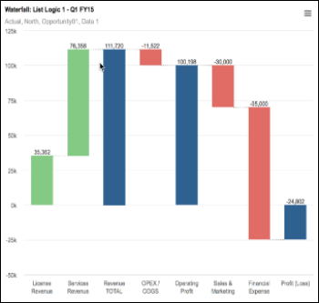
Waterfall charts help to convey how an initial value is affected by a series of intermediate positive or negative values. They are particularly useful for understanding the gradual transition in value of an item that is subject to increment or decrement.
Whole columns represent the initial and the final values, while the intermediate values are expressed as floating columns. The columns are color-coded to distinguish between positive and negative values. Positive values are green, negative values are red, and totals are blue. These colors can be customized in Chart Options.
Waterfall charts are very flexible and can be useful for viewing product earnings, company profit, cost sheets, the number of contracts in hand, the structure of a sales pipeline, cash flow statements, or monitoring how divisional profit and loss is formed.
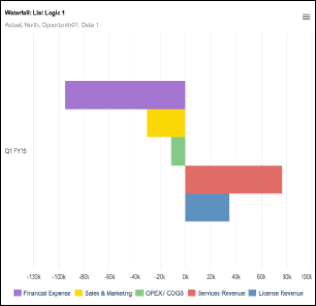
If we compare the same data, presented as a bar chart and then as a waterfall chart, you can see how the waterfall chart gives a clearer view of how values changed over the period:
Waterfall charts can be created from simple lists or from line items. Chart Options are presented for you to choose whether to:
- Select auto axis to switch the axes around, or rotate axes to adjust the view of the data.
- Show or Hide data labels.
- Select colors for Increment, Decrement and Total values.
- Hide zero values.

