Bar charts use horizontal bars to show comparison between categories or things. One axis displays the categories being compared, the other shows data values.
Bar charts are effective for showing the situation at a point in time. If something can be counted, it can be represented in a column chart, for example the number of products sold or hits on a website.
Standard bar charts can be easy to read as they follow the standard reading flow. They are also effective for illustrating ranking. Used to compare change between groups over time, bar charts are easiest to read when data value differences are relatively large. If you have many categories to compare, a line graph might be easier to read.
Bar charts can be created in standard, stacked, or percentage formats. Each format displays the same data in a different way, so it's easier to make comparisons or see data patterns emerging. The method for creating standard, stacked and percentage charts is the same, regardless of the output.
Which Chart? discusses the different chart types and which type is best for particular purposes.
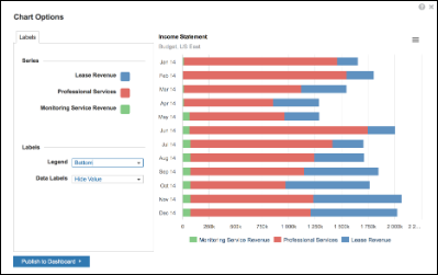
Stacked bar charts
Stacked bar charts use horizontal and vertical bars, divided into sub-parts. They show the cumulative values of a data item and compare the parts to the whole. Items stacked side-by-side are differentiated by colored bars or strips.
They show the component parts of each element being examined, integrating different data sets to create a richer picture of the sum of changes. They can show change over time and are particularly useful when comparing relative and absolute differences, where the sum of the values is as important as the totals.
A stacked chart is useful for looking at changes in. For example, expenditure over time, across several products or services.
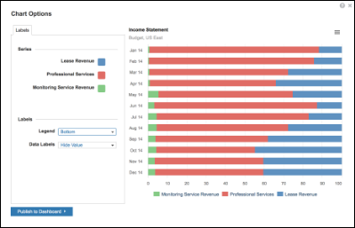
Percentage bar charts
Percentage bar charts are the same as stacked charts, but show values as a percentage — so all bars are the same length. You can use them in the same way as stacked charts, and they are particularly useful when comparing relative differences.
Create a Standard Bar Chart
- Highlight a range of cells in a grid:
- Choose appropriate values in Chart Options.
- Select Publish to Dashboard and select a target dashboard.
Create a Stacked or Percentage Bar Chart
Stacked and Percentage bar charts are created in exactly the same way as a standard bar chart. Select Bar - Stacked or Bar - Percentage from the options displayed when you select the Chart button on the Anaplan Toolbar.

