A Combination or dual Y-axis has multiple series and dual axes. These consist of a line chart overlaid on a column chart, although other chart combinations are possible.
Combination charts provide a flexible way of displaying data and form the basis of analytic tools such as the Pareto Analysis.
You can choose from area, column, line, or dot charts and mix and match them as you require. When choosing chart types, keep in mind the order in which charts are overlaid on each other. Area charts are always to the back of the chart, then column charts, line charts and dot charts are at the front of the display. For the examples here, a combination of column and line chart is used.
Combination charts are useful where you want to validate the relationship between two variables that have different magnitudes and scales of measurement but are related in a meaningful way. For example, where two charts share a common category axis (region) and may have more than one quantitative axis (Y-axis), each representing a different scale of values (revenue and profit).
Combination charts are most useful for following trends and identifying outliers in the data that may require further investigation.
In this example, the trend for Revenue follows the trend for profit, across regions.
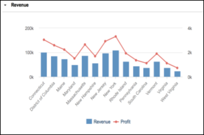
This chart shows that Maine and New Hampshire are not following the trend. This could be a trigger for further investigation.
Generate a Combination chart
Combination charts are generated in the same way as other chart types and follow the same conventions:
- Only Administrators can generate them.
- Chart Options are used to configure detail.
- Tooltips are displayed.
- The Publish to Dashboard option is available.
- Charts can be printed or saved in different formats.
As with other chart types, you can select as many items as you want. However, a maximum of 200 items after any filtering will display on the chart and be available for configuration in Chart Options.
When you change a chart type in Chart Options, the new chart will retain the default behavior of the original chart type.
Zero values in Combination charts
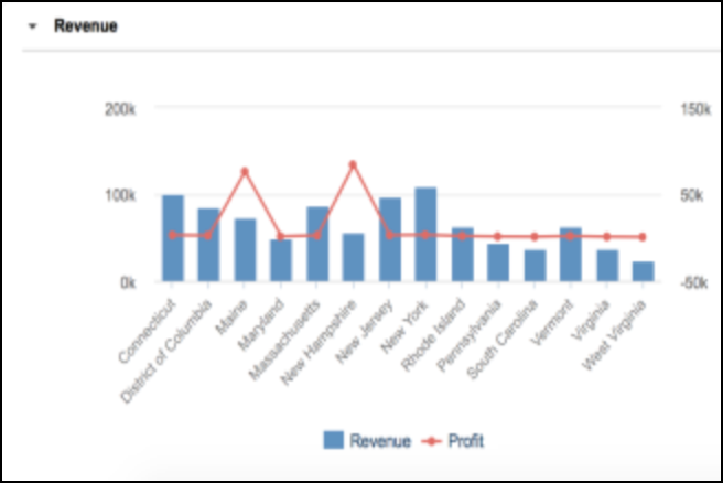
Zero values at the end of a data set are not displayed on Line charts. The default behavior on a combination chart is for the first series, a column chart, to display zero values. If you convert that series from a column to a line chart, the line chart will display zero values at the end of the data series. This is because the Line chart will adopt the default behavior of the Column chart.
However the last series selected, displayed by default as a line chart, will not show any zero values at the end of the data series. This default behavior persists, even if you change the chart type to a column chart. Trailing zero values will not be displayed because the default behavior of the original chart, the Line chart, is to not display trailing zeros.
Handling zeros or no data explains further how Anaplan deals with null and zero values when generating charts.
Selecting data
Combination charts can only be generated from a module grid for data with the format Number, and not from a dashboard or nested grid. If you try to generate a chart from data with a format other than Number, a message informs you that your data selection is invalid. If you select a range of line items that include items of both Number format and another format, only the Number format items will be displayed on the chart.
Charts can only be generated from line items and line item subsets. Line items take priority over line item subsets. They will always be represented as series on a combination chart.
The order in which you select the series will dictate the order in which the series display in the chart. If you are making a discontinuous selection, using the Ctrl or Cmd key, the last series selected will display as the line graph, or whichever chart type you have chosen for the right axis.
Aggregate values or sub-totals can be excluded from the chart, using the Hide option or level-based selections, before generating the chart.
Chart structure
When you generate a Combination Chart, the structure of the axes will follow these conventions:
- The first series selected displays as a quantitative axis on the left. The last series selected displays as the quantitative axis on the right.
- Items on the primary (left) axis will define the scale for that axis.
- Items on the secondary (right) axis will define the scale for that axis.
- It is possible to have columns and line items share a single axis.
- Only one level of a time hierarchy is displayed, based on the first cell selected. Other levels are excluded. For example, if the first cell selected is a quarterly value, weekly, monthly, and annual values will be excluded. Only quarterly values will be displayed.
The default display follows these conventions:
- A Column chart with an overlaid Line chart.
- The Line chart in the foreground and the Column chart in the background.
- The Chart title at the top left of the chart.
- The Y-axis labels vertically, alongside the axis scale.
Create a Combination Chart
- Highlight a range of cells in a grid.
- Click the Chart button on the Anaplan Toolbar and select Combination Chart.
- In Chart Options, select your preferences for Series, Axes, and Labels.
- Click Publish to Dashboard and select a target dashboard.
Chart Options
The Chart Options dialog is split into three sections Series, Axes, and Labels.
You can hide the sections by clicking on the down arrowhead to the left of the section name. The detail for the section will roll-up into the heading. Select the arrowhead again to display the detail.
Series
To change the chart type for a series, select an option from the dropdown list next to the series name.
To change a series color, select the colored box next to the series name, and select an alternative color from the palette displayed.
To change which series displays on the right axis, select the Right Axis check box for the series. To display a single axis on the left of the chart, deselect the Right Axis check box for all series. The values on the left axis will then run from the lowest value across all series to the highest value. To display a single axis on the right of the chart, select the Right Axis check box for each series.
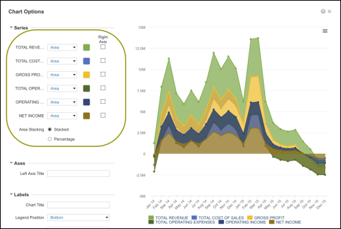
Where there are multiple series types, choose whether the bars in a Column or Area chart are:
- Clustered: a separate column for each series type, which does not apply to area charts.
- Stacked: a single column or area shows the value of each series type, differentiated by color.
- Percentage: a single column or area shows the percentage value of series type, differentiated by color.
Axes
Axes titles are blank by default. Enter a Left Axis Title and/or a Right Axis Title, if required.
Labels
By default, the Chart Title is blank. Administrators can enter up to 60 characters, including white space.
There are five options for the Legend Position: Bottom, Top, Left, Right, Hidden.
It’s also possible to choose whether to Hide Value or Show Value for each series.
The Publish To Dashboard button publishes the chart to a new or existing dashboard.
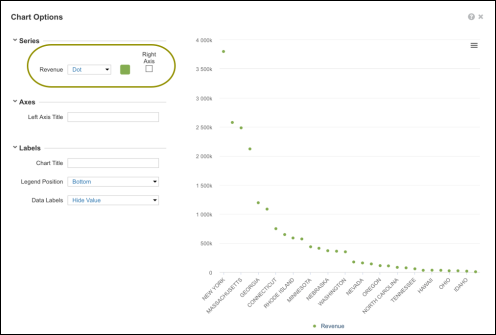
Area charts and Dot charts
Part of the functionality of the Combination chart is the ability to generate a Dot or an Area chart. These are chart types that are not available from the Charts menu. If you select suitable data and generate a Combination chart, you can choose to remove the second X-axis and change the options to Dot or Area charts. This will result in a single axis standard chart.