
The initial column in a Waterfall Chart can be considerably larger than the subsequent values, making labels hard to read and the data difficult to interpret. Auto Axis addresses this issue by determining a smaller range of values for the quantitative axis.
Auto Axis calculates 10% of the product by subtracting the smallest data value from the largest data value. This value is added to the smallest data value, the value is rounded, and the axis is plotted from this point. Usually, the largest columns are cut off, making the smaller columns larger, the proportions clearer, and the labels easier to read.
For example, take a minimum value of 50, and a maximum value of 100. 100-50 = 50. 10% of 50 = 5. The quantitative axis would start at 45 rather than zero.
Auto Axis Calculations
The calculations for Auto Axis are based on screen resolution and are dynamic. The quantitative axis will change as the chart is moved from one environment to another.
The way the chart is displayed alters to accommodate changing display sizes. The values on the quantitative axis may change as the view moves from preview to dashboard, or from dashboard to .PDF output. You may find that, in situations where there are very large values and some very small values, the smaller values don’t display because the screen resolution renders them too small to be visible.
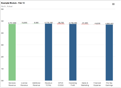
If we look at this chart, on a dashboard, we can see that the quantitative axis begins at 0M and goes through to 6M.
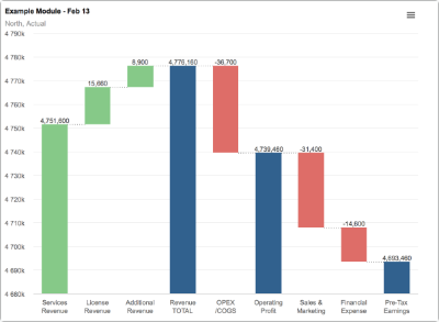
When Auto Axis is enabled, the preview shows the quantitative axis beginning at 4680k and running through to 4790k. The chart looks the same when exported to .PDF.
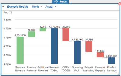
When Update Dashboard is selected and the chart is viewed on the dashboard, the quantitative access runs from 4675k to 4800k. The values are displaying accurately. The screen resolution change causes the quantitative access to change.
Auto Axis parameters
Auto Axis works best with a large initial positive value.
If the initial value is zero, you can select Hide Zero Value in the Chart Options prior to enabling Auto Axis, to ensure that the value range is not skewed by the zero value.
Very large numbers combined with much smaller values, make it difficult for Auto Axis to represent the proportions accurately. In this situation Auto Axis may not respond, and no change will be made at all. This may also be the case where:
- Data values fall within the rounded 10% calculation made by Auto Axis. This can happen when using very large numbers.
- Values cross the axis into negative. The data values must all display in the positive sector of the chart. Negative values can occur within the waterfall chart, but must not cause the chart to display below zero value.
- All the values being charted are negative.
You may not always notice that Auto Axis is enabled, especially if the data falls within these parameters, as the chart display doesn’t change when Auto Axis is selected.
Enabling Auto Axis
In Chart Options, the default is for the quantitative axis to be fixed at zero.
If you select Auto Axis, the preview will immediately update the values on the quantitative axis. If you've just created the chart, you can Publish To a dashboard. If you’re editing an existing chart, from Chart Options select Publish Copy To and choose a target dashboard. Click Update Dashboard to publish to your original dashboard.

