Sometimes it would be easier to read a waterfall chart if the bars of the chart were displayed horizontally. For example, perhaps there are many bars in the chart, or the labels describing the data look squashed at the bottom of the chart.
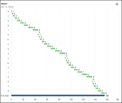
In Chart Options, select Rotate Axes to display the bars of the chart horizontally, with the data values at the end of each bar. As soon as you make the selection, the preview will show what the chart will look like.
Labels
Displaying a large number of characters on the y-axis will push your chart towards the right of the screen.
Labels on a y-axis can wrap or concatenate. This can’t be specified manually. Anaplan calculates whether wrapping or concatenating is the best option, based on the amount of data in the chart. If there are lots of data points, it’s unlikely that a label will be wrapped, as it could be difficult to read alongside all the other labels on the chart. In this situation, the label would probably be concatenated. If there are fewer data points, creating more space on the chart to arrange labels, they are more likely to be wrapped provided there is at least one space in the label. Otherwise, it will be concatenated.
Rotated display
When you’re planning to rotate the axes of a waterfall chart, there are some things to keep in mind about how the chart will display.
Data values on waterfall charts are always displayed in black text that may be difficult to read on dark colored bars such as Totals, which are deep blue. This happens when your waterfall chart contains both negative and positive values. When values become negative, they are displayed on the bar, rather than to the left of it. Similarly, if values are displayed very close to the right border of the chart, those values are moved into the bar. You can always hover over the bar to display a tooltip with the item label and data value.
Similarly, where a bar is very small, the value may be wider than the bar itself. Where the bar and the label overlap, the value may be difficult to read. Again, hovering over the bar will display the label and value.
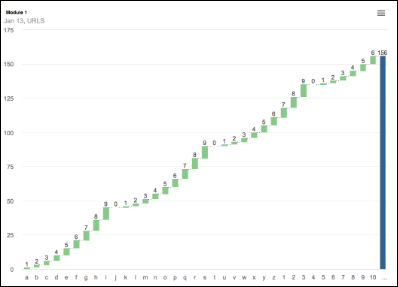
Rotated waterfall charts, in common with Bar charts, display alternate item labels where the number of items exceed 32 including Totals. This only applies to the y-axis and is based on screen resolution and the way text height is treated in a different way to text width.
All the bars are displayed, but alternate labels are not. This simple example illustrates the issue. Again, hovering over the bar displays a tooltip with the item label and the data value. If you are able to increase the screen resolution to display a larger image, all the data labels will display.