
Timeline charts illustrate events, in chronological order. For example the progress of a project, advertising campaign, acquisition process, in whatever unit of time the data was recorded.
To generate a Timeline chart, the data must be formatted as Date. These are the only charts for which the data selected is not formatted as Number. The chart is based on the selection of two date-formatted line items representing a start and an end date.
Create a Timeline Chart
- Select the data to be charted. Ensure the data items are date-formatted line items displayed across columns.
- Select the Chart button on the Anaplan Toolbar and select Timeline Chart.
- Select the appropriate values in the Chart Options.
- Select Publish to Dashboard and select a target dashboard.
Chart Options
Timeline charts have a unique set of Chart Options that enable modification to the way in which the chart is displayed. For example, grid lines, color coding, and the display of information in tooltips. The options also include those to alter to the start and end date of the data displayed.
| Title | Title for Axis |
| Axis Title | A title for the x-axis, which usually explains what the data is. |
| Gridlines | Configure the grid lines displayed at the back of the chart. |
| Timescale | Toggle between displaying a vertical grid line on the chart for each week or each month. |
| Dates | The time range for a Timeline chart is independent of the model time settings. The default dates are six months prior to the date the chart is generated through six months after the date the chart is generated. These dates can be adjusted. |
| Axis Start Date | Choose a date from the dropdown calendar as the start date for the data display. |
| Axis End Date | Choose a date from the dropdown calendar as the end date for the data display. |
| Source Data | Choose a date-formatted line item from which data will be sourced. |
| Item Start Date | The name of the first date-formatted line item in the data selection. |
| Item End Date | The name of the second date-formatted line item in the data selection. |
| Labelling | Configure the labels and information presented with the chart. |
| Bar Labelling | The dropdown lists all the line item names in the selection. Choose the line item whose values will be displayed on each series in the chart. For example, you could choose to display the start date on each bar in the chart. |
| Bar Color | Applies color to data points sharing the same value, for example all items that share a particular start date could be colored blue, those sharing a different start date, green, and so on. If a data value is invalid, the item will be colored black. |
| Tooltips | The dropdown will list all the line item names in the module. Choose the line items for which information will display in the tooltip when a user hovers over a particular data point. You can choose any number, or all, of the line items displayed. |
| Vertical Axis | Configure the default width of the vertical axis to accommodate the length of data labels, 80 pixels by default. |
| Max Variable Width | Select this option and then use the slider to set a maximum value. Once set, the vertical axis will resize automatically to fit the labels on the left axis, up to the width specified. |
| Fixed Width | Select this option and then use the slider to set a fixed width for the labels on the left axis. |
| Slider | Drag the slider right or left, or use the left and right arrow keys on your keyboard, to increase and decrease the number of pixels in which labels can display. The range of values is between 50-630 pixels. |
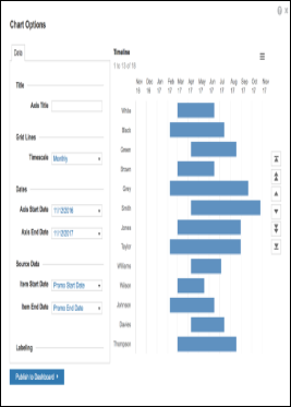
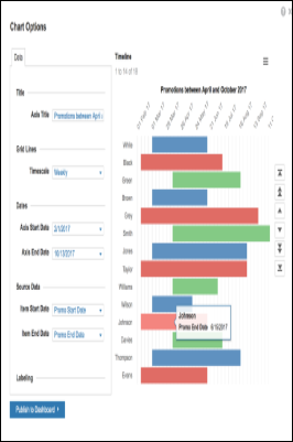
Before and after applying Chart Options
This is an example of a Timeline chart generated from default values. It is based on a default date range of six months prior to the date of generation, through to six months after the date of generation. The chart has no Axis Title, the grid lines are Monthly, and the Axis Start Date and Axis End Date reflect those in the data selected.
This is an example of a customized Timeline chart. The chart has been amended to include an Axis Title. The Timescale has been changed to Weekly, and you can see the grid lines are closer together. The Axis Start and End dates have been amended to zoom in on the data values. The Item Start Date has been color-coded, to show all items that share the same value in the same color. Tooltips displays the Item End Date.
Paging Controls
Paging controls enable navigation through data items:
- Go to start
- Move up one page
- Move up one item
- Move down one item
- Move down one page
- Go to end
A page comprises the items currently in view. The number of items displayed will vary, depending on the data and screen size.
Synchronization
Timeline Charts can automatically update using synchronization. Once a Timeline Chart is published to a dashboard, with Synchronize Selection enabled in the Dashboard Designer properties panel, any changes made to the source grid will be reflected automatically in the timeline chart.
- Open the dashboard in Dashboard Designer.
- For both the grid and the timeline chart, in the Selection Options section of the properties panel, and select Synchronize Selection to ensure that the chart updates dynamically when you choose an alternative combination on the dashboard.
- Select Save & Exit Dashboard Designer.

