Classic maps are in strict maintenance mode. All future updates are for Mapbox maps only.
Build a map card to display geographical data. This is useful to help people visualize differences between markets and highlight key values per market. The administrative subdivisions are:
- World countries
- Australian states and territories
- Canadian provinces and territories
- European countries
- French departments (only mainland France)
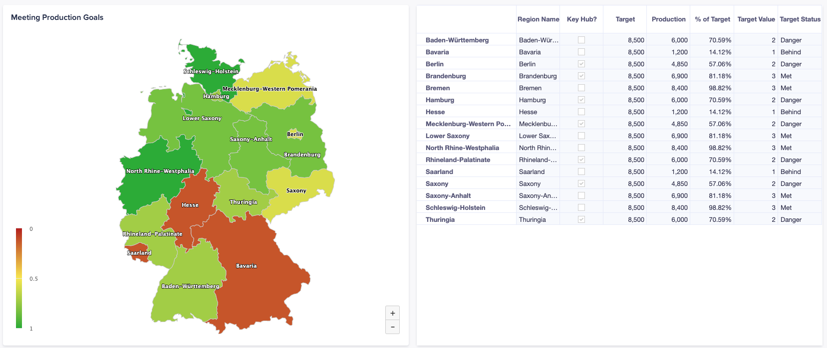
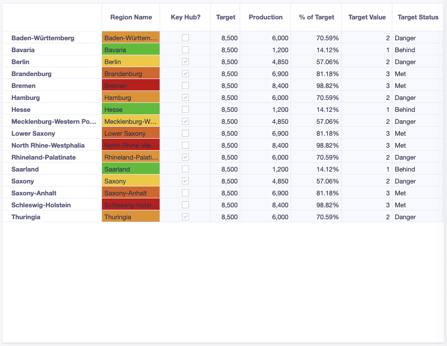
- German länder
- Japanese prefectures
- New Zealand regions
- Russian federal districts
- UK counties and boroughs
- USA states
Note: Map charts require that you carry out a number of steps to use the all the classic map features. See the steps below.
To learn how to add a map chart to a board or worksheet, see Configure a chart card.
Download map card regions and codes
Before you can build a map chart, you must obtain a list of regions/sub-regions to which you'll map your data, providing the basis for generating map charts.
In Anaplan, you can Download Map Chart Regions and Codes for use with map charts, as *.CSV files. This downloads a *.ZIP file that contains multiple *.CSV files to your browser's Downloads location. The *.CSV contains the standard subdivisions and their respective codes for the region you require.
Import map data
Once you've downloaded the map regions and codes, you need to create a list. This list corresponds to the regions that you want to base your map chart on. Then, import the *.CSV file that contains the relevant region codes.
- Once you've downloaded the map regions and codes, create appropriate lists and import the relevant *.CSV file.
- Create a module using your regions list.
- Pivot the grid to place regions on rows and line items on columns.
What can I use map charts for?
A common use of map charts is to comprehensively visualize and compare data across regions, which typically leads to strategic decisions.
Map tab
Map charts have configuration options available in the right-hand configuration panel, under the Map tab. The Map tab includes a Data section, Series section, and Labels section.
Data section
The Data section contains these items:
- Region dropdown where you define which map to display. This region must match the map in the source data
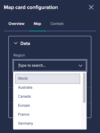
- Show only matched items toggle. Toggle right to remove subdivisions that don't match your source data. This enables you to manage geographies for which data exists, as the map will zoom in to matched regions or countries. You can further enhance maps with a hierarchy filter. The filter enables you to drill up and down regional hierarchies (see the Context tab description, below).
Series section
The Series section allows you to toggle conditional formatting, based on conditional formatting in the source data's first column. To accomplish this, go to View designer, select the custom view for the source data, and follow the process described in Conditional Formatting.
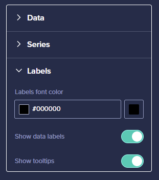
Labels section
The Labels section allows you to pick the color of your label text. Note that, depending on the color picked, your text will always be outlined by a black or white outline to improve readability. You can also toggle these data labels and tooltips for your chart.
Context tab
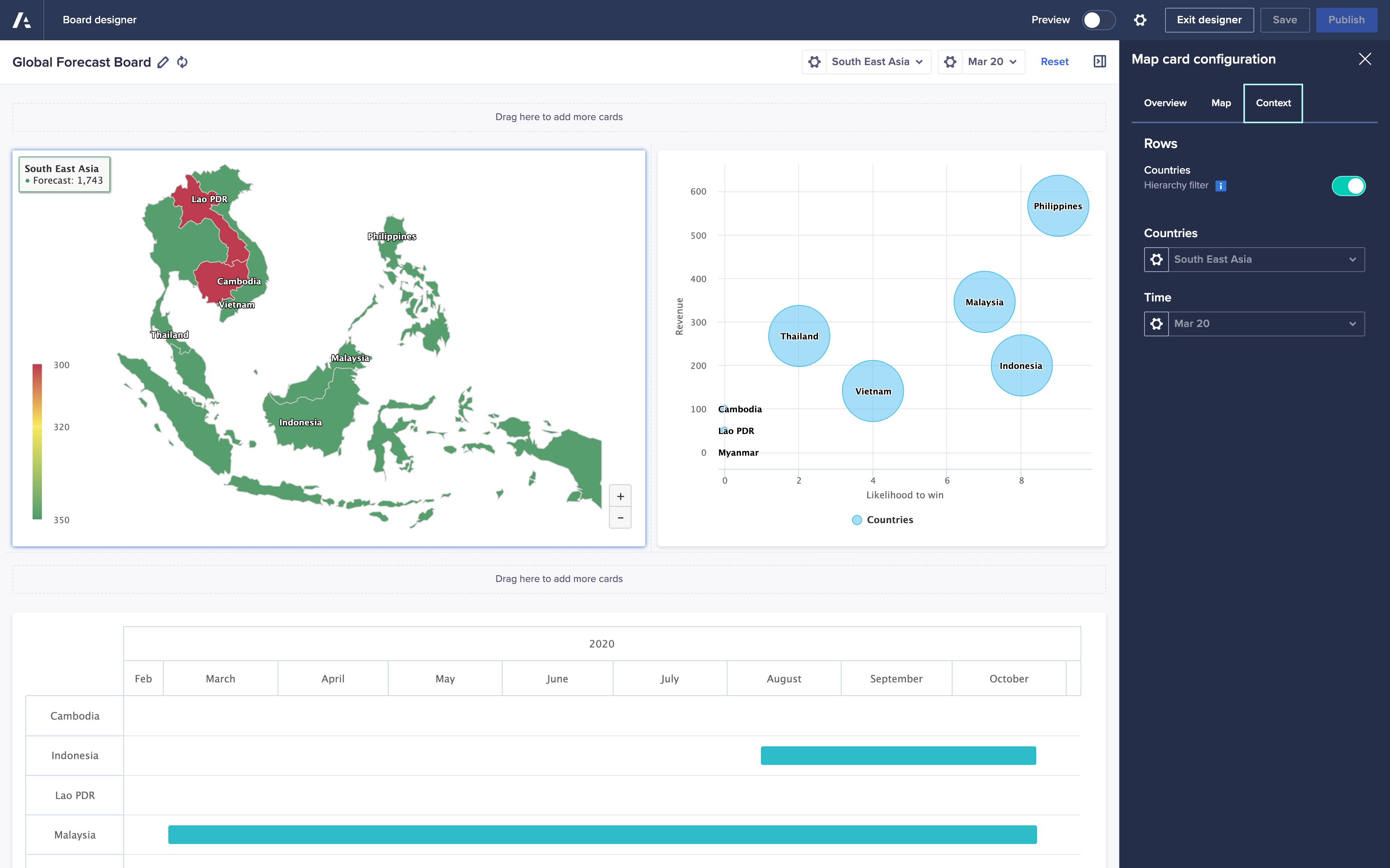
On the Context tab you can also toggle hierarchy filters. The hierarchy filter selector displays on the published chart, beside other the context selectors. You can use the Context tab to drill down and focus on specific regions. If you use the Context tab along with the Show only matched items toggle, it'll display only regions for which data exists. The display zooms to the subregion defined in your hierarchy filter. See Hierarchy filters.
Example: the map chart in the board below illustrates the use of conditional formatting with a hierarchy filter to display the Southeast Asia subregion. The Show only matched items toggle is on. You can see additional board data in the bubble chart to the right, and a Gantt chart below.
Use a map chart to answer:
- How is a certain market progressing
- Highlight key performance indicators for each individual region or subregion in your map
- Easily identify underperforming or overperforming markets
To learn about other types of chart, see Chart types in detail on the Charts page.

