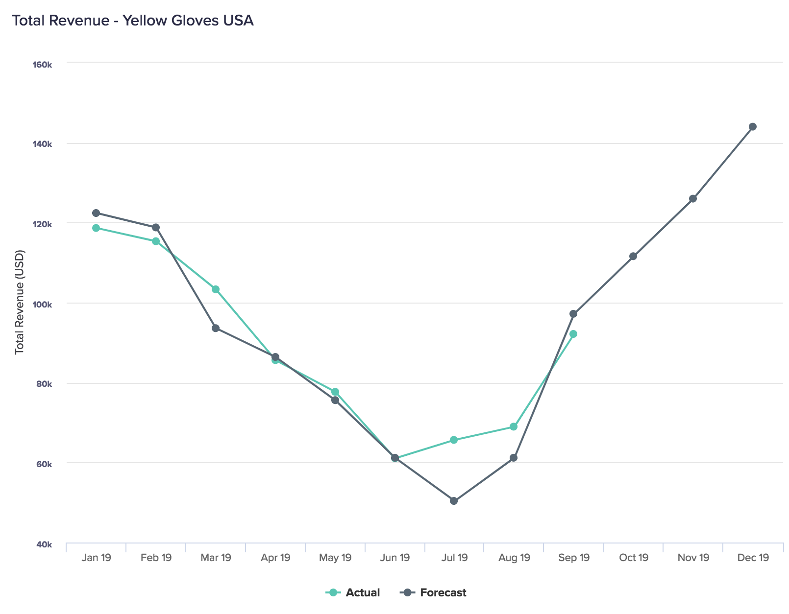
Line charts are a series of data points connected by straight lines, on two axes. Dimensions, such as time, display on the horizontal x-axis, and the dependent data displays on the vertical y-axis. One data set is always dependent on the other data set.
Line charts are especially useful when used as part of a combination chart, as they don't obstruct the view of other data on the chart.
To learn how to add a line chart to a board or worksheet, see Add cards to a board and Add cards to a worksheet.
What can I use line charts for?
Line charts display one or more dependent variables against one independent variable, such as time. This enables you to easily see spikes and troughs in a continuous data set.
Line charts are particularly useful for emphasizing trends, as they clearly show the rate of change over a fixed period of time or other dimension. When included in a combination chart, line charts can show the effect that a trend has on other values.
Use a line chart to answer:
- What are the fluctuations in X?
- How does A differ from Y?
- Is X related to A?
- How is X affecting Y?
- Have sales increased over the last financial year?
Considerations
A line chart may not be the best option when:
- Conveying proportions or quantitative data.
- There are a large number of categories, as they can become hard to read.
- Your X-axis dimension doesn't have data over a long time period, as this could give a false impression of ongoing trends.
Alternative chart types
Use a different type of chart if:
- Your interest is in individual values rather than trends (use a bar, column, or dot chart).
- You have a large number of categories (use a combination chart or dot chart).
To learn about other types of chart, see Chart types in detail on the Charts page.

