A combination chart can be made up of area, bar, column, dot, and line charts. Each data series can be represented by a different type of chart. They are all then displayed simultaneously on the same chart. A second axis can be added to the right of the chart to help compare different data series.
Combination charts provide the greatest flexibility when presenting your data in chart format.
To learn how to add a combination chart to a board or worksheet, see Add cards to a board and Add cards to a worksheet.
What can I use combination charts for?
Combination charts enable you to compare different series of data through different types of charts on the same axes simultaneously. This is useful for visualizing large quantities of data in varied formats.
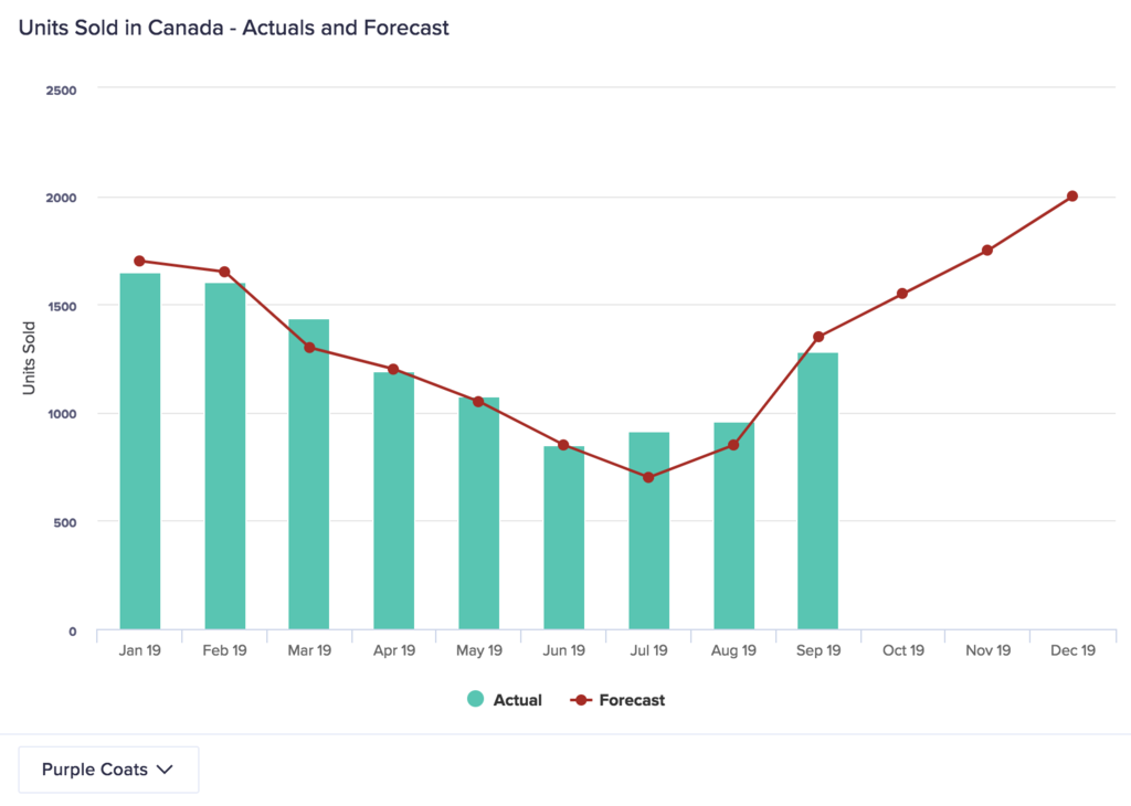
Adding a chart type that displays over another chart type can give you an immediate comparison of two or more data series over a dimension such as time. For example, in the image above, a line chart displays over a column chart, showing both forecast and actual data on the same chart. Dot and line charts are often displayed over other types of chart as part of a combination chart because they occupy the least visual space, meaning they don't obstruct the view of other data.
You can plot specified data series against an axis with a different scale on the right side of the chart. This enables you to compare data series with large differences in value more easily. If you use a right axis with a different scale, it's good practice to differentiate the corresponding data series by using a different color or chart type for them.
Use a combination chart to answer:
- How do our actual results compare to our forecast results?
- Have we, and will we, hit our targets for this financial year?
- How does A differ from B?
- Have sales increased over the last financial year?
- What are the fluctuations in X?
Considerations
A combination chart may not be the best option when:
- You don't know what insights you want to highlight — the wide variety of choices when creating combination charts can be overwhelming.
- You have a basic dataset and want to convey simple insights.
Alternative chart types
Use a different type of chart if:
- Performing a simple comparison for one data series over time (use a column chart or line chart).
- You have a small amount of data to analyze (use a column chart or pie chart).
To learn about other types of chart, see Chart types in detail on the Charts page.

