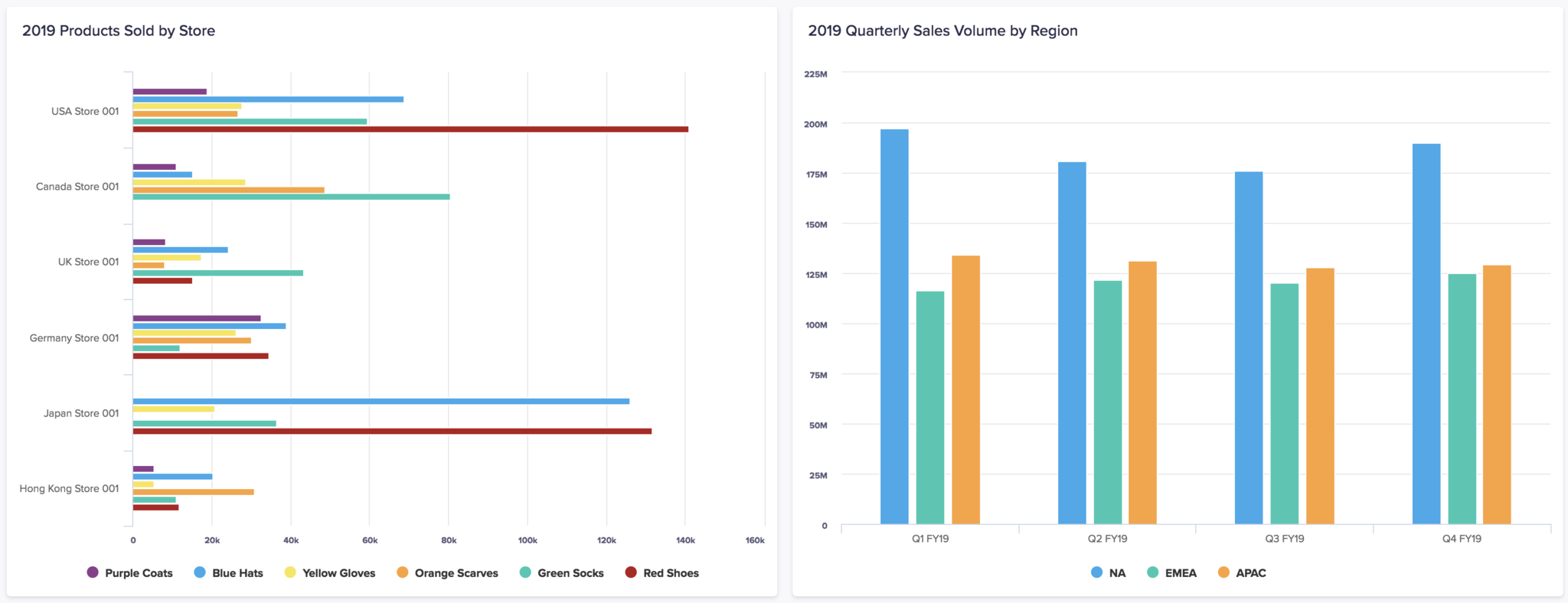
Bar and column charts display data in rectangular bars — the longer the bar, the larger the value. A bar chart plots the variable value horizontally, and the fixed dimension, such as time, vertically. A column chart plots the variable value vertically, and the fixed dimension horizontally.
To learn how to add a bar or column chart to a board or worksheet, see 'Add cards to a board' and 'Add cards to a worksheet'.
In the image below, a bar chart is shown on the left. A column chart is shown on the right.
What can I use bar and column charts for?
Use bar and column charts to summarize and compare values in a data category, and provide a snapshot of your data at specified points in time (or other dimensions).
Although bar and column charts are similar in their appearance and functions, their respective orientations mean they're better suited to different types of analysis:
- Bar charts use a horizontal display, which provides more room for long, complex, or numerous labels on the Y-axis. The labels also go from left to right, making labels on bar charts easy to read. In bar charts, categories are usually displayed along the Y-axis, so they're commonly used for analyses where time isn't a factor.
- In column charts, time is usually displayed along the X-axis, with the unit of measurement on the Y-axis. As this left to right direction is associated with a chronological sequence, column charts are ideal for highlighting changes over time.
You can also use bar and column charts to rank items in a data series. To do this, you must sort your data (by saving a view in your module, or designing a custom view) before creating a chart, so that the ranking is reflected in it.
Negative values are represented clearly in bar and column charts, as any negative values are plotted in the opposite direction to positive values. However, relatively large negative or positive values reduce the amount of space available on a chart, which can make it hard to differentiate between similar values.
Use a bar or column chart to answer:
- How does A differ from B?
- Which salesperson sold the most product?
- What was the average growth over the last X years?
- What is the composition of our website traffic?
Considerations
A bar or column chart may not be the best option when:
- Your data categories have long labels.
- The height or width of a chart card has been altered. This can change the scale of your unit of measurement, which can be misleading as this diminishes or emphasizes differences in value in your bar or column chart.
Alternative chart types
Use a different type of chart if:
- You are trying to identify trends in your data rather than individual values (use a line chart).
- You have a dataset with multiple data categories and versions (use a combination chart).
- You are comparing data for a large number of categories against the same common dimension (use a dot chart).
- You need to compare a number of exact numerical values across several categories (use a dot chart, or a grid).
Other types of bar and column charts
Stacked bar and column charts
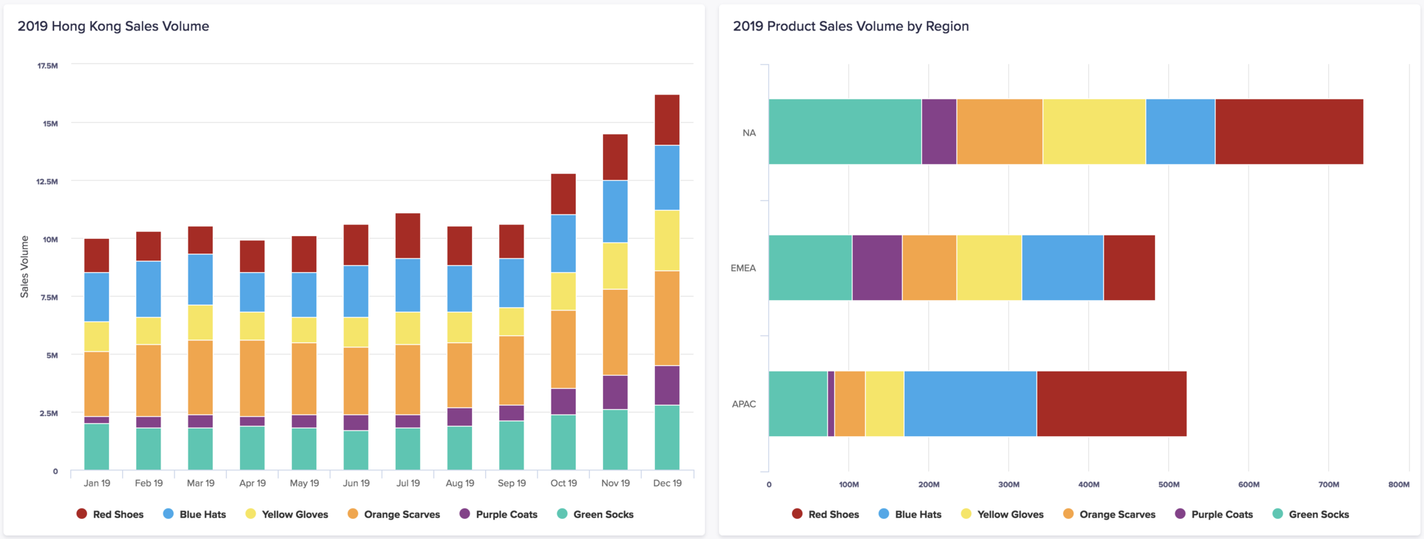
In a stacked bar or column chart, the values for different data categories are displayed in contiguous bars instead of the separated bars used in the default clustered charts.
Stacked bar and column charts are ideal when you want to simultaneously monitor both the overall value of a data category and the individual sub-categories within it.
Percentage bar and column charts
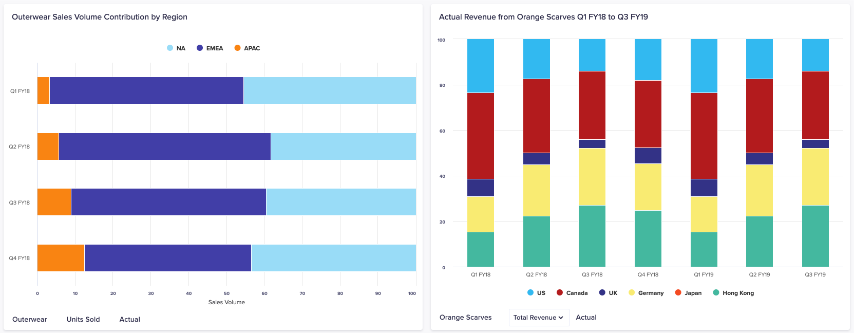
In a percentage bar or column chart, the entire axis of measurement is filled, showing the proportions of your data. This means that individual values for data categories aren't displayed.
Percentage bar and column charts are ideal when you want to see the relative contribution of a specific data category among others. However, the axis of measurement doesn't show the values of your data categories, so other types of charts are better for tracking numbers.
To learn about other types of chart, see Chart types in detail.

