Dot charts display the values of your data as a series of colored dots on two axes. Dimensions, such as time, display on the horizontal x-axis, and the dependent data displays on the vertical y-axis.
Dot charts show the exact values for your data points. Dot charts can be very effective as part of a combination chart.
To learn how to add a dot chart to a board or worksheet, see how to configure a chart card.
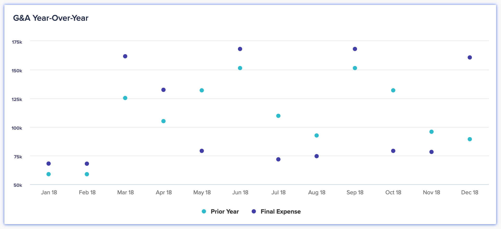
On a dot chart, data points are illustrated using different colors to make it easier to distinguish between different data categories.
What can I use dot charts for?
Dot charts show pinpoint values for your data against a dimension, such as time. Use them when you want to place emphasis on the exact values of your data rather than its comparative size.
Dot charts enable you to compare a large number of data series, where other chart types are liable to become visually overcrowded.
Dot charts work well as part of a combination chart. You can overlay a dot chart over another type of chart to highlight a target or benchmark, without the need to hide data.
Use a dot chart to answer:
- What are the exact values of my data for different time periods?
- How have sales differed across different locations and demographics?
- Which product performed the best each month?
Considerations
A dot chart may not be the best option when:
- data points are close in value, as dots can overlap and be hard to read, unlike other charts.
- visualizing total quantities or proportions.
Alternative chart types
Use a different type of chart if:
- you wish to communicate trends (use a line chart).
- you have a small number of data categories (use an area, bar, column, or pie chart).
- your data categories have identical values for given points in your dimension (use a stacked bar or column chart).
To learn about other types of chart, see Chart types in detail on the Charts page.

