Pie charts consist of a circle divided into segments that represent the component parts of the whole. Donut charts are the same, but with a hole in the center. The axis for a pie or donut chart follows the circumference of the circle.
To learn how to add a pie or donut chart to a board or worksheet, see Add cards to a board and Add cards to a worksheet.
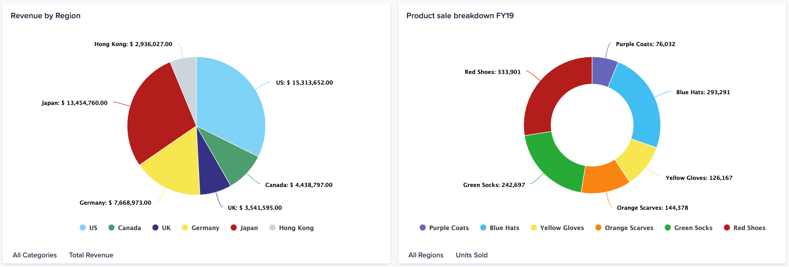
What can I use pie and donut charts for?
Pie and donut charts show a percentage breakdown of data, and, as they're visually simple, are well understood by most people. They display the proportions of a dataset (for example, market share) so are effective for highlighting relative sizes.
Use a pie or donut chart to answer:
- What is Y’s share of the whole?
- What is the ratio of X to Z?
- What are the comparative sizes of our business units?
- What is the composition of website traffic?
- What is the percentage breakdown of X, Y, and Z?
Considerations
A pie or donut chart may not be the best option when:
- The chart contains a large number of data series. This results in a large number of segments, which is hard to interpret.
- Your data series are close in value, as it can be hard to identify small differences between them.
Alternative chart types
Use a different type of chart if:
- You want to portray changes over time (use a line, bar, or column chart).
- It's important to know exact values within your data (use a bar or column chart).
- You're comparing a large number of categories of data (use a combination chart).
- The viewer needs to see values and is unable to hover over the chart card (use a chart with an axis).
To learn about other types of chart, see Charts.

