Administrators can change the grid style for all the grids in a model; end users can change the grid style for the grid they are working with.
Classic dashboards are not supported for new customers. Build Apps or Pages in the User Experience instead.
Change an individual grid style
The default style for a grid on a dashboard is Classic, but it’s easy to change.
- On the dashboard element menu, select Format > Grid Style.
- Select Classic, Clear, Ruled, or Striped grid styles.
The grid style of the dashboard element is immediately updated. If you’re an end user, any change you make will persist only until you exit the dashboard. If you want to keep your changes, you could save the dashboard with a different name.
Global grid style
The global grid style is the default style used when publishing new grids to a dashboard. Administrators can change the default style (Classic) to many alternative styles.
- In Model Settings, select Dashboards.
- On the View menu, select Global Default Grid Style and select from Classic, Clear, Ruled or Striped.
Changing the global grid style won't change the style of existing grids that have already been published to a dashboard. To change the style of existing grids, visit each grid and follow the instructions in the Change an individual grid style section above.
Grid styles
Classic
This is the default style for all grids unless the global style is changed or grids are changed on individual dashboards.
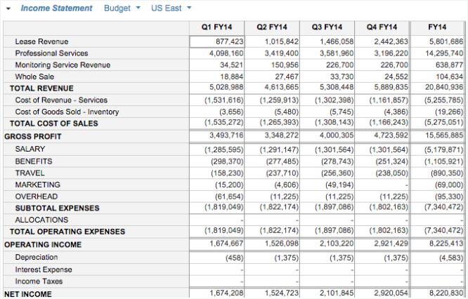
This style has no cell boundaries or label shading.
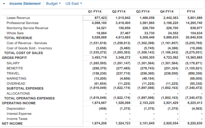
Ruled
This style has thin horizontal grid lines but no label shading.
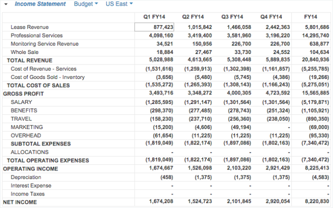
Striped
This style features an alternating row background.


