Options in the Dashboard Designer Properties panel can be used to define the size of chart, grid, and image placeholder dashboard elements.
Classic dashboards are not supported for new customers. Build Apps or Pages in the User Experience instead.
The measurements for text boxes, page selectors, list properties, and list subsets are not shown in the Height and Width panel.
If you resize a chart or grid element by dragging the arrowhead in the bottom-right corner, the new measurements are displayed in the Height and Width panel.
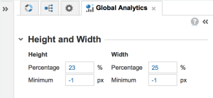
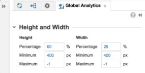
As well as using the resize arrowhead to alter the size of an element, you can enter values directly into the Height and Width panel. You have the option to define the size of an element by either the percentage of the screen that it occupies or by a precise number of pixels.
| Grid options | Chart options |
 |  |
Note: Elements will display using the value, either pixel or percentage, that will display the largest image on screen.
Grids, by default, will automatically expand to show all rows or columns wherever there is enough room on the screen to do so. The height of a grid is self-controlling and cannot be set manually. However, grids only take as much space as they need to display all columns. If you set the width to be 100%, but the grid only requires 80% of the screen to display all columns, it will not expand the width of the columns beyond 80%.
If you manually adjust the width of a grid to a value where it’s not possible to display all the columns and rows, horizontal and/or vertical scroll bars will display to help you navigate around the grid.
Charts do not have scrollbars because you can specify the maximum and minimum number of pixels for a chart, controlling the size completely. If the element is sized in such a way that it is too small to display the entire chart, it can be viewed by selecting Maximize from the Dashboard Element menu.
Pixel measurements
If you use a number of pixels to set the size of your elements, those elements will display at that size no matter what the screen size or resolution. This is fine in environments that are fully understood and uniform but could make dashboards difficult to read across a range of devices.
If you are entering values into the Pixel field and the dashboard doesn’t seem to be resizing, it could be that the default value in the Percentage field is greater than the value entered in the Pixel field. If you enter a number of pixels that represent a smaller value than the percentage value for the screen, the element will display at the percentage size. You could try setting the percentage values to a very small number, before entering values in the pixel field. The element will then display using the pixel values.
Percentage measurements
Using a percentage of the screen as the base measurement for charts and grids gives maximum flexibility when configuring dashboards that will be viewed by users with different kinds of devices set to a range of resolutions.
Automatic resizing
The default values for a newly published grid element are 50% and -1px minimum. For a chart element, the values are 50%, 50px height, 120px width, and -1 maximum. These values ensure that the element will always resize to fit into the space available on screen, resizing automatically when moved around the dashboard.
For example, despite the three elements each having a Percentage size value of 50% and a pixel value of -1, they automatically resize to display alongside each other with each adjusting to a percentage value of around 33%.
You might expect that, with a default value of 50%, only two of them would fit side-by-side, but you can continue to add elements and the existing elements will resize automatically to accommodate them.
Image placeholder resizing
When you resize an image placeholder element, the size of the linked image expands or reduces to fill the new dimensions. To prevent the image from appearing distorted, its aspect ratio is maintained regardless of the size of the image placeholder.
An image that is:
- Taller than its placeholder is displayed with equal white space on each side of the image. The image and placeholder heights match.
- Wider than its placeholder will be displayed with equal white space above and below the image. The image and placeholder widths match.

