Publish buttons to dashboards to enable end users to create list items, delete a branch of a list, navigate to other dashboards, and more.
Classic dashboards are not supported for new customers. Build Apps or Pages in the User Experience instead.
To create a consistent interface for end users, you can resize buttons and apply different styles to differentiate their function.
Note: We recommend that you do not use too many different button styles on a single dashboard.
Resize buttons
Applying the same number of pixels to the width of a number of buttons on a dashboard makes them easier to read and improve the look of the dashboard.
Note: The maximum number of characters a button label can display is 60. The maximum number of pixels for a button width is 499.
When a button is selected, options to adjust its size are displayed in the Width section of the Properties panel in the Dashboard Designer.
- Auto calculates the number of pixels required to display the characters specified for the button label.
- Custom enables you to specify the width of the button in pixels, regardless of the length of the label. You can either enter a discrete value or use the up and down arrows to increase or decrease the existing value. The label will be truncated if the number of pixels isn't sufficient to display the entire label. In this case, hovering over the button will display a tooltip showing the full label.
Style buttons
The options for changing the style of a button are displayed in the Style section of the Properties panel when a button is selected.
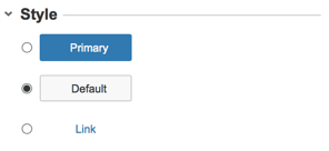
To style a button:
- In the Dashboard Designer, select a button.
- Select either Primary; Default; or Link.
- Select the Preview button to see the effect of applying the style.
- Select Save & Exit to save the changes.
Add tooltips to Buttons
Define and configure tooltips on buttons using the options in the Usability section of the Properties panel.

