Area charts are a series of data points connected by straight lines on two axes. The area between the data points and the axes are filled in with different colors. Dimensions, such as time, are displayed on the horizontal x-axis, with dependent data displayed on the vertical y-axis.
To learn how to add an area chart to a board or worksheet, see Add cards to a board and Add cards to a worksheet.
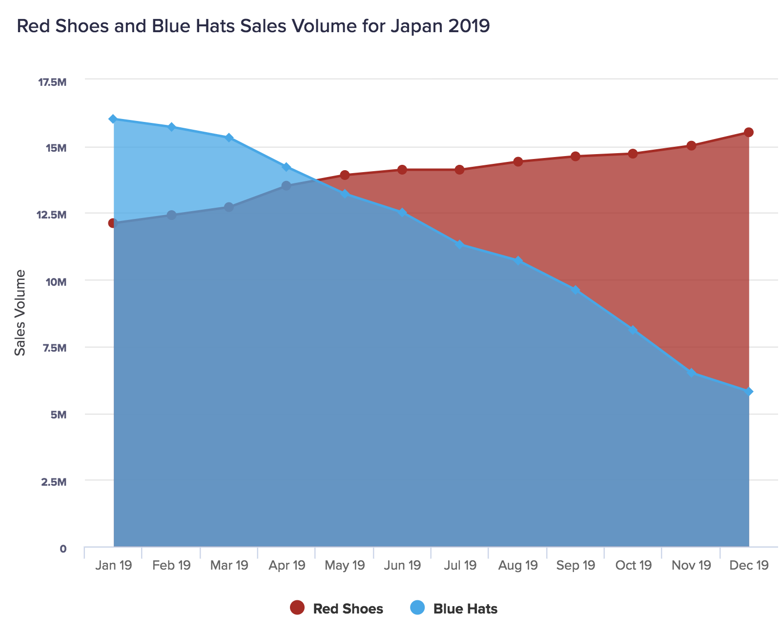
As the colors in area charts are semi-transparent, values remain visible even if the value of a data category is lower than that of another.
Area charts are most commonly used in the stacked format. This type of area chart enables you to proportionately compare different data categories while also monitoring changes over a time period or other dimension.
What can I use area charts for?
Area charts summarize changes in quantity over time, enabling you to easily compare different categories of data (they're especially useful for comparing two categories of data). Use an area chart to identify individual values, trends in a data series, and overall proportions.
The top edge of an area chart is effectively a line chart, meaning they can be used for many of the same purposes. However, the addition of color beneath this line in an area chart makes it easier for users to identify quantitative trends.
Use an area chart to answer:
- How have A and B changed comparatively?
- What proportion of sales do two products account for?
- What relative proportion of sales do X, Y, and Z account for over time?
Considerations
An area chart may not be the best option when:
- There are too many categories, as this can be difficult to read.
- There are a lot of overlapping values in your data series. The semi-transparency of the colors in the chart can make it hard to identify data categories.
Alternative chart types
Use a different type of chart if:
- You are interested in the direction of a trend rather than its proportions (use a line chart).
- You are only interested in proportions at a particular time (use a pie chart).
- You have several with similar values to compare (use a dot chart).
Other types of area chart
Stacked area chart
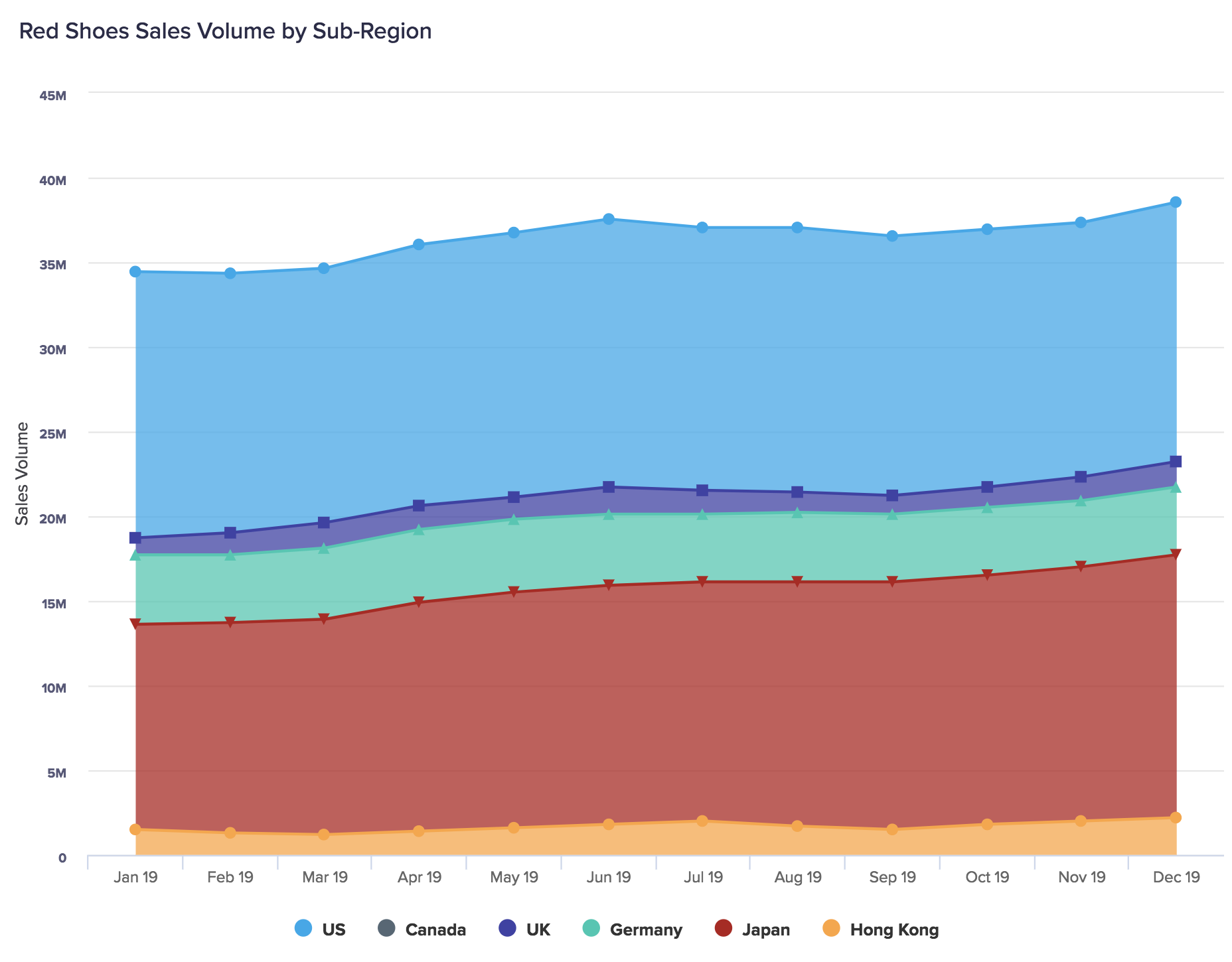
You can display an area chart as a stacked area chart, where the values for different data series are stacked on top of each other, rather than overlaid. The amount of vertical space that a color fills represents the value of a data series, rather than starting from the bottom of the Y-axis as in a standard area chart.
A stacked area chart makes it easy to see what contribution a single data series has made for a dimension compared to other categories. This means they're ideal for comparing the overall proportions of your data categories over a period of time or other dimension, while still enabling you to monitor any overall changes in value.
Percentage area chart
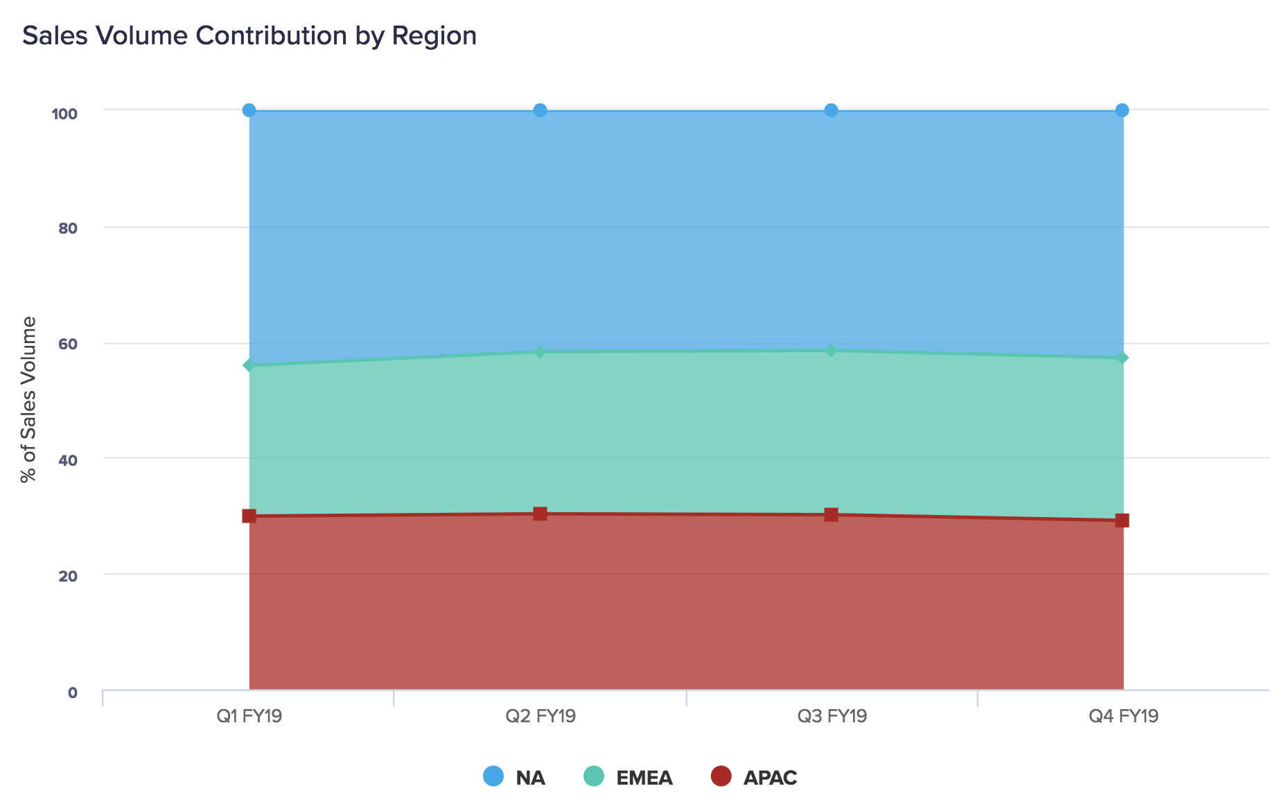
You can display an area chart as a percentage area chart, where the whole Y-axis is filled by your data categories proportionally. Individual values aren't displayed visually in this type of chart, requiring the user to hover over the segment to see them.
A percentage area chart enables you to easily see a single data category's contribution among several others for a given time period or other dimension. However, they don't show fluctuations in a data category's exact value or performance independent of other categories. A percentage column chart is best used to monitor the contribution of a specific data category relative to others.
To learn about other types of chart, see Chart types in detail on the Charts page.

