Use different card types to enhance the way in which users consume data.
For example, use a KPI card to emphasize an important figure; or use a grid card to display sales figures over time.
A card is an interactive component that page builders can add to a page.
- On worksheet pages, cards display in the Insights panel on the right of the screen.
- Board pages consist entirely of cards, which can be rearranged and resized.
- On report pages, you can freely arrange cards on slides or display cards in the Insights panel.
Note: You can use most card types in worksheets, boards, and report pages.
Action cards, field cards, and grid cards are not available on report pages. Table cards are only available on report pages.
The Anaplan mobile app supports the use of most card types. Exceptions are highlighted below. For more information on how cards are used on the mobile app, see Cards on mobile.
Action card
Use an action card on a board or worksheet page to display a set of actions for users to complete a business goal.
Each action displays as an action button on the card. When the action button is selected, a pop-up window displays the actions a user can trigger.
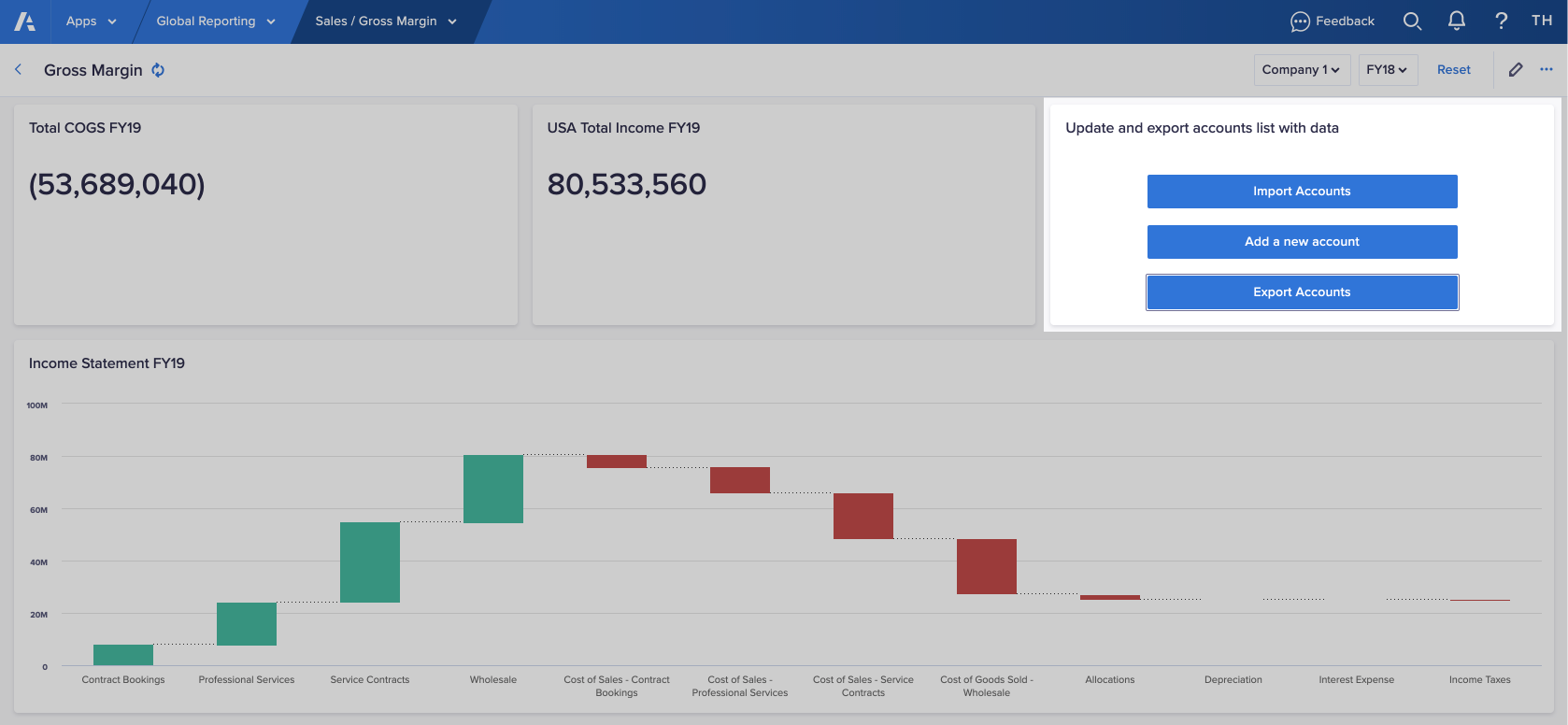
In this example, the card contains three buttons to complete a process. One button to import accounts, one to add a new account, and one to export the updated list of accounts.
Note: The Anaplan mobile app does not support processes or imports that depend on files, or exports from action cards.
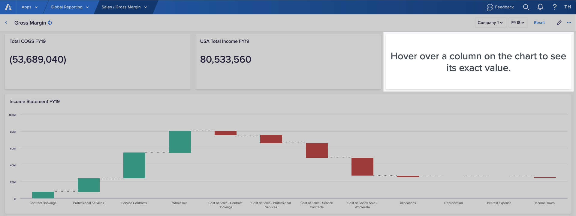
Chart card
Use a chart card to display the information as a chart. You can add different chart types to pages to make it easier for your users to spot trends and outliers.
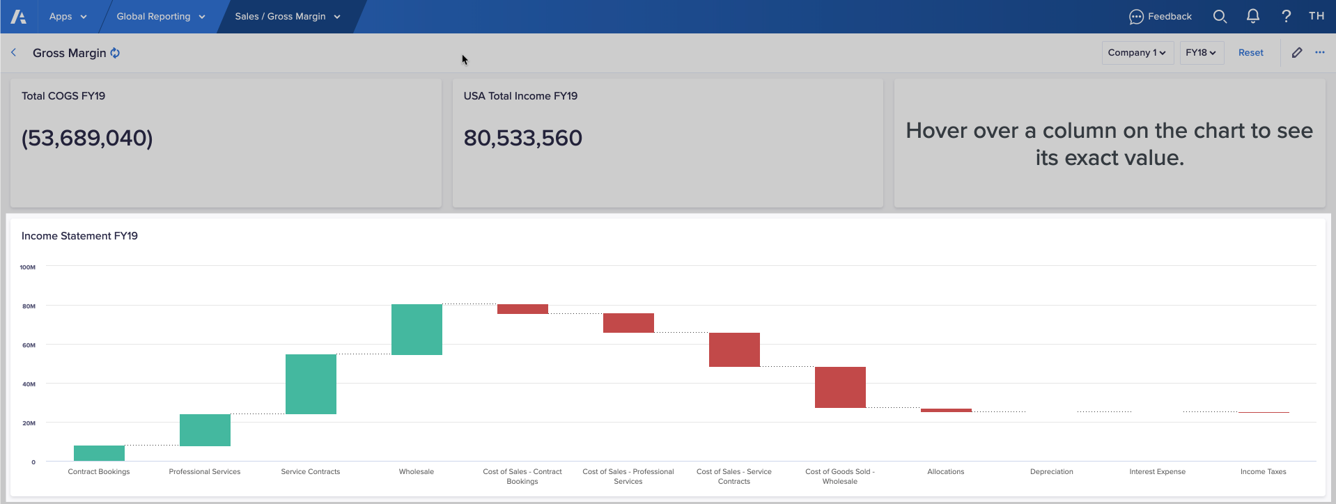
Note: The Anaplan mobile app does not support Gantt, scatter plot, and bubble charts.
Field card
Use a field card to publish one or more line items to a page.
Field cards focus attention on selected line items. If the line item is editable, the data can be changed. The changes are reflected throughout the app, and any other app that is linked to the same model.
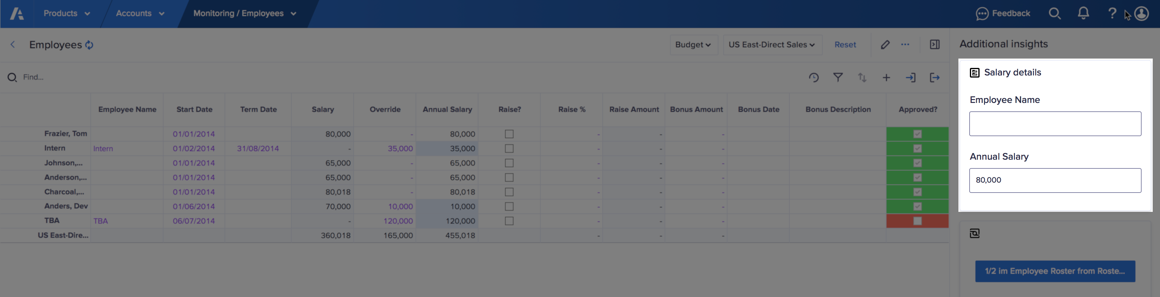
When a new value is entered, the data is updated instantly. The change is reflected in all places the value displays or where it's used in a calculation. Charts are also updated in real time along with any conditional formatting that may be in use.
Grid card
Use a grid card to display underlying data directly from a module for planning and analysis.
Note: If the main component you want to present on a page is a grid, use a worksheet.
Hierarchy card
Use a hierarchy card to visualize a list hierarchy in a module. Hierarchies provide a way to create organizational charts, to display a hierarchy in a territory, or create value driver trees. The Anaplan mobile app doesn't support hierarchy cards.
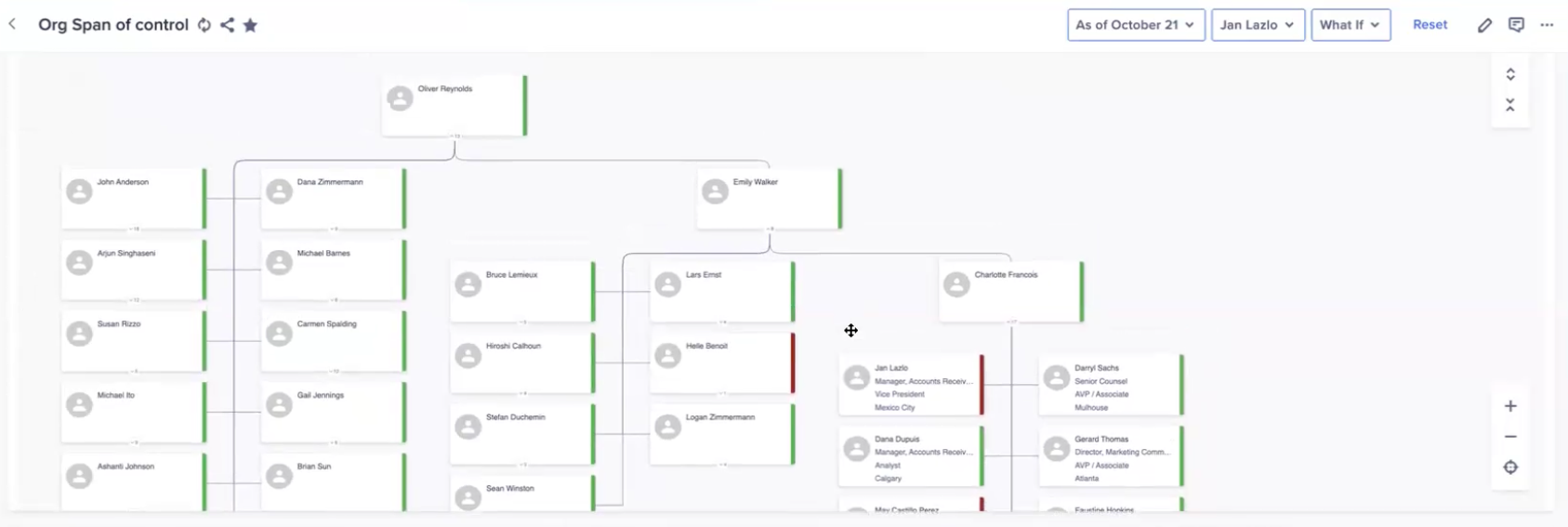
Image card
Use an image card as a visual identifier for a line item. Image cards reference line item URLs.
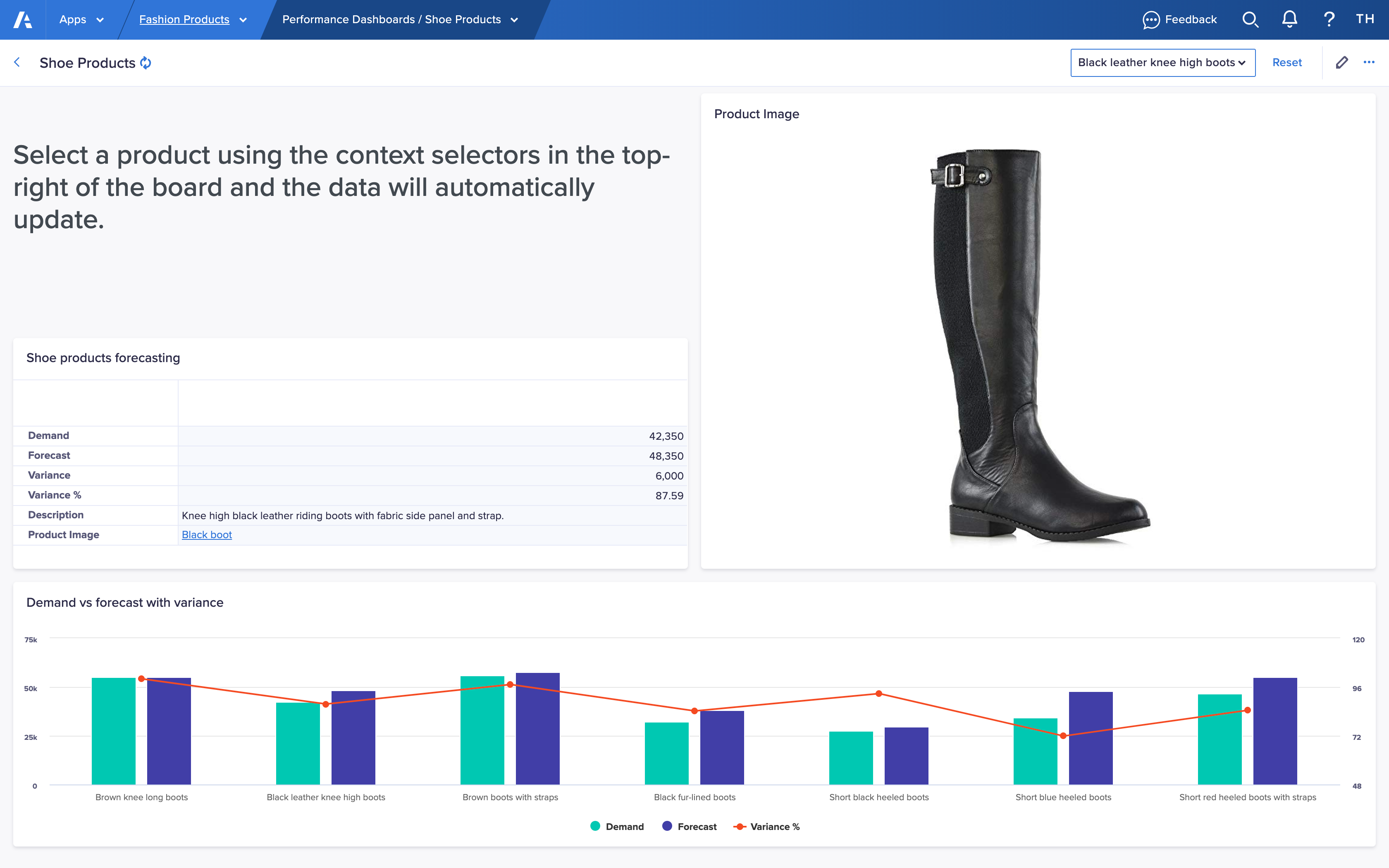
Image cards can be used to identify office locations, products, or different employees in your company.
Alternatively, you can display image line items in grid cards and presentation tables.
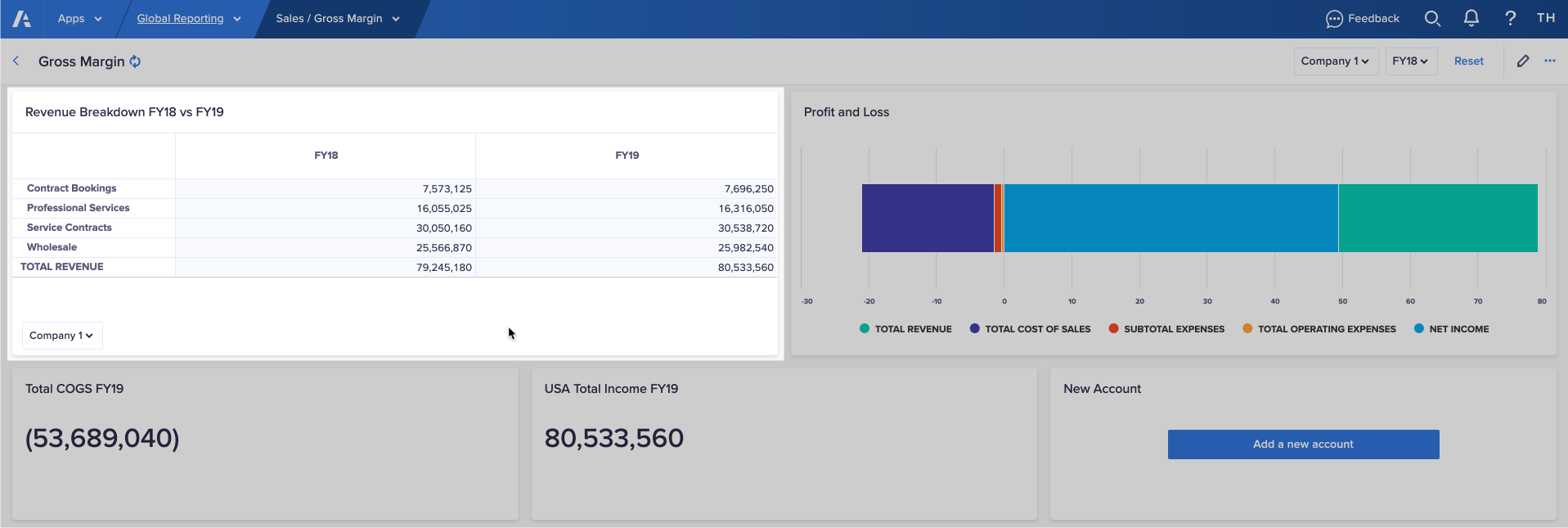
KPI card
Use a KPI card to display a single value from a cell. For example, a sales target, or total profit.
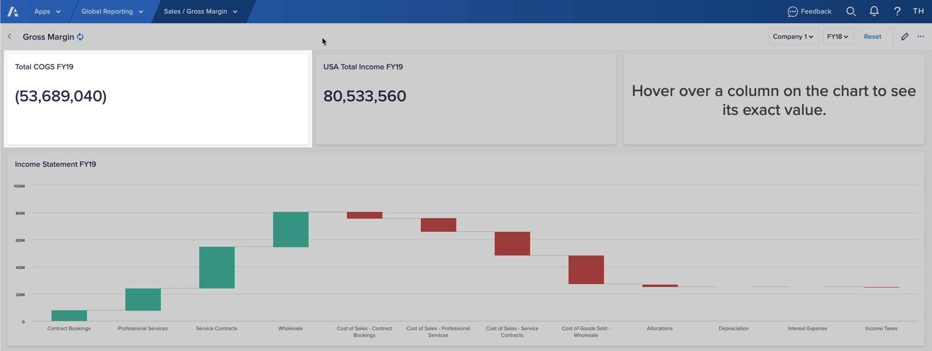
In the example image, the top-left corner of the grid displays the first value in the module.
Optionally, you can add a sparkline to a KPI card to display value changes over time.
Map card
Use a map card to display key data organized by region or country and its subdivisions. For example, you can display performance indices which highlight under-performing or over-performing markets.
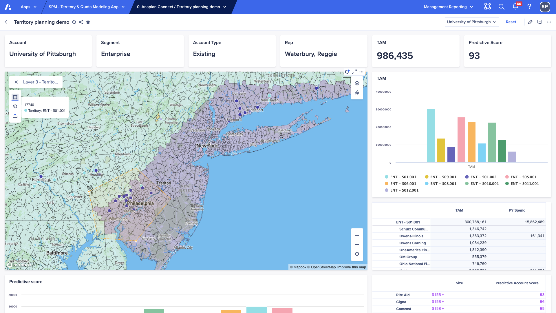
Optionally, use conditional formatting to help visualize data.
Note: The Anaplan mobile app does not support map cards.
Network card
Use a network card to visualize connections between lists in a model. Network cards can be used to show end-to-end connections in a supply chain network.
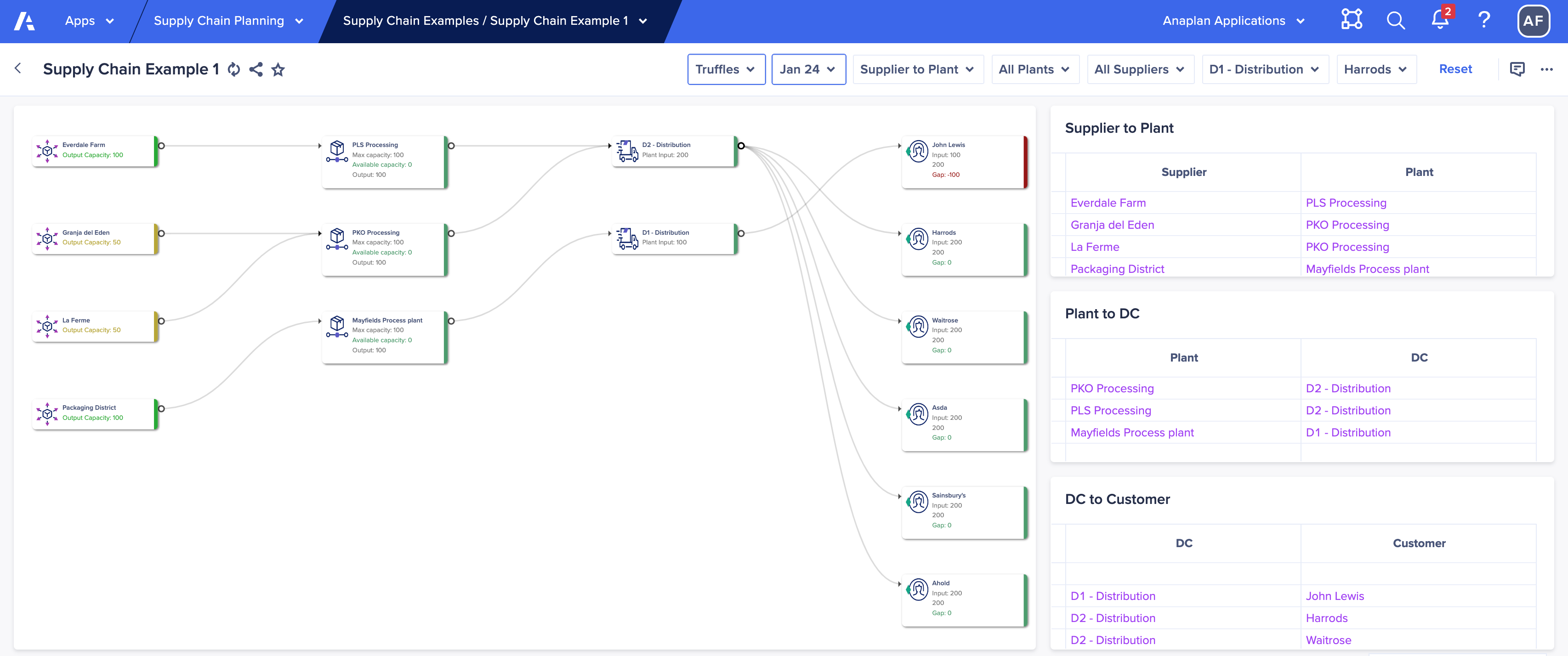
Table card
On a report page, table cards show highly-formatted tabular data and images. These are to show high-level data that contributes to business insights.
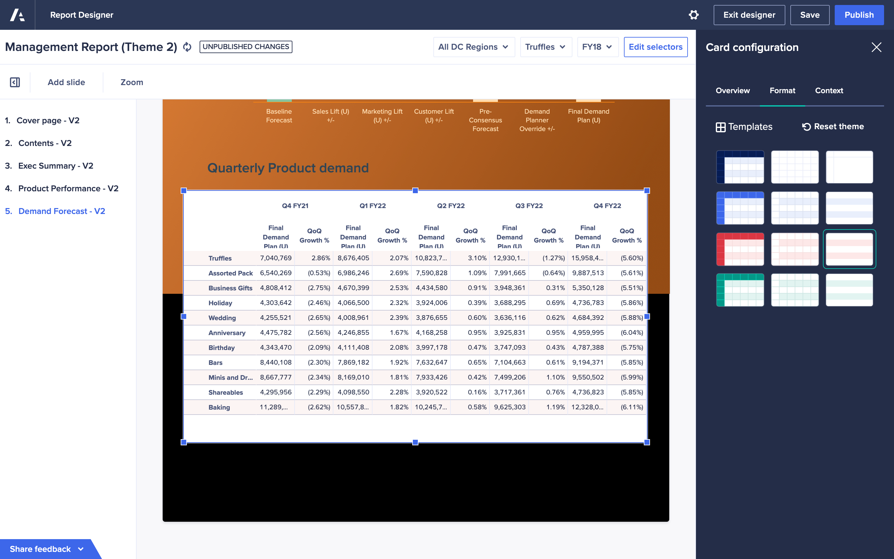
A table card presents your tabular data on a report page such as a profit and loss statement or balance sheet. The presentation table displays up to 300 rows and up to 50 columns. To show large grids, link to a board or worksheet. When you add a table card to a report, the number of columns is fixed at the time of creation and does not change afterwards.
Text card
Use a text card to add text to a page and provide context for the information on a page.
You might use text to:
- Add headings or formatted text
- Group cards on a page
- Create dynamic narrative from your data
- Provide instructions on how to complete tasks
Use text cards sparingly to make pages easier to use and navigate.

