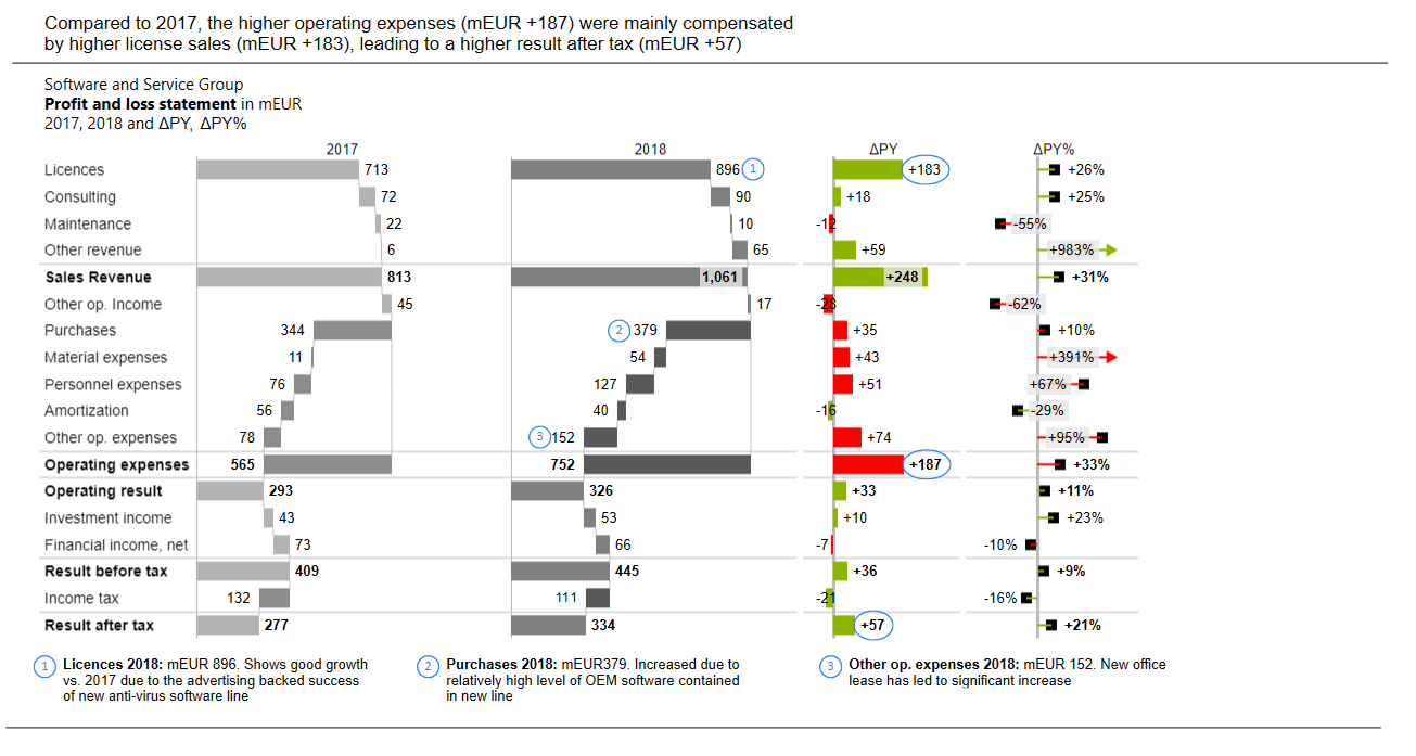
Message sheets allow users to analyze charts to the finest detail. They can be used to:
- Point out outliers
- Show the positive/negative change between two data points
- Annotate specific data
Create a message
Access Create Message from the Anaplan XL Reporting ribbon. Then, select a range to create message sheets for. A screenshot of the range is taken and opens up a new sheet.
Add a message and title
Message: This is an overall message summarizing the chart/report and usually appears at the top of the page.
Title: According to IBCS Standards, the title describes the content of the page without giving any interpretations or results. The title usually consists of three lines:
- Who: A legal entity, an organization unit, a project, and so on.
- What: The business measure and the unit they're measured in. Typically, measures are written in bold.
- When: Time periods, scenarios, and variances.
For example:
Crisps Corporation
Net Sales in mEUR
2015..2019 AC, 2020 PL
Footnotes: Footnotes are for general explanations, explanations of abbreviations, and information that increases the credibility of the report such as the source or date of publication.
Side toolbar
The side bar lets you insert further items to help further analyze your chart/report:
| Icon | Description |
| Second Excel Image | Allows you to add a second screenshot. |
| Highlight | Adds an elliptical circle, which can be edited and dragged over a particular data point. |
| Text | General comments concerning the whole chart. |
| Comment | This adds in a number to reference certain data points. |
| Comment Textbox | Number Comments related to certain data points. |
| Vertical/Horizontal Delta | Inserts two parallel assisting lines highlighting the difference between two values. To show a negative distance, select the Switch Color button on the top toolbar. |
| Warning Highlight | Inserts a red circle to highlight important negative, positive, or questionable parts of a chart. |
| Trend line | Inserts an arrow to highlight the direction of the trend with the slope. |
| Reference Arrow | Inserts a reference arrowhead for highlighting a reference standard. |
Right-Click Menu
Select an item and right-click to show the menu:
- Add: add another item such as a comment or highlight, and so on.
- Edit: open Message Item Settings.
- Delete
- Bring to Front
- Send to Back
- Move Backward
- Bring Forward
Message item settings
Text options tab
Text
Insert and edit the text of the selected item
Text layout
- Vertical alignment
- Direction
- Autofit mode: resizes the shape or shrinks the text so that the item fits on the page.
- Inner margin
Shape options
Style
Shape fill:
- Color
- Transparency
Shape outline:
- Outline type
Layout
Size:
- Width
- Height
- Lock aspect ratio
Rotation
Top toolbar
Add slide: You can add a slide for different messages. To change the name of the slide, right-click in a blank space and select Edit. You can then edit the slides:
Each slide configured appears as a new slide when the message is exported to PowerPoint.
- Auto-snap to guides: When repositioning items, this snaps their position to align with other message elements.
- Switch color: When using a vertical or horizontal delta, change the color of the delta marker to either green or red to indicate a positive or negative change.
- Rotate selection: Rotate the direction of a delta, trend line, or reference arrow.
- Undo
- Redo
- Save to PowerPoint

