
When you edit a chart or add a chart card to a board or a worksheet, you can configure a variety of settings. These settings vary and depend on the type of chart that you select.
Use chart settings to customize chart cards so they can be easily understood by end users.
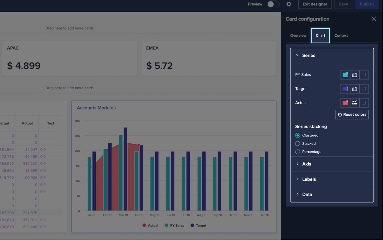
When you create or edit a chart card, you can configure it in the right-hand Card configuration panel. For example, you can choose the chart type, format the data series, and set hierarchy filters for rows and columns. Configure your chart settings on the Chart tab.
Data
The settings available under the Data option depend on the Chart type you configure.
When you configure an area, combination, dot, or line chart, the Plot trailing zeros toggle displays under the Data option. If your data series ends with values that are zero, toggle to the right to display the zeros. Toggle to the left to hide them. Use this option when you don't have values for future months, but still want to display them on your chart.
When you configure a waterfall chart, Data enables you to choose how each line item displays in the waterfall chart. You can:
- Change the color of Increments, Decrements, and Totals. Select the colored box icon next to the category you want to change the color for. In the drop-down palette that displays, select a different color.
The defaults are green for Increments, red for Decrements, and gray for Totals. - Suppress zeros. Toggle the switch to remove any line items with a value of zero from your waterfall chart.
- Set the First item as total. Toggle the switch to change the first column to the same color as the final total. Use this option to display the transition between equivalent starting and finishing values (such as financial years).
Series
Configure the data series on a chart card to determine how each of your line items displays on a chart.
Axis
Define configuration elements that make reading data easier or highlight aspects of the data rendered in the chart. You can define text labels to display next to the vertical or horizontal axes, or change the background grid. You can also change the color of your labels and axes.
In area, bar and column, combination, dot, scatter, and bubble, and line charts you have custom scaling options for your axes. These allow you to set minimum and maximum values for each axis, including for a secondary axis in combination, and scatter and bubble charts, if the option for a secondary axis has been activated in the Series section of the Chart tab. The default value for the scale on each axis is set to Auto, but other options include Fixed or Fixed-auto. These option behave as follows:
- Auto scale, automatically sizes the chart's axis to accommodate the lowest and highest values in the data
- Fixed scale, allows you to set a minimum and maximum value for the scale, independent of the data in the series
- Fixed-auto scale, allows you to set a minimum and maximum value for the scale, but will automatically adjust the chart to encompass the highest or lowest value on the axis
In the Axis section of the Chart tab, you can label any numeric axes in your charts. The default value for the label format is Auto, but you can select Manual to specify:
- A prefix of up to 3 characters.
- A suffix of up to 3 characters.
- Decimal places of up to 4 places.
In a waterfall chart, the Auto axis toggle displays in the Axis section. Toggle right to change the minimum value of the y-axis. This makes the columns for small intermediate values larger and easier to compare. Toggle left to display the full y-axis.
Rotate axes also displays in the Axis section for a waterfall chart. Toggle right to swap the horizontal and vertical axes.
The font color of the axis fonts and lines can be customized by clicking on the color pickers next to the Axis font color and Axis line color options, in the right-hand panel. This allows you to add color accent and highlights to your axes.
Notes:
- Chart axis scaling isn't available in map, pie, donut, Gantt, and waterfall charts.
- The maximum number of items that can be included in a chart axis is 400 items.
Labels
Choose where you want the legend to display and whether you want data labels to be on or off. Data labels help users to identify the exact values for points on the chart. Once you enable labels, you can adjust their font size for ease of viewing. Use the Chart font size dropdown to select a size option. Note that this option will be off in its default state if your data has over 500 data points. You can switch this on, at any time.
Tooltips and data labels are toggled on and off, independently, using the Show data labels and Show tooltips toggles. These toggles are available to all chart types except Gantt and scatter/bubble charts. Tooltips are on by default. These settings are individual to each chart, and aren't applied at page level.
For pie and donut charts, you can also toggle Show percentages to show percentages in the data labels.
The font color of the chart labels can be customized by clicking open the color picker next to the Label font color option, in the right-hand panel. This allows you to add accents to your labels.
In Gantt charts you can also change the Labels border color, which adds an accent to the overall contour of the chart.

