Anaplan XL Reporting maps enable plotting geographic data directly in Excel and publishing to the Anaplan XL Web server.
Introduction
You can plot the data locations, and optionally set the color and size of the plotted points to show values.
Setup
To create a map from Excel, highlight the relevant data and select Map from the Visualize drop-down button in the Anaplan XL menu.
The Map properties window opens.
Map Range
Anaplan XL expects your data to be arranged in a particular way to create maps.
Generally, there should be several columns of data as described below.
Known Latitude and Longitude
The columns should contain:
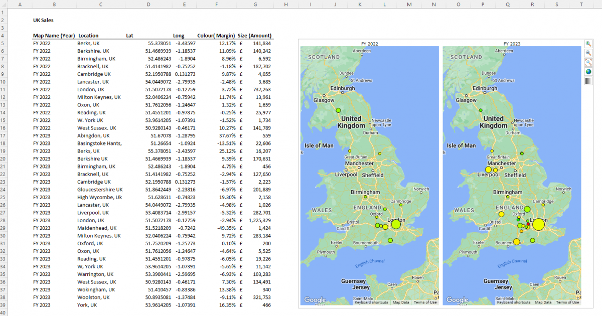
| Column | Description |
| Map Name | Title of the map, a map will be created for each different name. (For example to create a map for each year.) |
| Location Name | Title of the data point, shown when you hover over the point. |
| Latitude | Latitude of the point. |
| Longitude | Longitude of the point. |
| Colour (optional) | Defines the colour of the point plotted, can be a number or text. If no column is selected then all points will be the same colour. See Colours for more information. |
| Size (optional) | Defines the size of the point, this must be a number. If no column is selected then all points will be the same size. |
This would be a typical set of mapping data:
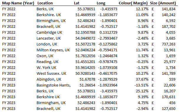
Look Up Latitude/Longitude
If you don't know the latitude/longitude you can look it up using the Extras -> Lookup Latitude/Longitude menu item.
Highlight the place names and select the menu item. This can take some time, so isn't available as a function. It's recommended you look up the locations once and then reference them, for example using the VLookup () formula.
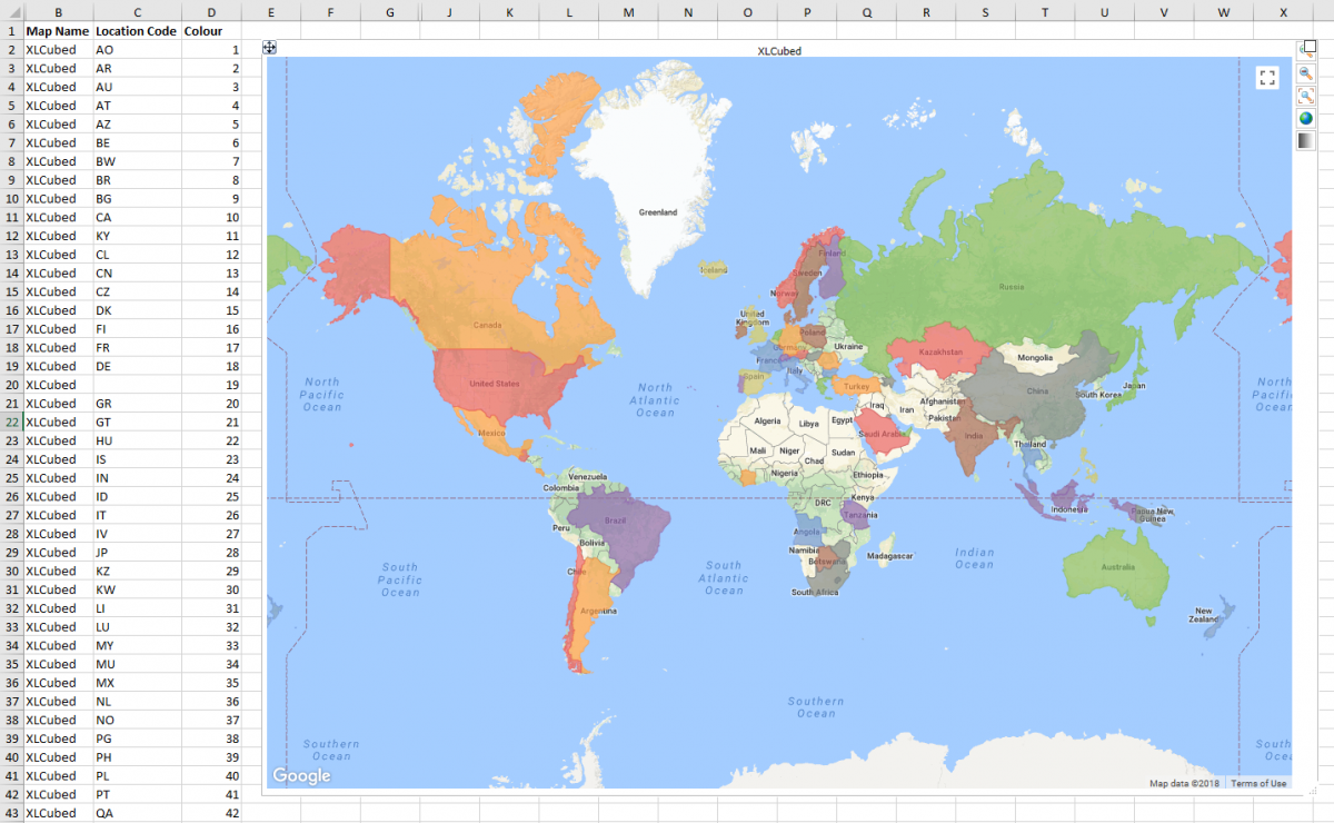
Named places
Named places use a predefined set of codes to identify locations. You can then plot either the outline of the location of a point in its center.
Anaplan XL comes with defined outlines for many common requirements.
You may also add custom sets of locations; to do this, please contact support.
The columns for the report should contain:
| Column | Description |
| Map Name | Title of the map. A map will be created for each different name. (For example to create a map for each year.) |
| Location Name | Name of the place to plot. |
| Colour (optional) | Defines the color of the point plotted, can be a number or text. If no column is selected, then all points will be the same color. |
| Size (optional) | Defines the size of the point. This must be a number. If no column is selected, then all points will be the same size. (Doesn't apply if plotting polygons.) |
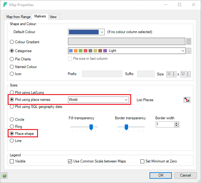
For named places, display the outline instead of a center marker. Customize the shape and border transparency. Select Plot using place names and choose a place from the dropdown. Then, select Place shape on the Markers tab in the Map Properties window.
Map controls
| Button | Description |
 | Zoom in |
 | Zoom out |
 | Zoom to Fit |
 | Toggle map display type. Switch between road and satellite views. |
 | Toggle fade map. Fading the map makes the data points more prominent.(Requires IE9+ in Excel, and IE9+, Firefox or Chrome on the web) |
Properties
Right-clicking on the map and selecting Edit Map brings up the map properties dialog.
Colors
If your data includes a color column, this column can contain numbers or text, and there are three ways the values could drive the color.
- Color Gradient: If you have numbers, the colors can be from a color gradient. For example, Red-Green shading for negative/positive margins.
- Categorize: you can categorize each point with a number or text. For example, if mapping national stores, the color column could contain the store type. Each store type would then be plotted with a particular color.
- Pie Charts: See below.
- Named Color: The column could contain specific colors, using named colors or HTML syntax such as #ff0000. This allows you maximum flexibility to drive the color using any criteria you choose.
- Icon: you can map each location with an icon. The color column would need to contain the file name of the icon to be used.
Sizes
If no size column is found, then all markers will be the default size specified in the map properties.
If a size column is included, then the marker size will be between the low and high value sizes set in the properties screen. The exact marker size is calculated by interpolating between these values.
Output cells
In the properties screen you can set up output cells for the map and location names.
With these selected, selecting a data point will update Excel. This can then be used to drive a detailed report for the selected point.
If you turn on multi-select and pick an output range rather than a cell, you can output multiple values. Drawing tools appear on the map to enable you to pick many points, and OK the selection.
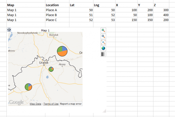
Pie charts
You can plot pie charts instead of simple points. In this case, columns after the location column will be used as data values for the pie segments.
By default, the size of the pie chart will be based on the total of all the data values. You can optionally set the last column to be the pie chart size. This allows you to control the size based on another parameter or make all the charts the same size (by filling the final column with 1s).
View
Initial view
Defines the startup view of the map. The options are
- Zoom to fit: Matches existing behavior, map is zoomed and scrolled to show all data points.
- Save on close: The zoom and scroll are saved with the workbook.
- Custom view: You decide the zoom and scroll, select Set to select the current view.
Custom style
These settings enable you to customize the map layers, such as road, water, and place names.
You can adjust all the layers at once, or individually. Select Apply to see a preview of what the map will look like.
Security
In some corporate environments, URLs may need to be added to sites trusted for javascript.
- xlcubedweb.com
- xlcubedmapping.com
- maps.googleapi.com

