There are two types of Comparison in-cell charts that you can use within your report:
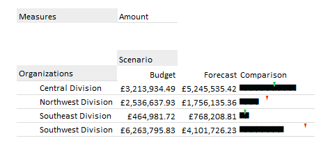
Indicator comparison chart: This shows the current performance with an indicator icon for comparison to a defined baseline value (e.g. Budget, Forecast).
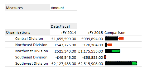
Integrated variance chart: This is an overlay chart used to show current performance, with integrated variances to prior periods.
This dialog is used to format any Comparison In-Cell Charts in your report. For details about how to invoke the dialog, see In-Cell Chart Designer.
Comparison options
| Option | Description |
| Chart Type | Choose between the chart types:
|
| Compare Values | The range of data to use for comparison. |
| Width | The width of the chart. |
| Positive Value | The default color to use for positive values. |
| Negative Value | The default color to use for negative values. |
| Increase | The default color to use for an increase in value. |
| Decrease | The default color to use for a decrease in value. |
Axis options
| Option | Description |
| Customize axis | Allows you to choose further options defining how the formula cell (for In-Cell Chart formulae), or the member name (when used in Grids) is rendered. |
| Use title only | Uses the given text as a caption. |
| Axis with tickmarks above | Draws a horizontal axis, with tickmarks and optional labels above the axis. |
| Axis with tickmarks below | Draws a horizontal axis, with tickmarks and optional labels below the axis. |
| Custom tickmark frequency | Overrides the automatic calculation of major tickmarks. |
| Minor ticks per major tick | Adds the given number of minor (labelless) tickmarks between each major tickmark. |
| Show labels on major ticks | Specifies whether numeric labels should be rendered for the axis. |
| Number format | The format string to be used for the axis labels. |
| Custom axis minimum | Overrides the automatic minimum for the axis. |
| Custom axis maximum | Overrides the automatic maximum for the axis. |

