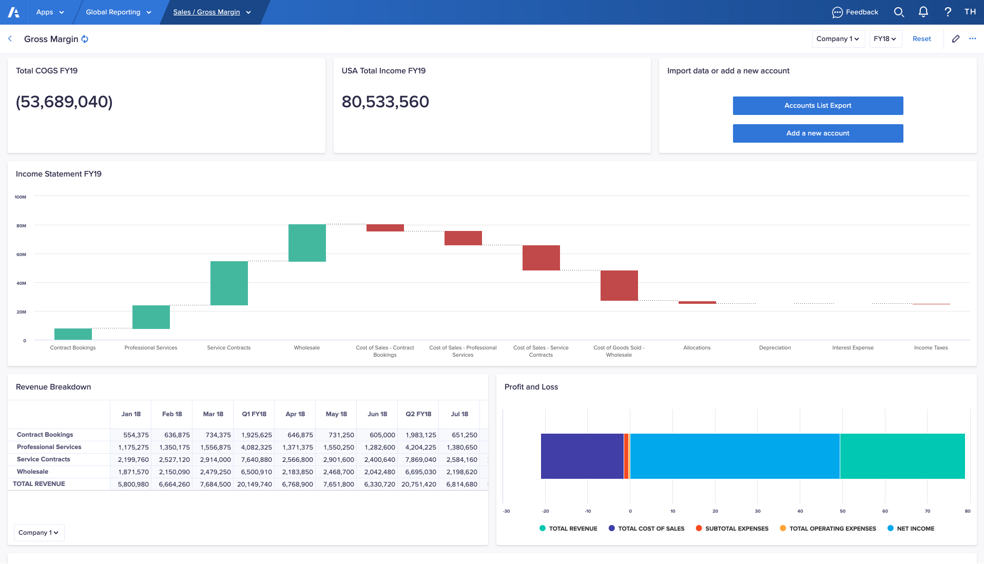
A card is an interactive component that page builders can create and add to a page. Use cards on a board to display relevant, visually-striking data for end users to consume.
Boards consist entirely of cards. Rearrange and resize the cards to create the ideal data display for user analysis.
Page builders can add these types of card to a board:
Once you've added a card, you can save it as a template and reuse it on other pages in the same app.
Users can create cards on personal pages, except action cards, which aren't supported on personal pages.
To add and configure a card on a board:
- Select Edit this page in the toolbar to open your page in designer mode.
- In the Add card section of the Cards panel, double-click a tile, or drag it onto the board.
By default, the card displays, full width, at the bottom of the board. - Select the Configure button or select the pencil icon on the card.
- Configure your card.
Learn how to configure each card type in the above links. - When you're ready, save the page as a draft or select Publish.
Insights panel
To add a card to the Insights panel:
- On the Additional insights panel, select the cog icon .
- On the Cards panel, drag and drop a card tile in the Additional insights panel.
- Select Configure to configure your card.
You can configure cards to display by default under the board. The most relevant data is immediately visible to users.
To set a card to open by default, select the ellipsis > Set as open by default.
To display a card from Additional insights:
- Select the card type icon to the left of the card name, or the expand icon at the top right of the card.
The card displays on the bottom half of the primary grid. If actions have been added, action buttons display when you expand the card. - Select Maximize on the card to expand it to full-screen. Select Close to collapse the card and return it to the Additional insights panel.
You can select Additional insights or Close to hide the Additional insights panel.

