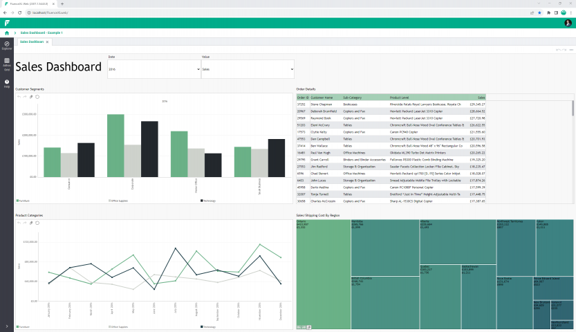
Dashboard sheets enable you to build responsive dashboards and visual reports.
Dashboard sheets:
- Dynamically resize to fill the screen they are being viewed on.
- Can be optimized to display in different layouts depending on the screen size and orientation.
- Auto-link objects together as they are added to the dashboard sheet.
Create a dashboard
Dashboard sheets are available under the Visualise group in the Anaplan XL ribbon. It creates a new sheet in the workbook and opens the dashboard ribbon. You can add grids, small multiples, treemaps, maps, viewports, or slicers from this ribbon. Set them up in the same way as when inserting them on a standard Excel sheet.
When you add a component to the dashboard it's positioned starting at the active cell in the dashboard. You can then re-position it, and resize it as required.
Design mode: Anaplan XL dashboards have a design mode and a runtime mode, which is toggled through the Design mode button on the Dashboard ribbon.
Zoom: Zoom in on a component to make it fill the screen and hide all other dashboard objects. Selecting zoom again reverts this action.
Import existing: allows for the import of existing Anaplan XL objects within the current workbook onto the dashboard sheet.
Auto-link new items: when adding a new dashboard component, link it to other objects on the dashboard sheet.
The layout, item settings, and properties of the dashboard are controlled in the dashboard taskpane, which is automatically visible when in design mode.
Layout
Adjust the number of rows and columns in the dashboard. You can also control how many rows/columns are visible if you require the dashboard to be scrollable.
Item settings
Here you can see all the items on the dashboard and control their visibility (some items could be visible in one target but not another). The names of each item are set in their individual properties. You can set a border for each item.
Properties
Set the dashboard background color.
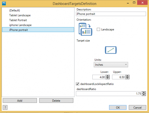
Targets
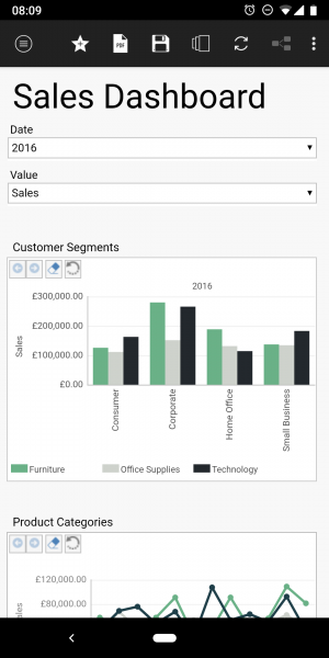
Targets are categorizations of the display size at which the dashboard can be viewed. This allows for different layouts of the same dashboard to be defined based on the best fit of the available screen size. The concept is that the dashboard itself is developed once and can then be layout optimized per device type.
You can add a new target: Specify these details:
- The lower and upper range of diagonal screen size, which you want the target layout to be applied to.
- Whether the target is portrait or landscape.
- The aspect ratio to ensure that when objects are being dynamically resized, this is taken into account.
Each target frame has a number of rows and columns which you can adjust. You can arrange the components on the dashboard within the available matrix. To optimize a dashboard for a smartphone in portrait mode, arrange the components vertically and limit the view to two or three components on the screen. For example, add a new target with one column and six rows. Each resulting cell contains one dashboard component, and Show x Rows at a time is set to three. This means the phone user would swipe up to see the second set of three objects within the dashboard.
Printing
Set a target to be used when printing by selecting the Use for printing checkbox in the properties of the target.
Categories
Categories control how the objects on a dashboard are linked together. By default, every component added to a dashboard is linked to all the other objects. For example, when a grid is added to a dashboard already containing a slicer, the grid is automatically linked to the slicer and updates based on the slicer selections. Similarly, when a small multiple or treemap is added, they're auto-linked to the other objects. Initially, everything is linked together on the red category. To view the categories, select any component on the dashboard. The current category is shown on the top right, signified by a color. The default initial color is red.
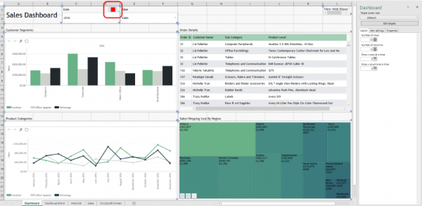
Select the red category square to show other available categories. Hover over the color to highlight all other dashboard items in the same category. By default, all objects are linked together on the red category.
When a selection is made on one component, this is used as a filter on the other objects. This behavior can be overridden or tailored as required for specific cases, for example:
- To remove a link from a specific slicer to a certain chart where it has no relevance.
- To enable more complex selections, for example children of the selected slicer item.
- To enable objects from different data sources where a direct link may not work.
To remove a link between two objects, clear the category in the required component.
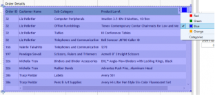
The date slicer has both red and blue categories selected, so it'll link to the grid. The values slicer has only red selected so it won't affect the grid.
- The date slicer controls all objects on the dashboard
- The values slicer only controls the objects with a red category
The automatically generated links show within the designer for the individual objects as Dashboard Selection. This can be changed to show children, or descendants at a level as needed.
For more complex scenarios with components from different data sources on the same dashboard which you still want to link, you can use the approach below:
- Remove categories completely by deselecting them.
- Set one component (slicer, chart, or grid) to output its selection to a cell on another Excel sheet.
- Base the second object's selection on that same cell
Dashboard labels
Use dashboard labels you to add text to a dashboard sheet. You can enter text directly, paste it from a highly formatted source such as Word, or reference the contents of an Excel cell.
- Colors: set the font color, text background color, and label background color.
- Font size: set the font to a fixed size, or auto-size text to fit the size of the label.
- Alignment: align text both horizontally and vertically within the label.

Dashboard titles
You can add titles to items on a dashboard sheet. This allows you to group a text title and interactive buttons with the dashboard item.
Enable titles from the item settings in the dashboard taskpane.
This add a blank space above the item where you can right-click to edit. You can then add a text title and buttons.
Appearance
You can set these properties:
- Text: set the text label. The font and the background color can be set from the toolbar.
- Title height.
- Use dashboard item border settings: draws a border around the title with the same color and width that is set in the item settings on the dashboard taskpane.
Buttons
You can use buttons to link to other parts of the workbook or to zoom into the selected item.
- Appearance: set whether the button displays an image or a label. You can also assign it a tooltip and border.
- Click action: configure what'll happen when the button is clicked. This can either link to another Excel cell, or zoom in (enlarge to full-screen) the dashboard item.
- Layout: buttons are right-aligned in the title. You can set their height, width, and margin.

