This dialog is used to format any dotplot in-cell charts in your report.
For details about how to invoke the dialog, review In-cell chart designer.
Chart Options
Length
The horizontal scale factor to use when drawing the chart
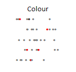
Color
The color to draw the plots
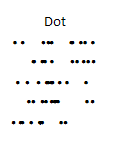
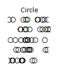
Plot symbol
There are two choices:
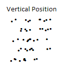
Stacking type
Based on the stacking type — the values will be grouped and drawn either varying the color or the vertical position:
Stacking value type
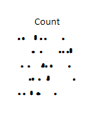
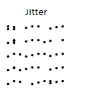
Defines how dots are stacked — the number of values, an alternate set of values, or a random jitter:
Count: The Y value is defined by the number of values that are the same (only applied when the stacking type is Position or Color).
Values: Provide another range the same shape as the source values to enable plotting of specific X and Y values (only applied when the stacking type is Position or Color).

Jitter: The Y value is taken from a fixed set of random values to enable dots near each other to be easily distinguished (only applied when the stacking type is Position).
Colors
Defines the colors to use when stacking values.
Axis
| Options | Description |
| Use title only | Displays the text in the header cell for the charts. |
| Axis with tickmarks above | Axis will have tickmarks above the base line. |
| Axis with tickmarks below | Axis will have tickmarks below the base line. |
| Custom tickmark frequency | Controls how often an axis value will be displayed. |
| Minor tick per major tick | Number of ticks to appear between each value. |
| Show labels on major ticks | Controls when to display the values. |
| Number format | Specify the number format for the tickmarks. |
| Custom x-axis min and Custom x-axis max | Controls the horizontal maximums and minimums. |
| Custom y-axis min and Custom y-axis max | Controls the maximums and minimums for when stacking is enabled. |

