Pages are interactive layouts that display data from your models.
Pages aren't contained inside a model. Instead, you create pages and group them together in Apps.
Source data
Each page displays data from a single-source model. However, you can change the source model for a page so that it displays data from another source model.
If you have Professional or Enterprise entitlement, workspace administrators can enable multiple models for a page and associate additional models with that page. Associated models are models that are available for selection as the source model for a page. The page can still only display data from one source model at a time. However, when you have access to more than one model associated with a page, you can switch between source models associated with the page.
Choose your page type
As a page builder, you choose the type of page you want to build when you create a page.
- Choose worksheets to present data in large grids that you can analyze and edit.
- Choose boards to create more visual pages that display high-level information.
- Choose reports to create consistently formatted reports, to help you present actionable insights for executive stakeholders.
After you create your page, it displays in designer mode, where you can draft the appearance and functions of the page.
Once you publish your page, you can access designer mode at any time to edit and customize it further. Select the pencil icon in the top-right of the page to enter designer mode.
Page types
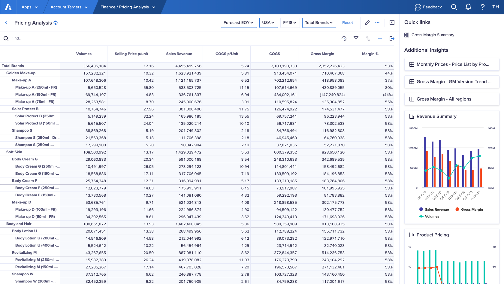
Worksheets
Worksheets are best suited to display full-page grids, where the main use for the page is to enter and filter data. A worksheet enables you to perform detailed planning and analysis.
You can also use Additional insights on a worksheet to link to other pages and add cards. Cards enable further interaction with the model data or add visualizations to the page. However, on a worksheet, the main focus is the grid.
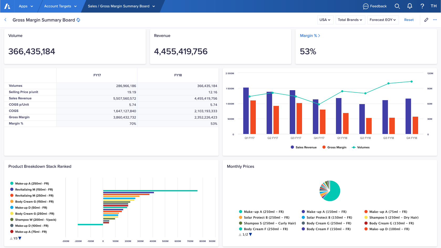
Boards
Boards display cards. You can include a grid card, and you can also choose to display visualizations more prominently, such as charts and key performance indicators.
Boards can also be used as a navigational tool, to direct users to more detailed data. For example, you can publish a chart to a board, and link the card to a worksheet with more detailed data. This link guides the user to the supporting data they need for analysis.
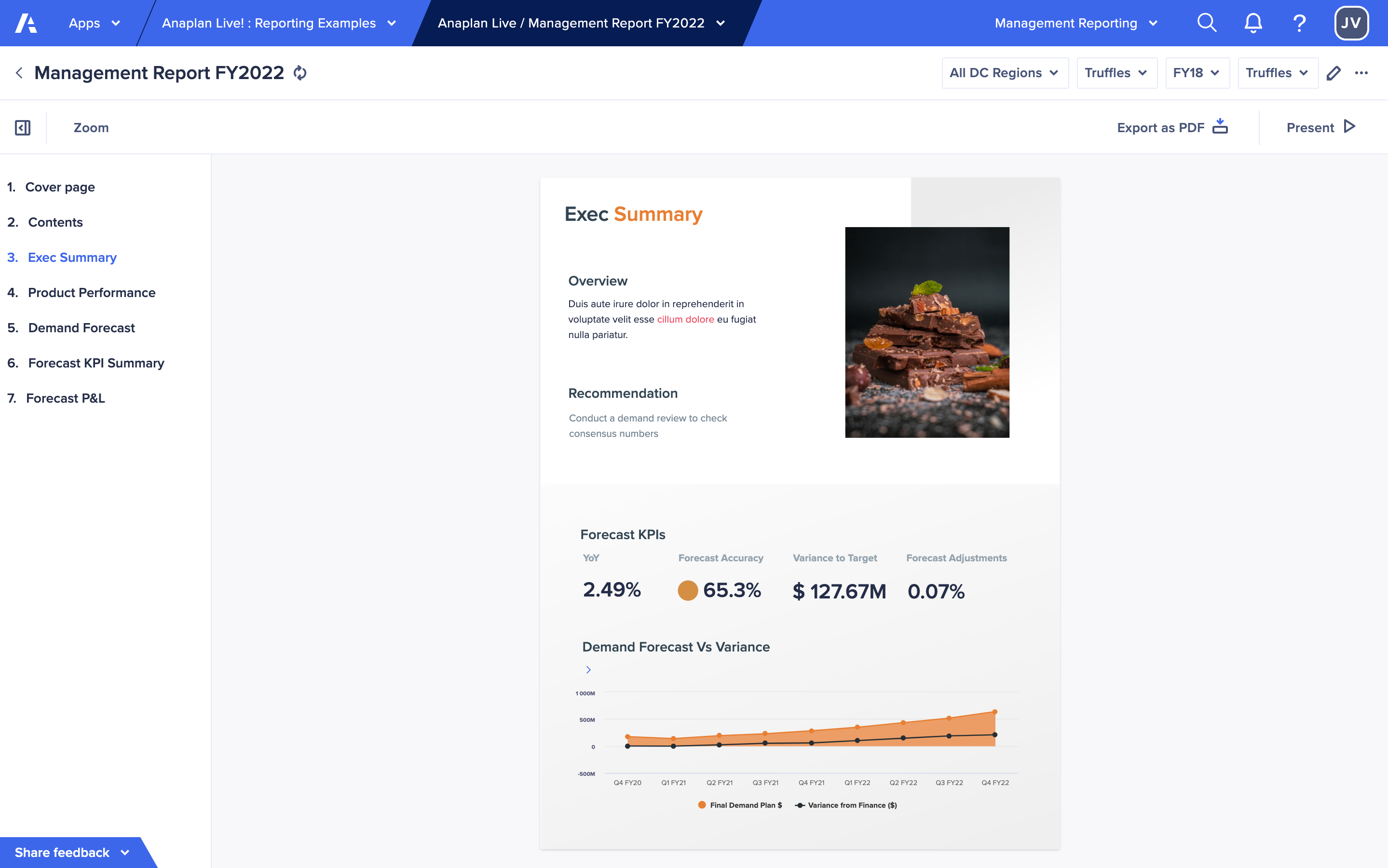
Reports
Each slide of your report consists of any number or type of cards. You can arrange these on slides to focus each slide on a specific insight.
To select a context, users can use context selectors and select elements of synchronized charts. You can configure the context to focus on particular data or enable degrees of freedom for your users to explore the report. Users can view your report, present it full-screen, and export it as a PDF file.