Chart cards display data through a variety of chart types. Select the type that best explains the significance of your data.
Page builders can add the following types of charts to pages in Anaplan:
Chart cards are synchronized with other cards on a page. If you click on a data series on a chart card (for example, a column on a column chart), other cards update to display the same data series as your selection. For example, if you select a region, other charts and grids will display the corresponding data for that region.
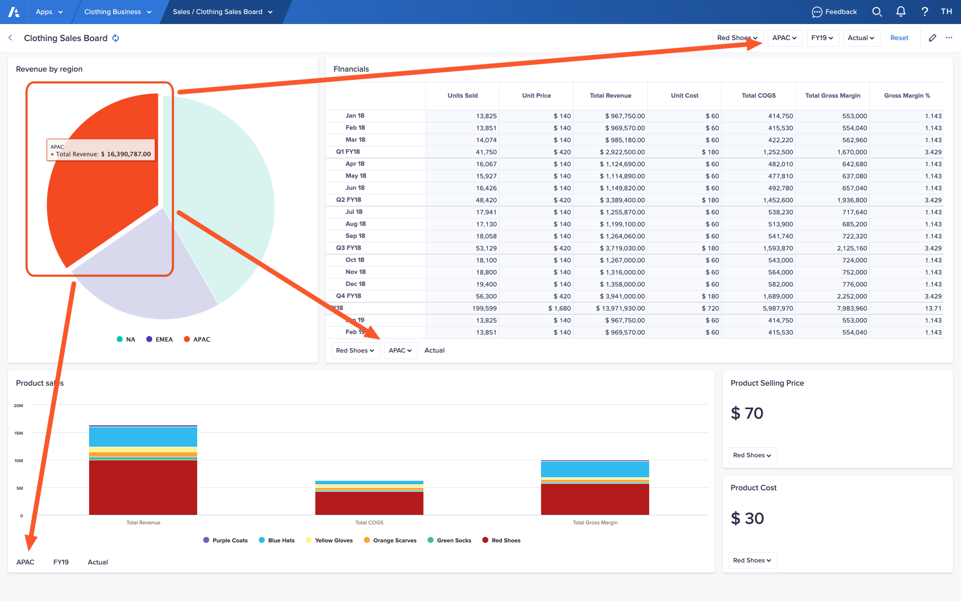
When you move your cursor over a data series on a chart card, its value displays in a box above the cursor. This enables you to see exact values for certain types of chart such as pie charts, which do not have a numerical axis.
Click the name of a data series in the legend to stop it displaying on a chart card. This enables you to compare specific data series on a chart card.
You can emphasize a data series on a pie chart card by clicking on a segment. This makes the segment move outwards from the center of the pie chart.
Export a chart card as an image
You can export a chart card as an image to share it with stakeholders or use it in other ways.
To export a chart card as an image:
- Click the ellipsis (…) in the top-right of the chart card.
A dropdown displays, which contains any actions configured for the card, and a link to the Source module. - Hover your cursor over Exports.
A list of available exports displays. Even if the page builder has not configured any exports for a chart card, you can always:- export a chart card as an image
- choose Print chart to print the chart card with your default browser settings
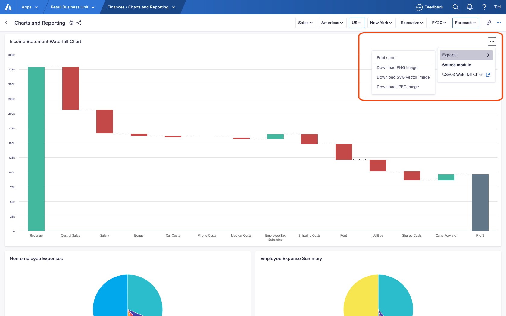
- Based on the file format you want, choose Download PNG image, Download SVG vector image, or Download JPEG image.
An image of the chart card downloads to the location specified in your browser settings.

