Creates a set of colored icons suitable for use as a heat map.
Double-clicking the chart, or selecting the Anaplan XL > Format In-Cell Chart... right-click menu item enables the editing of the chart format using the SparkHeatMap Chart Designer.
Syntax
XL3SparkHeatMap( Data, Output, InRows, Icon, HighColour, LowColour, [ColourSteps], [MidColour], [Minimum], [Maximum], [Label] )
Parameters
| Parameter | Description |
| Data | The data to chart. This can be a range or a formula |
| Output | The target range in which to render the chart(s) |
| InRows | Specifies whether the input data are in rows or columns:
|
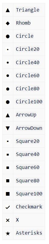
| Icon | The icon to use. The possible icons are listed below: |
| HighColour | The color to use for the maximum value |
| LowColour | The color to use for the minimum value |
| ColourSteps | The number of different color bands |
| MidColour | The color to use as the mid-range color, or -1 or an empty parameter for none |
| Minimum | A value to use as the minimum. The value is taken from the data if no value is specified |
| Maximum | A value to use as the maximum. The value is taken from the data if no value is specified |
| Label | Specifies the text to use in the formula cell |
Icon Sets
Use icons with In-Cell Charts.